
Research
2025 Report: Destructive Malware in Open Source Packages
Destructive malware is rising across open source registries, using delays and kill switches to wipe code, break builds, and disrupt CI/CD.
By Kush Pandya - Dec 24, 2025
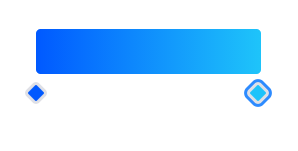
gradient-control
Advanced tools
Angular package that provide one reusable component for change gradient colors value by using mouse dragging.
This library was generated with Angular CLI version 11.2.14.
This Package is fully supported with angular's various version and written in angular. This provide simple drag and drop UI for change gradient colors and it's all properties. Package is configurable with multiple directives and support two way binding.
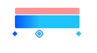
Preview of Delete Area (Red backgrounded) of control :
Import GradientControlModule into your app.module.ts like Below :
import { GradientControlModule } from 'gradient-control';
.
.
@NgModule({
    imports: [
        ...
        GradientControlModule
    ]
});
In Your
HTML Templatefile of angular, Just Usegradient-controlselecter like below :
<gradient-control [(colorArray)]="colors"></gradient-control>
| Option | DataType | Purpose |
|---|---|---|
| colorArray | Array[{ color: string, stop: number }] | input/output value binder. used for two way binding like ngModel. It Takes Array of objects as a input. object's color property should be string and stop should be in between minColorStop and maxColorStop property's value. Default colorArray is : [ { color: '#0059ff', stop: 0 }, { color: '#1ec3fa', stop: 1 } ] |
| minColorStop | Number | Defines minimum value that color's stop can hold. This value will be treat same as min boundry of input type=range. Default value is 0.
Note: |
| maxColorStop | Number | defines maximum value that color's stop can hold. This value will be treat same as max boundry of input type=range. Default value is 1.
Note: |
| minColors | Number | Minimum number of colors that can hold by control. Colors can not be remove after colors count reach at minimum. Default value is 2. |
| maxColors | Number | maximum number of colors that can hold by control. Colors can not be added after colors count reach at maximum. Default value is 4. |
| removeAreaBackgroundColor | String | css background color that will display when any color pin is dragged on it above the control. (see preview - red area is remove area of color.) when any Color pin is dragged over that area and release hold. That pin will be deleted with it's color. If you want to change that red color with your theme. then this proeprty will help. Default Value is rgba(255, 0, 0, 0.424) |
| removeAreaTooltip | String | Tooltip string that will be shown when mouse hover over removeArea of color pin. Default value is Drag color pin here for remove color |
| colorPinTooltip | String | Tooltip string that will be shown when mouse hover over Color pin (diamond shape under the color Ramp). Default value is Double click to open color picker |
| addColorTooltip | String | Tooltip string that will be shown when mouse hover over Color Ramp(gradient part of a control). it will help user to guide how to use that control. Default value is Double click to add new color |
| containerClass | String | Css classname that can style extra according to your site's theme. |
| Event | Return Type | Purpose |
|---|---|---|
| colorArrayChange | colorArray [{ color: string, stop: number, stopInPercent: number, id: number }] | fire when any changes in colorArray using control or assignment (=) in binding variable. |
| onColorAdd | colorArray (same as above) | This event will Fire when any new color is added via double click on color Ramp. |
| onColorRemove | colorArray (same as above) | This event will Fire when any any color is removed via pull color pin into remove area above the color Ramp. |
| onColorControlActivate | object { color: string, stop: number, stopInPercent: number, id: number } | fire when select any color pin via click on color pin. |
| onColorSlideStart | colorArray (same as above) | Dispatch event when user start sliding color pin. It will fire only once in cycle of dragStart-dragging-dragEnd |
| onColorSliding | colorArray (same as above) | Dispatch event while user sliding color pin. It will fire multiple time when any pin move through mouse. second stage of cycle dragStart-dragging-dragEnd |
| onColorSlideEnd | colorArray (same as above) | Dispatch event once when user ends sliding color pin. It will fire only once. third stage of cycle dragStart-dragging-dragEnd |
You can Use
GradientControlServicefor convert color array into gradient css.
import service in your component's constructor and Use it's function like below :
import { GradientControlService } from 'gradient-control';
.
.
.
constructor(public gradientService: GradientControlService) {
    .
    .
    .
}
Convert color Array into css :
    GradientControlService.getGradientCss = function(colorArray, Options: gradientCSSOptions<optional> )

    // Where
    Options: gradientCSSOptions = {
        type: 'Linear' | 'Radial',      @Optional (default: 'Linear')
        angle: number,                  @Optional (default: 0)
        min: number<minColorStop>,      @Optional (default: 0)
        max: number<maxColorStop>       @Optional (default: 1)
        }
Note : If you used minColorStop and maxColorStop property with your custom boundry value in html with control. then you must have to pass that values into this getGradientCss function like this: service.getGradientCss(colorArray, {minColorStop: number, maxColorStop: number, gradientType: 'Linear' | 'Radial', angle: number<0-360> }).then(...)
Note : Don't use function from service that is start with underscore(_). it's for internal use of library. GradientControlService only provice one function that converts color array into css.
/*
    below function is fire when colorArrayChnage event will fire from conmponent. check live demo and interect with control. you can check console.log in inspect > console.
*/
colorArrayChange(colorArray) {
    console.log("ColorArrayChange Event", colorArray); <== []
    this.gradientService.getGradientCss(colorArray).then(result => {
      this.backgroundCss = result;
    })
  }
In HTML, Background variable used like this :
<div [ngStyle]="{'background': backgroundCss}">...</div>
Fully Functional Control look like this :
<gradient-control
    [minColors]="3"
    [maxColors]="5"
    [minColorStop]="minColorStop"
    [maxColorStop]="maxColorStop"
    (onColorAdd)="onColorAdd($event)"
    (onColorRemove)="onColorRemove($event)"
    (onColorControlActivate)="selectPin($event)"
    (onColorSlideStart)="onColorSlideStart($event)"
    (onColorSliding)="onColorSliding($event)"
    (onColorSlideEnd)="onColorSlideEnd($event)"
    [(colorArray)]="colorArray"
    (colorArrayChange)="colorArrayChange($event)"
></gradient-control>
Js for above control looks like below:
minColorStop: number = 1
minColorStop: number = 100
colorArray: Array<any> = [
    {color: '#fff', stop: 10 },
    {color: '#f0a', stop: 45 },
    {color: '#00c', stop: 70 }
    {color: '#000', stop: 100 }
]
function onColorAdd(colorArray) {...}
function onColorRemove(colorArray) {...}
function selectPin(singleColorObject) {...}
function onColorSlideStart(colorArray) {...}
function onColorSliding(colorArray) {...}
function onColorSlideEnd(colorArray) {...}
function colorArrayChange(colorArray) {...}
You can checkout repo to see full example code with rotation angle and gradient type changes.
In above merged directive, colorArray variable will be automatic update on value changes.
Each and every things that on a internet is written and develop by someone with lot's of efforts and time. You can empower them to do more and best work for others who can freely use that by Buying them a coffee.
To get more help on the this Control. Contact me on this email contact2mayurkukadiya@gmail.com
FAQs
Angular package that provide one reusable component for change gradient colors value by using mouse dragging.
We found that gradient-control demonstrated a not healthy version release cadence and project activity because the last version was released a year ago. It has 1 open source maintainer collaborating on the project.
Did you know?

Socket for GitHub automatically highlights issues in each pull request and monitors the health of all your open source dependencies. Discover the contents of your packages and block harmful activity before you install or update your dependencies.
Research
Destructive malware is rising across open source registries, using delays and kill switches to wipe code, break builds, and disrupt CI/CD.

Security News
Socket CTO Ahmad Nassri shares practical AI coding techniques, tools, and team workflows, plus what still feels noisy and why shipping remains human-led.

Research
/Security News
A five-month operation turned 27 npm packages into durable hosting for browser-run lures that mimic document-sharing portals and Microsoft sign-in, targeting 25 organizations across manufacturing, industrial automation, plastics, and healthcare for credential theft.