Product
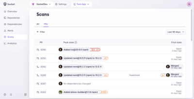
Introducing Pull Request Stories to Help Security Teams Track Supply Chain Risks
Socket’s new Pull Request Stories give security teams clear visibility into dependency risks and outcomes across scanned pull requests.
inferno-datatable
Advanced tools
InfernoJS datatables without jQuery. Smart Inferno datatable that includes search, pagination and localization.
A InfernoJS datatables without jQuery. Smart datatable that includes search, pagination, and localization support.
DEMO: InfernoJS Datatables in Action!
Jump to: installing, required props, costumization (e.g. localization) via config, styling, roadmap, contributing.
Fun fact, this a re-write of my React-based datatables library.
To get started with inferno-datatable in your project:
npm i inferno-datatable --save
# or
yarn add inferno-datatable --save
Then:
import InfernoDatatable from 'inferno-datatable';

// somewhere:

<InfernoDatatable
  tableKey={key}
  columns={columns}
  rows={rows}
  config={config} // optional, overrides all default settings/labels
/>
Now you are all set to enjoy some InfernoJS datatables in your project! 🙌
Look at the demo data file for examples of how the rows and columns props look.
You can also clone this repo which includes a full demo with create-inferno-app that you can use to try out the library.
The tableKey is a String used to identify the table dataset. It is required.
The columns prop is an array of colum objects which have a key and label. Like this:
const columns = [{
    key: 'id',
    label: '#',
  }, {
    key: 'name',
    label: 'Name',
  }, {
    key: 'email',
    label: 'Email',
  },
];
The rows prop is an array of objects that have the key-value pairs described in our columns. For example:
const rows = [
  {
    id: 1,
    name:  'Sansa Stark',
    email: 'sansa@winterfell.gov',
    onClickHandler: someFunction,
    isActive: true,
  },
  {
    id: 2,
    name: 'Jon Snow',
    email: 'jon@nightswatch.gov',
    onClickHandler: someFunction,
    isActive: false,
  },
];
The key onClickHandler is optional. It will attach an onClick() callback on the row. The isActive prop is also optional. The row that has this prop set to true will have a special class applied (CSS styling purposes).
You can pass a config prop the <InfernoDatatable /> component to change all the default settings and labels.
This is great if you want to change the text or localize your component. Here’s an overview of all the options you can specify via the config object:
itemsPerPageOptions: an Array of Numbers, defaults to [10, 25, 50, 100],itemsPerPageLabel: a String, defaults to Entries per page:nextPageLabel: a String, defaults to NextpreviousPageLabel: a String, defaults to BacksearchLabel: a String, defaults to Search:searchPlaceholder: a String, default to Type to search…noEntriesLabel: a String, defaults to No entries to show.entryCountLabels: an Array of Strings, defaults to ['Showing', 'to', 'of', 'entries.']. Prints out Showing 10 to 20 of 300 entires. at the bottom of the table.See the customOptions object in the demo data for an example of how it is used in example #2 on the demo page.
Out of the box, inferno-datatable is somewhat bare-bones. Include this CSS starter file in your project to get the look from the demo. Edit it to suit your needs.
The distribution of library (see lib directory) comes with a cool .css file that has the markup from above.
There are many ways to contribute. For example:
Need help with your first PR in OSS? Open an issue and we will find something simple and cool for you!
FAQs
InfernoJS datatables without jQuery. Smart Inferno datatable that includes search, pagination and localization.
We found that inferno-datatable demonstrated a not healthy version release cadence and project activity because the last version was released a year ago. It has 1 open source maintainer collaborating on the project.
Did you know?

Socket for GitHub automatically highlights issues in each pull request and monitors the health of all your open source dependencies. Discover the contents of your packages and block harmful activity before you install or update your dependencies.

Product
Socket’s new Pull Request Stories give security teams clear visibility into dependency risks and outcomes across scanned pull requests.

Research
/Security News
npm author Qix’s account was compromised, with malicious versions of popular packages like chalk-template, color-convert, and strip-ansi published.

Research
Four npm packages disguised as cryptographic tools steal developer credentials and send them to attacker-controlled Telegram infrastructure.