Product
Introducing Data Exports
Export Socket alert data to your own cloud storage in JSON, CSV, or Parquet, with flexible snapshot or incremental delivery.
ink-progress-bar
Advanced tools
Progress bar component for Ink.
$ npm install ink-progress-bar
See examples/basic.js for an example app. Run it with ./examples/run basic.
import React, { Component } from 'react';
import { Color } from 'ink';
import ProgressBar from 'ink-progress-bar';

class MyProgress extends Component {
	render() {
		return (
			<>
				<Color red>
				<ProgressBar
					left={text.length}
					percent={this.state.done / TASKS}
				/>
				</Color>
			</>
		);
	}
}
All props except the ones below are passed to <Text> as-is.
Type: string
Default: '█'
The character to use for each step.
Type: number
Default: 0
The percentage (between 0 and 1) of progress.
Type: number
Default: 0
The number of characters to subtract from each side of the progress bar. Commonly used if you want text before/after the progress bar on the same line. See examples/basic.js for an example.
MIT © Frankie Bagnardi
FAQs
a customizable progress bar for ink
The npm package ink-progress-bar receives a total of 15,158 weekly downloads. As such, ink-progress-bar popularity was classified as popular.
We found that ink-progress-bar demonstrated a not healthy version release cadence and project activity because the last version was released a year ago. It has 1 open source maintainer collaborating on the project.
Did you know?

Socket for GitHub automatically highlights issues in each pull request and monitors the health of all your open source dependencies. Discover the contents of your packages and block harmful activity before you install or update your dependencies.

Product
Export Socket alert data to your own cloud storage in JSON, CSV, or Parquet, with flexible snapshot or incremental delivery.

Research
/Security News
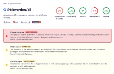
Bitwarden CLI 2026.4.0 was compromised in the Checkmarx supply chain campaign after attackers abused a GitHub Action in Bitwarden’s CI/CD pipeline.

Research
/Security News
Docker and Socket have uncovered malicious Checkmarx KICS images and suspicious code extension releases in a broader supply chain compromise.