
Security News
The Changelog Podcast: Practical Steps to Stay Safe on npm
Learn the essential steps every developer should take to stay secure on npm and reduce exposure to supply chain attacks.
By Sarah Gooding - Oct 31, 2025
ion7-calendar
Advanced tools
INFO: This is a forked package from ion2-calendar. Since ion2-calendar does not support Angular versions >= 16, I want to maintain this package to keep it up to date with the latest versions of angular and ionic.

| npm Package Version | Angular Version | Ionic Version |
|---|---|---|
| from 3.6.25 | 12 <= Version <= 16 | 5 <= Version <= 7 |
Please send me a message if you notice that the support differs from the table.
live demo click me.
$ npm install ion7-calendar moment --save
import { NgModule } from '@angular/core';
import { IonicApp, IonicModule } from '@ionic/angular';
import { MyApp } from './app.component';
...
import { CalendarModule } from 'ion7-calendar';

@NgModule({
  declarations: [
    MyApp,
    ...
  ],
  imports: [
    IonicModule.forRoot(),
    CalendarModule
  ],
  bootstrap: [MyApp],
  ...
})
export class AppModule {}
import { NgModule } from '@angular/core';
import { IonicApp, IonicModule } from 'ionic-angular';
import { MyApp } from './app.component';
...
import { CalendarModule } from "ion7-calendar";

@NgModule({
  declarations: [
    MyApp,
    ...
  ],
  imports: [
    IonicModule.forRoot(MyApp),
    // See CalendarComponentOptions for options
    CalendarModule.forRoot({
      doneLabel: 'Save',
      closeIcon: true
    })
  ],
  bootstrap: [IonicApp],
  entryComponents: [
    MyApp,
    ...
  ]
})
export class AppModule {}
<ion-calendar
  [(ngModel)]="date"
  (change)="onChange($event)"
  [type]="type"
  [format]="'YYYY-MM-DD'"
>
</ion-calendar>
import { Component } from '@angular/core';

@Component({
  selector: 'page-home',
  templateUrl: 'home.html'
})
export class HomePage {
  date: string;
  type: 'string'; // 'string' | 'js-date' | 'moment' | 'time' | 'object'
  constructor() { }

  onChange($event) {
    console.log($event);
  }
  ...
}
<ion-calendar
  [(ngModel)]="dateRange"
  [options]="optionsRange"
  [type]="type"
  [format]="'YYYY-MM-DD'"
>
</ion-calendar>
import { Component } from '@angular/core';
import { CalendarComponentOptions } from 'ion7-calendar';

@Component({
  selector: 'page-home',
  templateUrl: 'home.html'
})
export class HomePage {
  dateRange: { from: string; to: string; };
  type: 'string'; // 'string' | 'js-date' | 'moment' | 'time' | 'object'
  optionsRange: CalendarComponentOptions = {
    pickMode: 'range'
  };

  constructor() { }
  ...
}
<ion-calendar
  [(ngModel)]="dateMulti"
  [options]="optionsMulti"
  [type]="type"
  [format]="'YYYY-MM-DD'"
>
</ion-calendar>
import { Component } from '@angular/core';
import { CalendarComponentOptions } from 'ion7-calendar';

@Component({
  selector: 'page-home',
  templateUrl: 'home.html'
})
export class HomePage {
  dateMulti: string[];
  type: 'string'; // 'string' | 'js-date' | 'moment' | 'time' | 'object'
  optionsMulti: CalendarComponentOptions = {
    pickMode: 'multi'
  };

  constructor() { }
  ...
}
| Name | Type | Default | Description |
|---|---|---|---|
| options | CalendarComponentOptions | null | options |
| format | string | 'YYYY-MM-DD' | value format |
| type | string | 'string' | value type |
| readonly | boolean | false | readonly |
| Name | Type | Description |
|---|---|---|
| change | EventEmitter | event for model change |
| monthChange | EventEmitter | event for month change |
| select | EventEmitter | event for click day-button |
| selectStart | EventEmitter | event for click day-button |
| selectEnd | EventEmitter | event for click day-button |
| Name | Type | Default | Description |
|---|---|---|---|
| from | Date | new Date() | start date |
| to | Date | 0 (Infinite) | end date |
| color | string | 'primary' | 'primary', 'secondary', 'danger', 'light', 'dark' |
| pickMode | string | single | 'multi', 'range', 'single' |
| showToggleButtons | boolean | true | show toggle buttons |
| showMonthPicker | boolean | true | show month picker |
| monthPickerFormat | Array | ['JAN', 'FEB', 'MAR', 'APR', 'MAY', 'JUN', 'JUL', 'AUG', 'SEP', 'OCT', 'NOV', 'DEC'] | month picker format |
| defaultTitle | string | '' | default title in days |
| defaultSubtitle | string | '' | default subtitle in days |
| disableWeeks | Array | [] | week to be disabled (0-6) |
| monthFormat | string | 'MMM YYYY' | month title format |
| weekdays | Array | ['S', 'M', 'T', 'W', 'T', 'F', 'S'] | weeks text |
| weekStart | number | 0 (0 or 1) | set week start day |
| daysConfig | Array<DaysConfig> | [] | days configuration |
Import ion7-calendar in component controller.
import { Component } from "@angular/core";
import { ModalController } from "@ionic/angular";
import {
CalendarModal,
CalendarModalOptions,
DayConfig,
CalendarResult,
} from "ion7-calendar";
@Component({
selector: "page-home",
templateUrl: "home.html",
})
export class HomePage {
constructor(public modalCtrl: ModalController) {}
openCalendar() {
const options: CalendarModalOptions = {
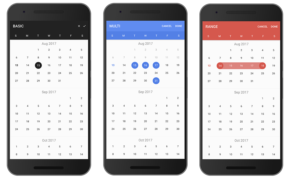
title: "BASIC",
};
const myCalendar = await this.modalCtrl.create({
component: CalendarModal,
componentProps: { options },
});
myCalendar.present();
const event: any = await myCalendar.onDidDismiss();
const date: CalendarResult = event.data;
console.log(date);
}
}
Set pickMode to 'range'.
openCalendar() {
  const options: CalendarModalOptions = {
    pickMode: 'range',
    title: 'RANGE'
  };

  const myCalendar = await this.modalCtrl.create({
    component: CalendarModal,
    componentProps: { options }
  });

  myCalendar.present();

  const event: any = await myCalendar.onDidDismiss();
  const date = event.data;
  const from: CalendarResult = date.from;
  const to: CalendarResult = date.to;

  console.log(date, from, to);
}
Set pickMode to 'multi'.
openCalendar() {
  const options = {
    pickMode: 'multi',
    title: 'MULTI'
  };

  const myCalendar = await this.modalCtrl.create({
    component: CalendarModal,
    componentProps: { options }
  });

  myCalendar.present();

  const event: any = await myCalendar.onDidDismiss();
  const date: CalendarResult = event.data;
  console.log(date);
}
Use index eg: [0, 6] denote Sunday and Saturday.
openCalendar() {
  const options: CalendarModalOptions = {
    disableWeeks: [0, 6]
  };

  const myCalendar = await this.modalCtrl.create({
    component: CalendarModal,
    componentProps: { options }
  });

  myCalendar.present();

  const event: any = await myCalendar.onDidDismiss();
  const date: CalendarResult = event.data;
  console.log(date);
}
your root module
import { NgModule, LOCALE_ID } from '@angular/core';
...

@NgModule({
  ...
  providers: [{ provide: LOCALE_ID, useValue: "zh-CN" }]
})

...
openCalendar() {
  const options: CalendarModalOptions = {
    monthFormat: 'YYYY 年 MM 月 ',
    weekdays: ['天', '一', '二', '三', '四', '五', '六'],
    weekStart: 1,
    defaultDate: new Date()
  };

  const myCalendar = await this.modalCtrl.create({
    component: CalendarModal,
    componentProps: { options }
  });

  myCalendar.present();

  const event: any = await myCalendar.onDidDismiss();
  const date: CalendarResult = event.data;
  console.log(date);
}
Configure one day.
openCalendar() {
  let _daysConfig: DayConfig[] = [];
  for (let i = 0; i < 31; i++) {
    _daysConfig.push({
      date: new Date(2017, 0, i + 1),
      subTitle: `$${i + 1}`
    })
  }

  const options: CalendarModalOptions = {
    from: new Date(2017, 0, 1),
    to: new Date(2017, 11.1),
    daysConfig: _daysConfig
  };

  const myCalendar = await this.modalCtrl.create({
    component: CalendarModal,
    componentProps: { options }
  });

  myCalendar.present();

  const event: any = await myCalendar.onDidDismiss();
  const date: CalendarResult = event.data;
  console.log(date);
}
| Name | Type | Default | Description |
|---|---|---|---|
| from | Date | new Date() | start date |
| to | Date | 0 (Infinite) | end date |
| title | string | 'CALENDAR' | title |
| color | string | 'primary' | 'primary', 'secondary', 'danger', 'light', 'dark' |
| defaultScrollTo | Date | none | let the view scroll to the default date |
| defaultDate | Date | none | default date data, apply to single |
| defaultDates | Array | none | default dates data, apply to multi |
| defaultDateRange | { from: Date, to: Date } | none | default date-range data, apply to range |
| defaultTitle | string | '' | default title in days |
| defaultSubtitle | string | '' | default subtitle in days |
| cssClass | string | '' | Additional classes for custom styles, separated by spaces. |
| canBackwardsSelected | boolean | false | can backwards selected |
| pickMode | string | single | 'multi', 'range', 'single' |
| disableWeeks | Array | [] | week to be disabled (0-6) |
| closeLabel | string | CANCEL | cancel button label |
| doneLabel | string | DONE | done button label |
| clearLabel | string | null | clear button label |
| closeIcon | boolean | false | show cancel button icon |
| doneIcon | boolean | false | show done button icon |
| monthFormat | string | 'MMM YYYY' | month title format |
| weekdays | Array | ['S', 'M', 'T', 'W', 'T', 'F', 'S'] | weeks text |
| weekStart | number | 0 (0 or 1) | set week start day |
| daysConfig | Array<DaysConfig> | [] | days configuration |
| step | number | 12 | month load stepping interval to when scroll |
| defaultEndDateToStartDate | boolean | false | makes the end date optional, will default it to the start |
{ data } = event| pickMode | Type |
|---|---|
| single | { date: CalendarResult } |
| range | { from: CalendarResult, to: CalendarResult } |
| multi | Array<CalendarResult> |
{ role } = event| Value | Description |
|---|---|
| 'cancel' | dismissed by click the cancel button |
| 'done' | dismissed by click the done button |
| 'backdrop' | dismissed by click the backdrop |
| Name | Type | Default | Description |
|---|---|---|---|
| cssClass | string | '' | separated by spaces |
| date | Date | required | configured days |
| marked | boolean | false | highlight color |
| disable | boolean | false | disable |
| title | string | none | displayed title eg: 'today' |
| subTitle | string | none | subTitle subTitle eg: 'New Year\'s' |
| Name | Type |
|---|---|
| time | number |
| unix | number |
| dateObj | Date |
| string | string |
| years | number |
| months | number |
| date | number |
FAQs
A date picker component for ionic 7
The npm package ion7-calendar receives a total of 429 weekly downloads. As such, ion7-calendar popularity was classified as not popular.
We found that ion7-calendar demonstrated a not healthy version release cadence and project activity because the last version was released a year ago. It has 1 open source maintainer collaborating on the project.
Did you know?

Socket for GitHub automatically highlights issues in each pull request and monitors the health of all your open source dependencies. Discover the contents of your packages and block harmful activity before you install or update your dependencies.
Security News
Learn the essential steps every developer should take to stay secure on npm and reduce exposure to supply chain attacks.

Security News
Experts push back on new claims about AI-driven ransomware, warning that hype and sponsored research are distorting how the threat is understood.

Security News
Ruby's creator Matz assumes control of RubyGems and Bundler repositories while former maintainers agree to step back and transfer all rights to end the dispute.