Ionic Tooltips


Tooltips module for apps built with Ionic Framework.
Compatibility
This module is designed to work with ionic-angular@^3.9.2 but it should work with any version above 2.0.0 as it doesn't heavily depend on the Ionic Framework.
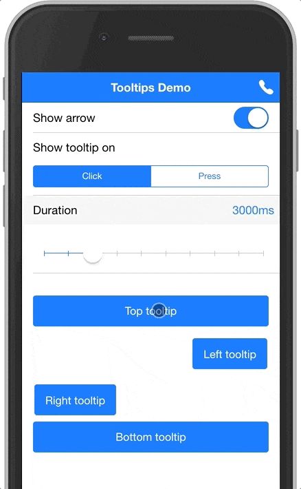
Demo
Below is a gif showing the module in action, you can also clone the example project here: https://github.com/zyra/ionic-tooltips-example
Examples
The module can be used to display tooltips for any element in your app. It also provides a special treatment for buttons in the header navigation (inspired by Google's apps).
Here's a quick example to show a tooltip below a button:
<button ion-button tooltip="I'm a tooltip below a button" positionV="bottom" arrow>
Press me to see a tooltip
</button>
And here's another example to show a tooltip below a nav button:
<ion-header>
<ion-navbar>
<ion-title>Page title</ion-title>
<ion-buttons end>
<ion-button icon-only tooltip="Call" navTooltip>
<ion-icon name="call"></ion-icon>
</ion-button>
</ion-buttons>
</ion-navbar>
</ion-header>
Installation
- Make sure you have
@angular/animations installed. If you don't have it, run the following command to install it:
npm i --save-exact @angular/animations@5
- Install this module by running the following command:
npm i ionic-tooltips
- Import
TooltipsModule in your @NgModule. If you are using lazy module loading, then you need to import it in the modules where it's used.
import { TooltipsModule } from 'ionic-tooltips';

@NgModule({
   ...
   imports: [
      ...
      TooltipsModule.forRoot()
   ]
})
export class MyModule { ... }
- Import
BrowserAnimationsModule in your app's main @NgModule.
import { BrowserAnimationsModule } from '@angular/platform-browser/animations';

@NgModule({
  ...
  imports: [
    ...
    BrowserAnimationsModule
  ]
})
Now you're ready to use this module. See information below for usage.
Usage
The tooltip directive takes a string, which will be used as the tooltip text. To use HTML in your tooltip, you need to pass the content through the [tooltipHtml] directive documented below. When using the tooltip directive, you can also use the following inputs:
tooltipHtml
(string) specifies HTML to use inside the tooltip. This will override any value you passed with the [tooltip] directive (if any was provided).
navTooltip
(boolean) add this attribute or set it's value to true to specify that the tooltip belongs to a nav button. Defaults to false.
positionV
(string) specifies the vertical position of the tooltip. Can be either 'top' or 'bottom'.
positionH
(string) specifies the horizontal position of the tooltip. Can be either 'right' or 'left'.
event
(string) the event to show the tooltip on. Can be either 'hover', 'click' or 'press'. Defaults to 'hover' on desktop, 'press' on mobile.
Note: 'hover' only works on desktop.
desktopEvent
(string) the event to show the tooltip on when displayed on a desktop . Can be either 'hover', 'click' or 'press'. Defaults to 'hover'.
Note: This only works when the event attribute is omitted.
mobileEvent
(string) the event to show the tooltip on when displayed on a mobile. Can be either 'click' or 'press'. Defaults to 'press'.
Note: This only works when the event attribute is omitted.
arrow
(boolean) add this attribute or set it's value to true to show an arrow attached to the tooltip. Defaults to false.
duration
(number) number of milliseconds to show the tooltip for. Defaults to 3000.
active
(boolean) add this attribute or set it's value to true to display the tooltip. Defaults to false.
topOffset
(number) add this attribute to offset the vertical position of the tooltip. Defaults to 0.
leftOffset
(number) add this attribute to offset the horizontal position of the tooltip. Defaults to 0.
hideOthers
(boolean) add this attribute to set weather to hide other visible tooltips. Defaults to false.
Versioning
We use SemVer for versioning. For the versions available, see the tags on this repository.
Contribution
- Having an issue? or looking for support? Open an issue and we will get you the help you need.
- Got a new feature or a bug fix? Fork the repository, make your changes, and submit a pull request.
License
This project is licensed under the MIT License - see the LICENSE.md file for details
Support this project
If you find this project useful, please star the repository to let people know that it's reliable. Also, share it with friends and colleagues that might find this useful as well. Thank you :smile:


