keyboard-css
Advanced tools
keyboard-css - npm Package Compare versions
Comparing version
| { | ||
| "name": "keyboard-css", | ||
| "version": "1.1.1", | ||
| "version": "1.2.0", | ||
| "description": "A CSS to show keyboard keys.", | ||
@@ -5,0 +5,0 @@ "main": "css/main.min.css", |
| <!-- markdownlint-disable --> | ||
| <p align="center"> | ||
| <img src="src/copy/assets/logo.png" alt="Keyboard CSS Logo"> | ||
| <img src="https://raw.githubusercontent.com/shhdharmen/keyboard-css/main/src/copy/assets/logo.png" alt="Keyboard CSS Logo"> | ||
| </p> | ||
@@ -11,3 +11,3 @@ | ||
| <p align="center"> | ||
| <img src="src/copy/assets/demo.gif" alt="Keyboard CSS Demo"> | ||
| <img src="https://raw.githubusercontent.com/shhdharmen/keyboard-css/main/src/copy/assets/demo.gif" alt="Keyboard CSS Demo"> | ||
| </p> | ||
@@ -31,2 +31,4 @@ <!-- markdownlint-restore --> | ||
| - [Basic Usage](#basic-usage) | ||
| - [Usage with `kbd`](#usage-with-kbd) | ||
| - [Usage with `button` and `a`](#usage-with-button-and-a) | ||
| - [Remove Surface Border](#remove-surface-border) | ||
@@ -38,2 +40,6 @@ - [Sizing](#sizing) | ||
| - [Advanced Configuration Options with SASS](#advanced-configuration-options-with-sass) | ||
| - [Variables file](#variables-file) | ||
| - [Change font size](#change-font-size) | ||
| - [Add new size](#add-new-size) | ||
| - [Change depth](#change-depth) | ||
| - [License and Contributing](#license-and-contributing) | ||
@@ -66,8 +72,28 @@ - [Contributing](#contributing) | ||
| According to [W3C](https://www.w3.org/TR/2011/WD-html5-author-20110809/the-kbd-element.html), the `kbd` element represents user input (typically keyboard input, although it may also be used to represent other input, such as voice commands). | ||
| The main purpose of Keyboard CSS is to enhance look and feel such `kbd` elements, but it can also be used with `button` and `a` elements, for better interactivity (like simulating click). | ||
| ### Basic Usage | ||
| You just have to add a single class to apply the related styles, i.e. kbc-button, preferably to a `<button>` or `<a>`: | ||
| You just have to add a single class to `kbd`, `button` or `a` to apply the related styles, i.e. **`kbc-button`** | ||
| #### Usage with `kbd` | ||
| When `.kbc-button` is used with `kbd` element, font-size and line-height is inherited from parent for better accessibility. | ||
| ```html | ||
| <h3>Press <kbd class="kbc-button">/</kbd> to search this site.</h3> | ||
| <p>Press <kbd class="kbc-button">Ctrl</kbd> + <kbd class="kbc-button">Shift</kbd> + <kbd class="kbc-button">R</kbd> to re-render this page.</p> | ||
| ``` | ||
| 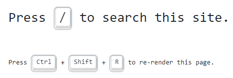 | ||
| #### Usage with `button` and `a` | ||
| When used with button and a elements, it starts supporting interactions. | ||
| ```html | ||
| <button class="kbc-button">K</button> | ||
| <a class="kbc-button">K</a> | ||
| ``` | ||
@@ -77,4 +103,2 @@ | ||
| Great! Your button is now a Keyboard key. Congrats! | ||
| ### Remove Surface Border | ||
@@ -85,3 +109,3 @@ | ||
| ```html | ||
| <button class="kbc-button no-container">K</button> | ||
| <kbd class="kbc-button no-container">K</kbd> | ||
| ``` | ||
@@ -93,4 +117,6 @@ | ||
| Total 5 sizes are available. You can add respective class to see the effect: | ||
| Total 5 sizes are available. You can add respective class to see the effect. | ||
| > Sizing works with `button` and `a` elements, and not `kbd` element. | ||
| | Size | Use case | Class | | ||
@@ -115,2 +141,4 @@ | ----------------- | ------------------------------------------- | ----------------- | | ||
| > States work with `button` and `a` elements, and not `kbd` element. | ||
| Like all buttons, this also have 4 states: `:hover`, `:focus`, `:active`, and `:disabled`. You can add classes with same state name to see it statically. | ||
@@ -132,10 +160,10 @@ | ||
| ```html | ||
| <button class="kbc-button">Default</button> | ||
| <button class="kbc-button kbc-button-primary">Primary</button> | ||
| <button class="kbc-button kbc-button-secondary">Secondary</button> | ||
| <button class="kbc-button kbc-button-success">Success</button> | ||
| <button class="kbc-button kbc-button-danger">Danger</button> | ||
| <button class="kbc-button kbc-button-info">Info</button> | ||
| <button class="kbc-button kbc-button-light">Light</button> | ||
| <button class="kbc-button kbc-button-dark">Dark</button> | ||
| <kbd> class="kbc-button">Default</kbd> | ||
| <kbd> class="kbc-button kbc-button-primary">Primary</kbd> | ||
| <kbd> class="kbc-button kbc-button-secondary">Secondary</kbd> | ||
| <kbd> class="kbc-button kbc-button-success">Success</kbd> | ||
| <kbd> class="kbc-button kbc-button-danger">Danger</kbd> | ||
| <kbd> class="kbc-button kbc-button-info">Info</kbd> | ||
| <kbd> class="kbc-button kbc-button-light">Light</kbd> | ||
| <kbd> class="kbc-button kbc-button-dark">Dark</kbd> | ||
| ``` | ||
@@ -182,4 +210,10 @@ | ||
| For example, to change the default base font-size to 20px, you can do like below: | ||
| ### Variables file | ||
| You can check all the variables at [_variables.scss](https://github.com/shhdharmen/keyboard-css/blob/main/src/sass/abstracts/_variables.scss) file. | ||
| ### Change font size | ||
| To change the default base font-size of `button` and `a` elements, to 20px, you can do like below: | ||
| ```scss | ||
@@ -192,3 +226,3 @@ // assuming you have already done: npm i keyboard-css | ||
| // and then import | ||
| @import "../../node_modules/keyboard-css/sass/main"; | ||
| @import "path/to/node_modules/keyboard-css/sass/main"; | ||
| ``` | ||
@@ -206,2 +240,4 @@ | ||
| ### Add new size | ||
| You can also introduce your new size: | ||
@@ -212,3 +248,3 @@ | ||
| $kbc-btn-size-map: ( | ||
| "xlg": ( | ||
| "xl": ( | ||
| "padding-y": 0.75rem, | ||
@@ -230,15 +266,33 @@ "padding-x": 1.25rem, | ||
| You can check all the variables at [_variables.scss](./src/sass/abstracts/_variables.scss) file. | ||
| And then use it in HTML: | ||
| ```html | ||
| <button class="kbc-button kbc-button-xl">XL Button</button> | ||
| ``` | ||
| ### Change depth | ||
| Depth is calculated and applied as multiple shadows. To increase/decrease it, you can change respective variables: | ||
| ```scss | ||
| // add size in $kbc-btn-size-map | ||
| $kbc-kbd-depth: 4; | ||
| // and then import | ||
| @import "path/to/node_modules/keyboard-css/sass/main"; | ||
| ``` | ||
| ## License and Contributing | ||
| Keyboard CSS is licensed under the [MIT](./LICENSE) license. | ||
| Keyboard CSS is licensed under the [MIT](https://github.com/shhdharmen/keyboard-css/blob/main/LICENSE) license. And same is available on Github: | ||
| %[https://github.com/shhdharmen/keyboard-css] | ||
| ### Contributing | ||
| 🙏 I would ❤️ for you to contribute to Keyboard CSS and help make it even better than it is today! Checkout [contributing](./CONTRIBUTING.md) guidelines for more details. | ||
| 🙏 I would ❤️ for you to contribute to Keyboard CSS and help make it even better than it is today! Checkout [contributing](https://github.com/shhdharmen/keyboard-css/blob/main/CONTRIBUTING.md) guidelines for more details. | ||
| ### Code of Conduct | ||
| This project and everyone participating in it are governed by the [Contributor Covenant Code of Conduct](./CODE_OF_CONDUCT.md). By participating, you are expected to uphold this code. Please report unacceptable behavior to <shhdharmen@gmail.com>. | ||
| This project and everyone participating in it are governed by the [Contributor Covenant Code of Conduct](https://github.com/shhdharmen/keyboard-css/blob/main/CODE_OF_CONDUCT.md). By participating, you are expected to uphold this code. Please report unacceptable behavior to <shhdharmen@gmail.com>. | ||
@@ -245,0 +299,0 @@ ## Contributors ✨ |
Sorry, the diff of this file is not supported yet
Sorry, the diff of this file is not supported yet
Sorry, the diff of this file is not supported yet
Sorry, the diff of this file is not supported yet
Sorry, the diff of this file is not supported yet
Sorry, the diff of this file is not supported yet
Improved metrics
- Total package byte prevSize
743790
12.21%- Lines of code
2267
79.35%- Number of lines in readme file
304
21.6%