Security News
Crates.io Users Targeted by Phishing Emails
The Rust Security Response WG is warning of phishing emails from rustfoundation.dev targeting crates.io users.
kyrsten-sass-utils
Advanced tools
My go-to variables/mixins/functions in one place for easier re-use.
npm install -D kyrsten-sass-utils
$screen-xs: 320px;
$screen-sm: 480px;
$screen-md: 768px;
$screen-lg: 992px;
$screen-xl: 1200px;
$font-weight-light: 300;
$font-weight-regular: 400;
$font-weight-medium: 500;
$font-weight-semibold: 600;
$font-weight-bold: 700;
rem($px)Easy conversion from pixels to rem.
@mediaMixin to facilitate mobile-first media queries.
@include media($screem-sm) { ... }
will compile to
@media only screen and (min-width: $screen-sm) { ... }
Using the sizes listed above (xs, sm, md, lg, xl), you can use these helper classes to show certain DOM elements for only certain screen sizes.
.show-[size]Show only for the given size. Example:
<div className="show-md">
  Will only appear from 768px to 991px.
</div>
<div className="show-lg">
  Will only appear from 992px to 1199px.
</div>
.show-[size 1]-[size 2]Show only for a given range. size-1 must be a smaller size than size-2. Example:
<div className="show-xs-md">
  Will appear on xs, sm and md screens (from 320px to 991px).
</div>
show-[size]-upShow for the given size and all larger sizes. Example:
<div className='show-md-up'>
  Will appear on md and all larger sizes (from 768px+).
</div>
The display property will default to block unless you add one of these classes. Available display options:
flexinlineinline-blockExample:
<div className="show-xs-md show-flex">
  Will appear from xs to md screens and will have "display: flex;".
</div>
FAQs
A small library of SASS utility variables/functions/mixins.
We found that kyrsten-sass-utils demonstrated a not healthy version release cadence and project activity because the last version was released a year ago. It has 1 open source maintainer collaborating on the project.
Did you know?

Socket for GitHub automatically highlights issues in each pull request and monitors the health of all your open source dependencies. Discover the contents of your packages and block harmful activity before you install or update your dependencies.

Security News
The Rust Security Response WG is warning of phishing emails from rustfoundation.dev targeting crates.io users.

Product
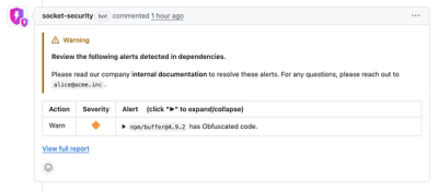
Socket now lets you customize pull request alert headers, helping security teams share clear guidance right in PRs to speed reviews and reduce back-and-forth.

Product
Socket's Rust support is moving to Beta: all users can scan Cargo projects and generate SBOMs, including Cargo.toml-only crates, with Rust-aware supply chain checks.