Research
2025 Report: Destructive Malware in Open Source Packages
Destructive malware is rising across open source registries, using delays and kill switches to wipe code, break builds, and disrupt CI/CD.
loadable-image
Advanced tools
 React Component to lazy load images.
npm i loadable-image
Or via yarn
yarn add loadable-image
<AsyncImage /> accepts all props of <img /> tag.
import { AsyncImage } from 'loadable-image'
...
<AsyncImage
  src='https://picsum.photos/1900'
  style={{ width: 150, height: 150 }}
/>
Loader/ErrorYou can pass your own loader and error components as props to AsyncImage component.
import { AsyncImage } from 'loadable-image'
...
<AsyncImage
  src='https://picsum.photos/1900'
  style={{ width: 150, height: 150 }}
  loader={<div style={{ background: '#888' }}/>}
  error={<div style={{ background: '#eee' }}/>}
/>
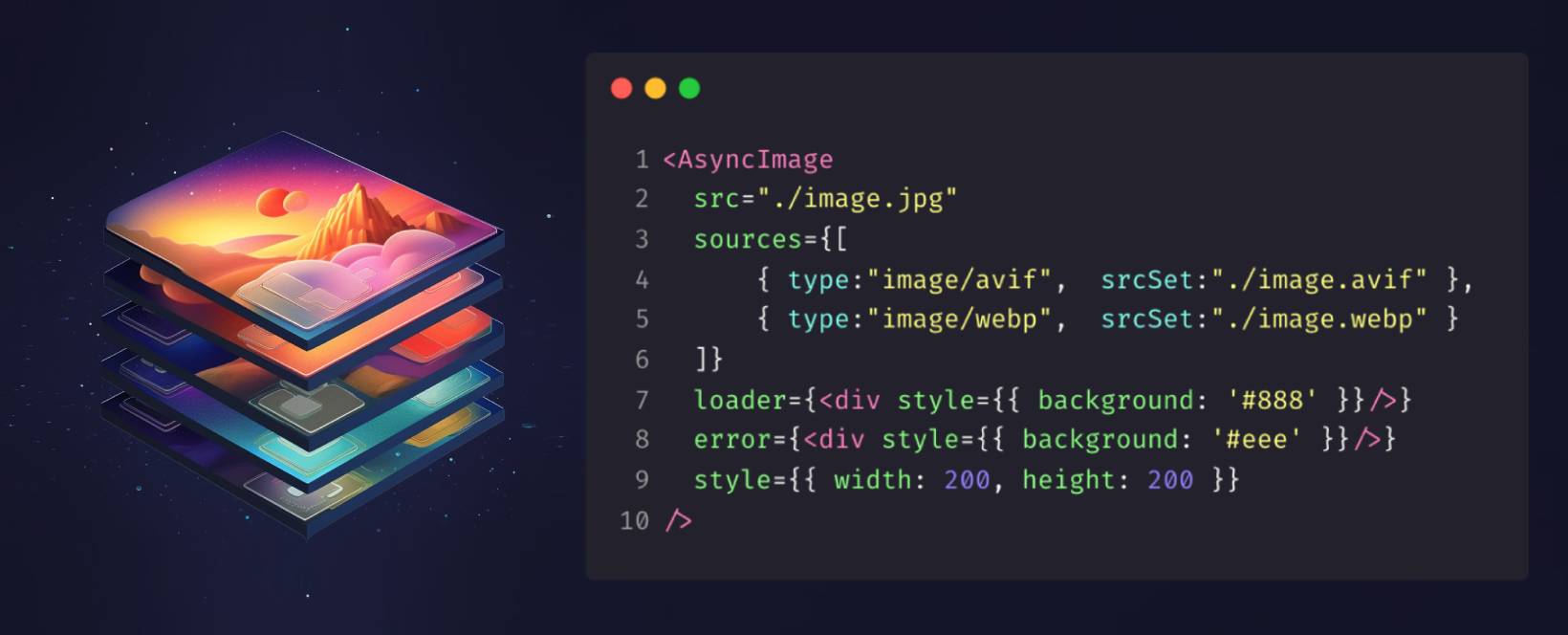
Since under the hood <AsyncImage /> is just a picture element. You can pass an array of different Sources as a prop. And browser will pick the first one that it supports.
import { AsyncImage } from 'loadable-image'
...
<AsyncImage
  src="./image.jpg"
  sources={[
      { type:"image/avif",  srcSet:"./image.avif" },
      { type:"image/webp",  srcSet:"./image.webp" }
  ]}
  style={{ width: 200, height: 200 }}
/>
To make image responsive you can use aspectRatio property in style prop. This way you can specify only width or height as 100% and the other one as auto.
Note that if you support older browsers you might need to use aspectRatio padding-hack.
import { AsyncImage } from 'loadable-image'
...
<AsyncImage
  src='https://picsum.photos/1900'
  style={{ width: "100%", height: "auto", aspectRatio: 16 / 9 }}
/>
Under the hood AsyncImage uses transitions-kit library
it's a collection Transition components built on top of react-transition-group its a small library maintained by React team for animating between different views.
You can pass your own Transition as a prop to AsyncImage component.
Here’s how you can implement a Blur transition that replaces a low-resolution image with a high-resolution one
import { Blur } from 'transitions-kit'
import { AsyncImage } from 'loadable-image'
...
<AsyncImage
  src='./original-image.jpg'
  style={{ width: 150, height: 150 }}
  Transition={props => <Blur radius={10} {...props}/>}
  loader={<img src='./extra-small-1x1.jpg' />}
/>
By default AsyncImage uses Fade transition.
import { Fade } from 'transitions-kit'
import { AsyncImage } from 'loadable-image'
...
<AsyncImage
  src='https://picsum.photos/1900'
  style={{ width: 150, height: 150 }}
  loader={<div style={{ background: '#888' }}/>}
  Transition={Fade}
/>
There are plenty different already predefined Transition components such as Grow, Zoom, Slide, Blur, Fade etc. in transitions-kit.
Feel free to try any of them.
import { Grow } from 'transitions-kit'
import { AsyncImage } from 'loadable-image'
...
<AsyncImage
  src='https://picsum.photos/1900'
  style={{ width: 150, height: 150 }}
  loader={<div style={{ background: '#888' }}/>}
  Transition={Grow}
/>
<AsyncImage /> accepts all standard props for HtmlImageElement and the following:
| Property | Type | Description |
|---|---|---|
| className | String | NOTE: CSS from style object has a higher priority |
| style | CSSProperties | CSSStyleDeclaration object |
| rootMargin | string by default: '600px 0px' | Margin around the root. Specifies when to trigger an image download. |
| loader | ReactElement | React element to display a loading state. |
| error | ReactElement | React element to display an error state. |
| sources | Array<SourceProps> | An array of options for <source /> element. |
| timeout | Number or Object | The duration for the transition, in milliseconds. You may specify a single timeout for all transitions, or individually with an object. |
| Transition | ComponentType<TransitionProps> | Custom Transition component. Check out transitions-kit's predefined components |
FAQs
React Component to lazy load images
The npm package loadable-image receives a total of 865 weekly downloads. As such, loadable-image popularity was classified as not popular.
We found that loadable-image demonstrated a healthy version release cadence and project activity because the last version was released less than a year ago. It has 1 open source maintainer collaborating on the project.
Did you know?

Socket for GitHub automatically highlights issues in each pull request and monitors the health of all your open source dependencies. Discover the contents of your packages and block harmful activity before you install or update your dependencies.

Research
Destructive malware is rising across open source registries, using delays and kill switches to wipe code, break builds, and disrupt CI/CD.

Security News
Socket CTO Ahmad Nassri shares practical AI coding techniques, tools, and team workflows, plus what still feels noisy and why shipping remains human-led.

Research
/Security News
A five-month operation turned 27 npm packages into durable hosting for browser-run lures that mimic document-sharing portals and Microsoft sign-in, targeting 25 organizations across manufacturing, industrial automation, plastics, and healthcare for credential theft.