Product
Introducing Socket Fix for Safe, Automated Dependency Upgrades
Automatically fix and test dependency updates with socket fix—a new CLI tool that turns CVE alerts into safe, automated upgrades.
By John-David Dalton - Apr 25, 2025
material-ui-dropzone
Advanced tools
Material-UI-dropzone is a React component using Material-UI and is based on the excellent react-dropzone library.
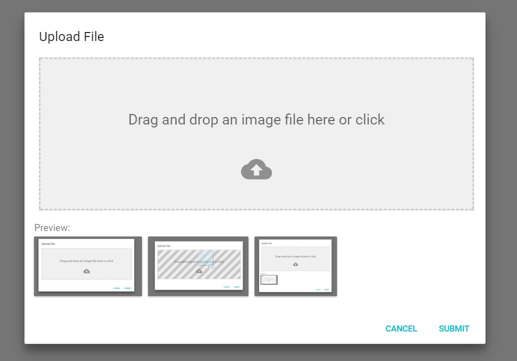
This components provide either a file-upload dropzone or a file-upload dropzone inside of a dialog. The file-upload dropzone features some snazzy "File Allowed/Not Allowed" effects, previews and alerts.
npm install --save material-ui-dropzone
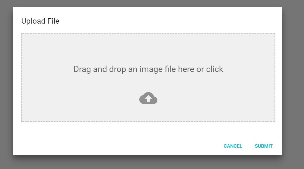
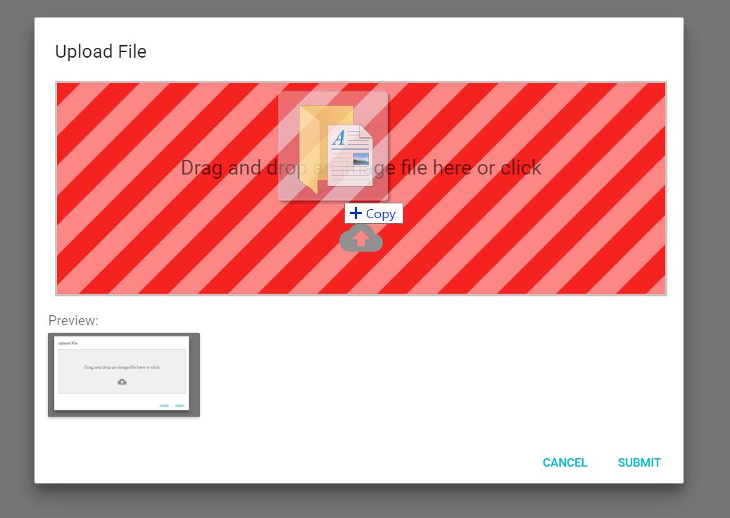
This is the component:
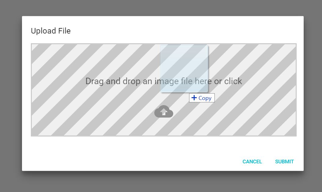
When you drag a file onto the dropzone, you get a neat effect:
And if you drop in a wrong type of file, you'll get yelled at:
This components creates the dropzone, previews and snackbar notifications without a dialog
import React, {Component} from 'react'
import {DropzoneArea} from 'material-ui-dropzone'

class DropzoneAreaExample extends Component{
  constructor(props){
    super(props);
    this.state = {
      files: []
    };
  }
  handleChange(files){
    this.setState({
      files: files
    });
  }
  render(){
    return (
      <DropzoneArea
        onChange={this.handleChange.bind(this)}
        />
    )
  }
}

export default DropzoneAreaExample;
| Name | Type | Default | Description |
|---|---|---|---|
| acceptedFiles | Array | ['image/*', 'video/*', 'application/*'] | A list of file mime types to accept. Does support wildcards. |
| filesLimit | Number | 3 | Maximum number of files that can be loaded into the dropzone |
| maxFileSize | Number | 3000000 | Maximum file size (in bytes) that the dropzone will accept |
| dropzoneText | String | 'Drag and drop an image file here or click' | Text in dropzone |
| showPreviews | Boolean | false | Shows previews BELOW the Dropzone |
| showPreviewsInDropzone | Boolean | true | Shows preview INSIDE the dropzone |
| showAlerts | Boolean | true | shows styled snackbar alerts when files are dropped, deleted or rejected. |
| Name | Return Params | Description |
|---|---|---|
| onChange | files(array) | Fired when the user drops files into dropzone or deletes a file. Returns all the files currently loaded into the dropzone. |
| onDrop | files(array) | Fired when the user drops files into the dropzone. Returns the files dropped |
| onDropRejected | files(array) | Fired when a file is rejected because of wrong file type, size or goes beyond the filesLimit. Returns the files that were rejected |
| onDelete | file | Fired when a file is deleted from the previews panel. |
This component provides the dropzone inside of a dialog.
import React, { Component } from 'react'
import {DropzoneDialog} from 'material-ui-dropzone'
import Button from '@material-ui/core/Button';

export default class DropzoneDialogExample extends Component {
    constructor(props) {
        super(props);
        this.state = {
            open: false,
            files: []
        };
    }

    handleClose() {
        this.setState({
            open: false
        });
    }

    handleSave(files) {
        //Saving files to state for further use and closing Modal.
        this.setState({
            files: files,
            open: false
        });
    }

    handleOpen() {
        this.setState({
            open: true,
        });
    }

    render() {
        return (
            <div>
                <Button onClick={this.handleOpen.bind(this)}>
                  Add Image
                </Button>
                <DropzoneDialog
                    open={this.state.open}
                    onSave={this.handleSave.bind(this)}
                    acceptedFiles={['image/jpeg', 'image/png', 'image/bmp']}
                    showPreviews={true}
                    maxFileSize={5000000}
                    onClose={this.handleClose.bind(this)}
                />
            </div>
        );
    }
}
| Name | Type | Default | Description |
|---|---|---|---|
| open | Boolean | false | Required. Sets whether the dialog is open or closed |
| acceptedFiles | Array | ['image/*', 'video/*', 'application/*'] | A list of file mime types to accept. Does support wildcards. |
| filesLimit | Number | 3 | Maximum number of files that can be loaded into the dropzone |
| maxFileSize | Number | 3000000 | Maximum file size (in bytes) that the dropzone will accept |
| showPreviews | Boolean | false | Shows previews BELOW the Dropzone |
| showPreviewsInDropzone | Boolean | true | Shows preview INSIDE the dropzone |
| showAlerts | Boolean | true | shows styled snackbar alerts when files are dropped, deleted or |
| Name | Return Params | Description |
|---|---|---|
| onSave | files(array) | Fired when the user clicks the Submit button. |
| onClose | event | Fired when the modal is closed |
| onChange | files(array) | Fired when the user drops files into dropzone OR deletes a file. Returns all the files currently loaded into the dropzone. |
| onDrop | files(array) | Fired when the user drops files into the dropzone. Returns the files dropped |
| onDropRejected | files(array) | Fired when a file is rejected because of wrong file type, size or goes beyond the filesLimit. Returns the files that were rejected |
| onDelete | file | Fired when a file is deleted from the previews panel. |
MIT
FAQs
A Material-UI file-upload dropzone
The npm package material-ui-dropzone receives a total of 22,140 weekly downloads. As such, material-ui-dropzone popularity was classified as popular.
We found that material-ui-dropzone demonstrated a not healthy version release cadence and project activity because the last version was released a year ago. It has 1 open source maintainer collaborating on the project.
Did you know?

Socket for GitHub automatically highlights issues in each pull request and monitors the health of all your open source dependencies. Discover the contents of your packages and block harmful activity before you install or update your dependencies.
Product
Automatically fix and test dependency updates with socket fix—a new CLI tool that turns CVE alerts into safe, automated upgrades.

Security News
CISA denies CVE funding issues amid backlash over a new CVE foundation formed by board members, raising concerns about transparency and program governance.
Product
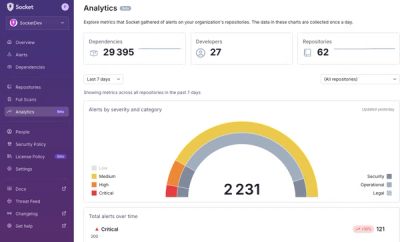
We’re excited to announce a powerful new capability in Socket: historical data and enhanced analytics.