Material-UI Material Design Dialogs
Comprehensive Material Design dialogs for the popular React framework Material-UI
Dialogs
Dialogs inform users about a task and can contain critical information, require decisions, or involve multiple tasks.
Usage
A dialog is a type of modal window that appears in front of app content to provide critical information or ask for a decision. Dialogs disable all app functionality when they appear, and remain on screen until confirmed, dismissed, or a required action has been taken.
Dialogs are purposefully interruptive, so they should be used sparingly.
When to use
Dialogs should be used for:
- Errors that block an app’s normal operation
- Critical information that requires a specific user task, decision, or acknowledgement
| Component | Priority | User action |
|---|
| Snackbar | Low priority | Optional: Snackbars disappear automatically |
| Banner | Prominent, medium priority | Optional: Banners remain until dismissed by the user, or if the state that caused the banner is resolved |
| Dialog | Highest priority | Required: Dialogs block app usage until the user takes a dialog action or exits the dialog (if available) |
Types
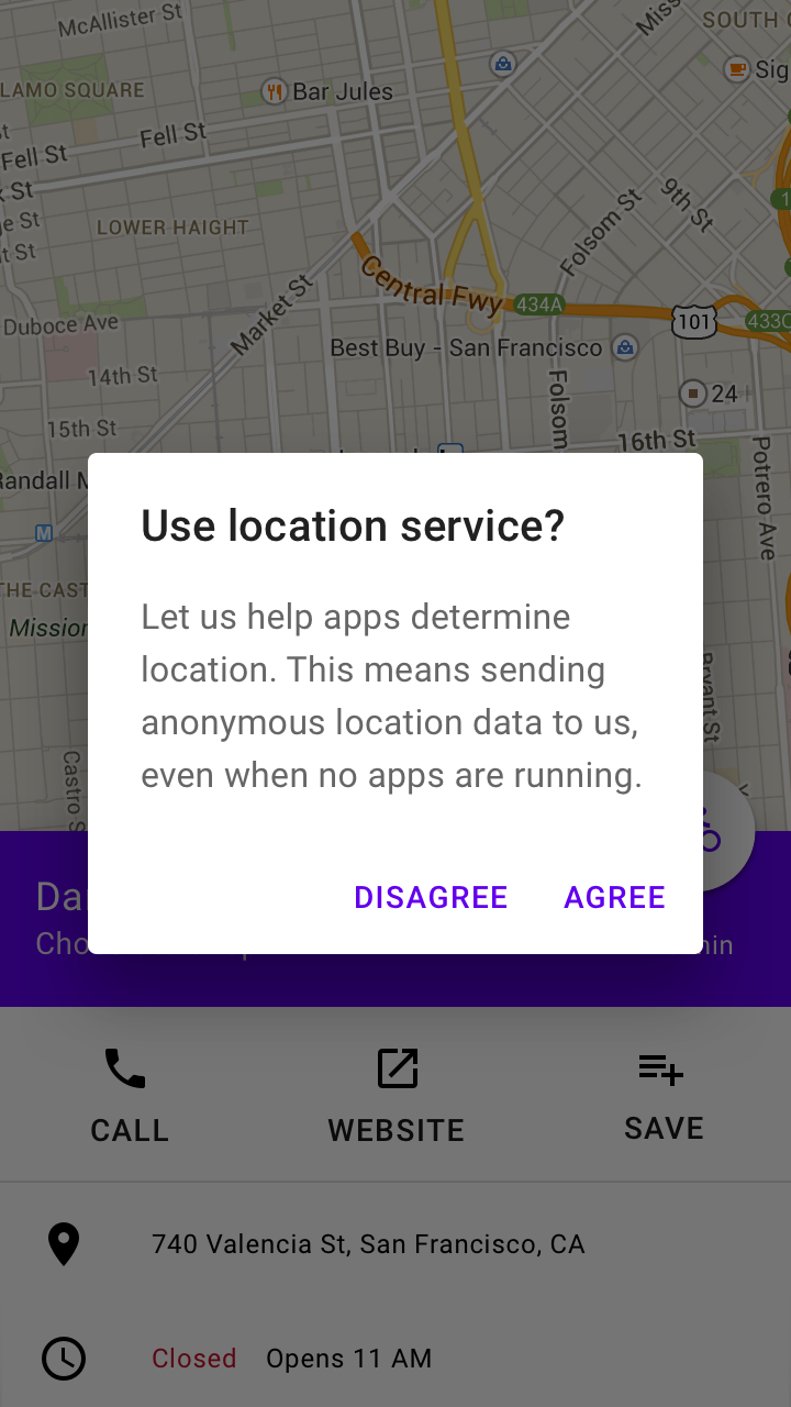
Alert dialogs interrupt users with urgent information, details, or actions.
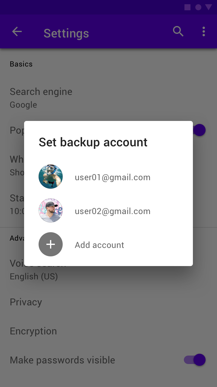
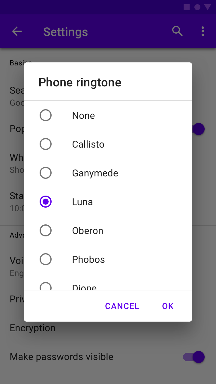
Simple dialogs display a list of items that take immediate effect when selected.
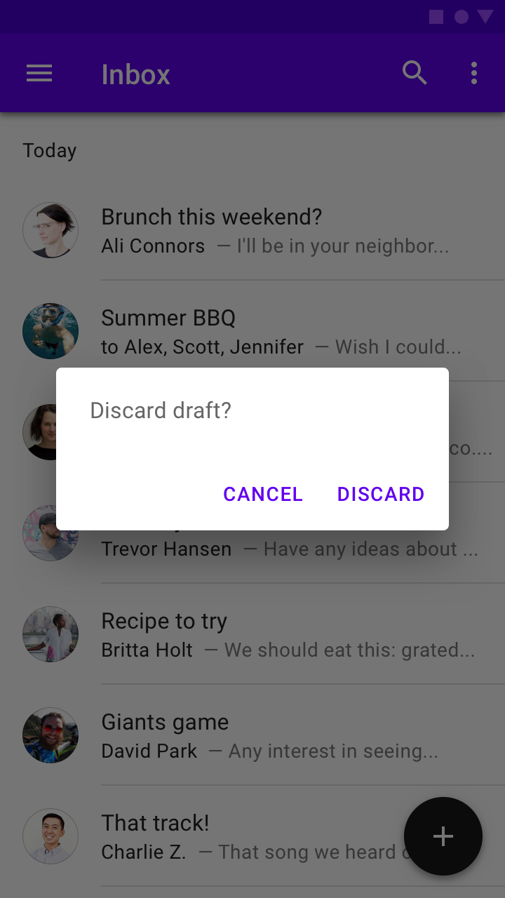
Confirmation dialogs require users to confirm a choice before the dialog is dismissed.
Title
A dialog’s purpose should be communicated by its title and button text.
Titles should:
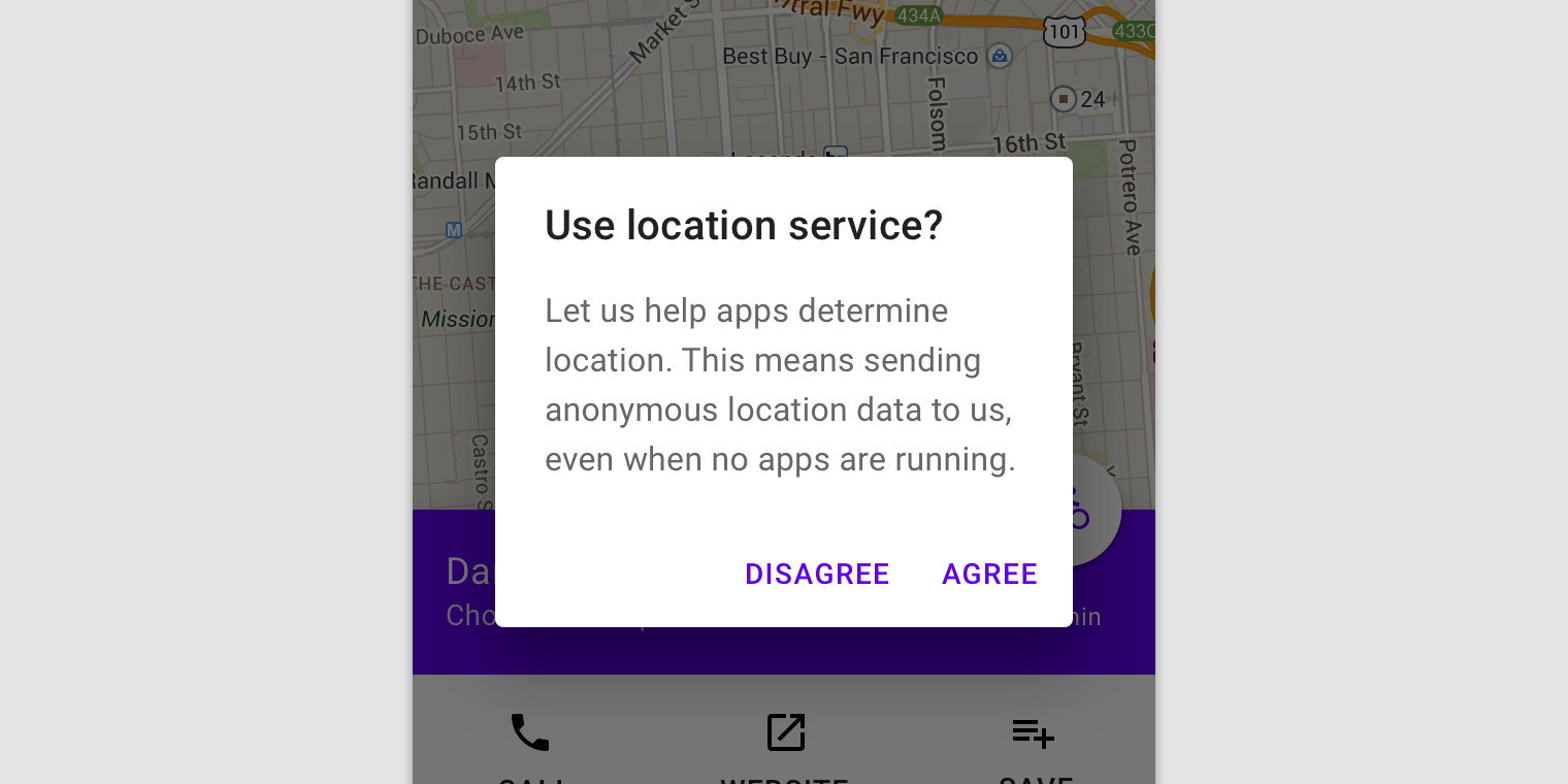
- Contain a brief, clear statement or question
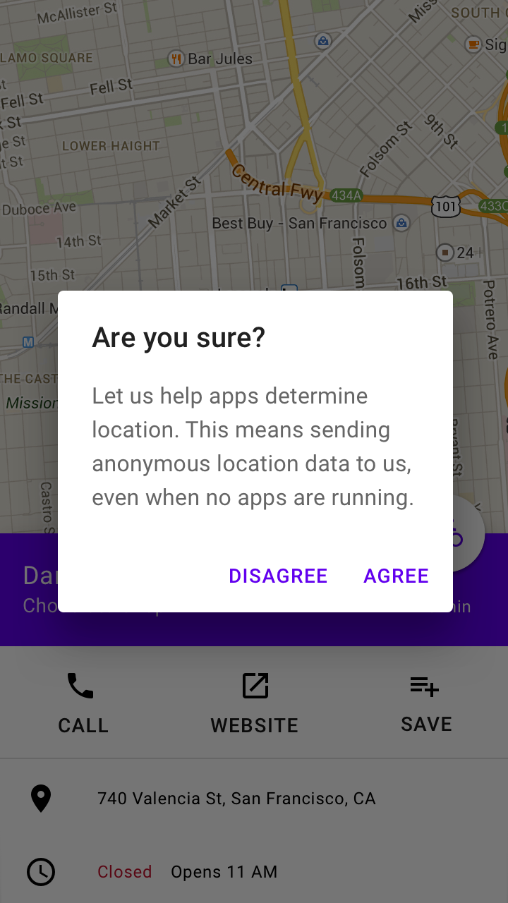
- Avoid apologies (“Sorry for the interruption”), alarm (“Warning!”), or ambiguity (“Are you sure?”)
Do
This dialog title poses a specific question, concisely explains what’s involved in the request, and provides clear actions.
Don’t
Don’t use dialog titles that pose an ambiguous question.
Buttons
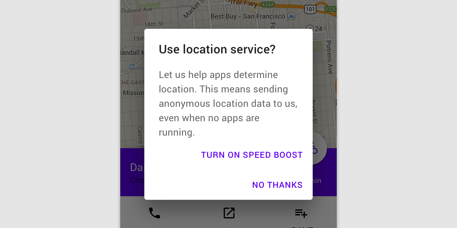
Side-by-side buttons (Recommended)
Side-by-side buttons display two text buttons next to one another.
These side-by-side buttons display buttons provide the actions of “Disagree” and “Agree” as options.
Stacked full-width buttons
Stacked buttons accommodate longer button text. Confirming actions appear above dismissive actions.


