Product
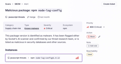
Introducing the Alert Details Page: A Better Way to Explore Alerts
Socket's new Alert Details page is designed to surface more context, with a clearer layout, reachability dependency chains, and structured review.
modular-scale-css
Advanced tools
Easily customizable modular scale css custom properties (variables) in pure css.
Easily customizable modular scale css custom properties (variables) in pure CSS.
The easiest way is to grab it via npm or yarn and move/bundle the file in your build step.
npm i modular-scale-css --save
The default ratio is the golden-ration --golden and the default bases are 1em for the --ms/--msa values and 2.25em for the --msb values.
To change which ratio to use, or update the base simply add the following in your css:
--ms-ratio: var(--major-third);
--ms-base: 10px;
If you are using a double-stranded modular scale simple add an a and a b base.
--ms-ratio: var(--major-third);
--ms-base-a: 10px;
--ms-base-b: 20px;
Now you can use your scale anywhere in your css:
/* single scale */
p{
  font-size: var(--ms0);
  width: var(--ms10);
}
/* double stranded scale */
div{
  font-size: var(--ms_a0); /*use _ to separate the a and b scale*/
  width: var(--msb_10);
  margin: width: var(--ms_b-1); /*minus means a step down*/
}
If you want to use a custom ratio, you can simply add it as the --ms-ratio value.
--ms-ratio: calc(3/5);
A modular scale is a measurement system that provides a set of numbers which you can use for your font-sizes, element sizes or negative space. Since it is based on an underlying ration, all numbers in your system are multiples of this ratio and your base, which makes them naturally fit together thus creating a more harmonies layout.
A good start is your body text type size. You could also use other font metrics like x-height or an important fixed-width like a sidebar or a major element.
This package includes many ratios from the visual arts, mathematics and music. If you have no reason to favor any of the provided, you can just try some ratios and see which values work best for your design.
To learn more about modular scales, visit modularscale.com.
Below you find a list of the included ratios. The first column is the CSS custom property used to specify the ratio in your css. See usage.
| CSS custom property (variable) | Ratio | Value |
|---|---|---|
| --minor-second | 15:16 | 1.067 |
| --major-second | 8:9 | 1.125 |
| --minor-third | 5:6 | 1.2 |
| --major-third | 4:5 | 1.25 |
| --fourth | 3:4 | 1.333 |
| --augmented-fourth | 1:√2 | 1.414 |
| --fifth | 2:3 | 1.5 |
| --minor-sixth | 5:8 | 1.6 |
| --phi | 1:1.618 | 1.618 |
| --golden | 1:1.618 | 1.618 |
| --major-sixth | 3:5 | 1.667 |
| --minor-seventh | 9:16 | 1.778 |
| --major-seventh | 8:15 | 1.875 |
| --octave | 1:2 | 2 |
| --major-tenth | 2:5 | 2.5 |
| --major-eleventh | 3:8 | 2.667 |
| --major-twelfth | 1:3 | 3 |
| --double-octave | 1:4 | 4 |
FAQs
Easily customizable modular scale css custom properties (variables) in pure css.
The npm package modular-scale-css receives a total of 20 weekly downloads. As such, modular-scale-css popularity was classified as not popular.
We found that modular-scale-css demonstrated a not healthy version release cadence and project activity because the last version was released a year ago. It has 1 open source maintainer collaborating on the project.
Did you know?

Socket for GitHub automatically highlights issues in each pull request and monitors the health of all your open source dependencies. Discover the contents of your packages and block harmful activity before you install or update your dependencies.

Product
Socket's new Alert Details page is designed to surface more context, with a clearer layout, reachability dependency chains, and structured review.

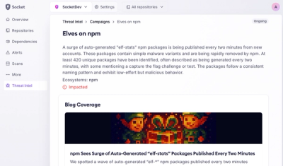
Product
Campaign-level threat intelligence in Socket now shows when active supply chain attacks affect your repositories and packages.

Research
Malicious PyPI package sympy-dev targets SymPy users, a Python symbolic math library with 85 million monthly downloads.