MOTA CSS
Auto generate css atomic

Install
npm install mota-css
or
yarn add mota-css
Demo
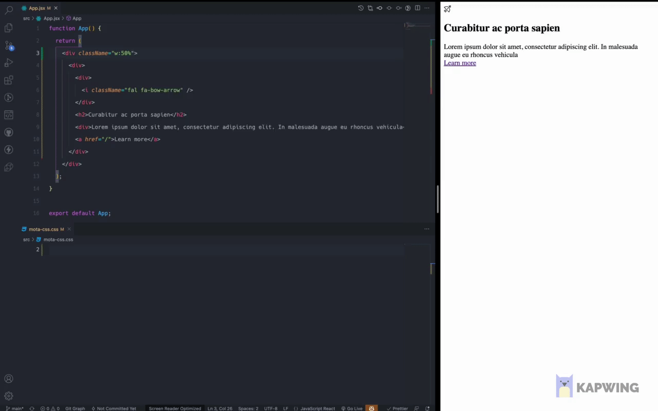
https://mota-css-example.netlify.app/
Repo
https://github.com/wiloke1/mota-css-example
mota-css.config.js
const { pfs, rtl, stylesMap } = require('mota-css');
const { validator } = require('mota-css/dist/validator');
module.exports = {
input: ["./src/**/*.jsx", "./src/**/*.js"],
output: "./src/mota-css.css",
defaultCss: `
body {
font-size: 14px;
}
`,
validator,
cache: true,
plugins: [pixelToRem(62.5), rtl(), pfs(), testplugin2()],
customValue(value) {
console.log(value);
return value;
},
breakpoints: {
sm: "768px",
md: "992px",
lg: "1200px",
},
custom: {
"color-primary": "var(--color-primary)",
"color-secondary": "var(--color-secondary)",
"color-tertiary": "var(--color-tertiary)",
"color-quaternary": "var(--color-quaternary)",
},
};
function pixelToRem(rootFontSize) {
return ({ styles, addStyles }) => {
const newStyles = stylesMap(styles, (selector, css) => {
const [property, value] = css;
if (/[\d.]*px/g.test(value)) {
const newValue = value.replace(/[\d.]*px/g, (val) => {
const num = Number(val.replace("px", ""));
return `${(num * 62.5) / rootFontSize / 10}rem`;
});
const newCss = [property, newValue];
return {
[selector]: newCss,
};
}
return {
[selector]: css,
};
});
addStyles(newStyles);
};
}
function testplugin2() {
return ({ addBase }) => {
addBase(`.testttttttttt { color: red }`);
};
}
CLI (file package.json)
{
  ...
  "scripts": {
    ...
    "mota-css": "mota-css --port 4321",
    "mota-css:watch": "yarn mota-css --watch"
  },
  ...
}
Compile
npm run mota-css:watch or yarn mota-css:watch
Intelligent Mota CSS tooling for VS Code
https://marketplace.visualstudio.com/items?itemName=wiloke.mota-css-intellisense
Syntax
<property>:<value>|<pseudo>|<pseudo><important -> "!">...@<media>

Eg:

Class Name               CSS
-----------------------------------------------------------------------------------------
c:red                 -> .c\:red { color: red }
bgc:blue!             -> .bgc\:blue\! { background-color: blue !important }
bd:1px_solid_yellow   -> .bd\:1px_solid_yellow { border: 1px solid yellow }
p:30px@md             -> @media (min-width:992px) { .p\:30px\@md { padding: 30px }
m:20px@+300px         -> @media (max-width:300px) { .m\:20px\@\+300px { margin: 20px } }
fz:20px|h             -> .fz\:20px\|h:hover { font-size: 20px }
cnt:(After_cnt)||af   -> .cnt\:\(After_cnt\)\|\|af::after { content: 'After ctn' }
cnt:(Before_cnt)|be   -> .cnt\:\(Before_cnt\)\|be:before { content: 'Before ctn' }
cnt:(Hover)|h||be     -> .cnt\:\(Hover\)\|be:hover:before { content: 'Hover' }
trf:scale(2)          -> .trf/:scale\(2\) { transform: scale(2) }
m:calc(20px_+_10px)   -> .m\:calc\(20px_+_10px\) { margin: calc(20px + 10px) }
Html
<div class="c:red c:blue|h bgc:color-primary fz:20px ml:10px w:30%@md p:30px@md m:20px@+300px pos:relative!"></div>
Generated css code
.c\:red { color: red }
.c\:blue\|h:hover { color: blue }
.bgc\:color-primary { background-color: var(--color-primary) }
.fz\:20px { font-size: 20px }
.ml\:10px { margin-left: 10px }
[dir="rtl"] .ml\:10px { margin-right: 10px }
.pos\:relative\! { position: relative !important }
@media (max-width:300px) {
.m\:20px\@\+300px { margin: 20px } }
@media (min-width:992px) {
.p\:30px\@md { padding: 30px }
.w\:30\%\@md { width: 30% } }
Use in js or ts
import { atomic } from 'mota-css';
import { validator } from 'mota-css/dist/validator';
atomic.setConfig({
breakpoints: {
sm: '768px',
md: '992px',
lg: '1200px',
},
cache: true,
parentSelector: '',
exclude: [],
custom: {
'color-primary': 'var(--color-primary)',
'color-secondary': 'var(--color-secondary)'
},
validator,
});
atomic.plugins([rtl(), pfs()]);
atomic.customValue(value => {
console.log(value);
return value;
});
atomic
.find(`<div class="c:red c:blue|h fz:20px w:30%@md p:30px@md m:20px@+300px pos:relative!"></div>`);
.find(`const className = "bgc:blue";`);
const id = atomic.on('success', css => {
console.log(atomic.getCss());
});
atomic.on('valid', diagnostic => {
console.log(diagnostic);
});
atomic.on('invalid', diagnostic => {
console.log(diagnostic);
});


