Multiselectdropdown
Description
A React component which provides multi select functionality with features like selection checkbox, Change the button text, color, background and disable button, single select dropdown and grouping features.

Getting Started
Features
- Dropdown with grouping & multiple selection option
- Bind to custom data source
- Select/De-select all items
- Select/de-select a single items
- Group select/unselect
- You can Change the button text color
- You can Change the button background color
- You can Change the Checkbox background color on select
- You can Add Texts in the buttons
- You can Disable both the buttons
Installation
The easiest way to use react-select is to install it from npm and build it into your app with Webpack.
npm i multiselectpackage
Then use it in your app
Usage
import { MultiSelectDropdown } from 'multiselectpackage';
function App() {
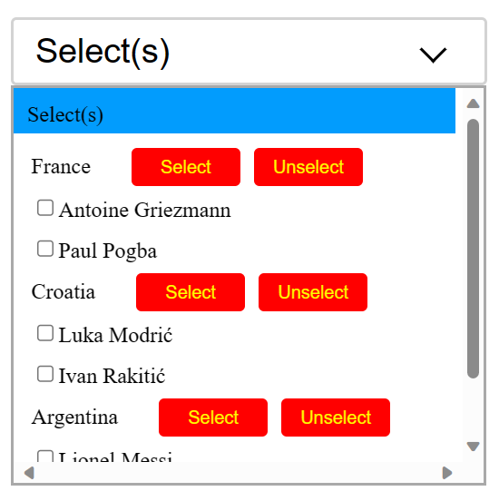
const options = {
"France":[{"name": " Antoine Griezmann",selected: false,id: 454},
{"name": "Paul Pogba",selected: false,id: 254}],
"Croatia":[{"name": "Luka Modrić",selected: false,id: 354},
{"name": "Ivan Rakitić",selected: false, id: 442}],
"Argentina":[{"name": "Lionel Messi",selected: false, id: 404},
{"name":"Elena Martínez",selected: false,id: 402}]
};
const backgroundColor ="red";
const label ="Select";
const label2 ="Unselect";
const color ="green";
const disable =true;
const checkboxcolor ="yellow";
const checkboxcolor = "yellow"
const handleSelect = (groupIndex, options) => {
console.log(Select clicked for Group ${groupIndex + 1});
console.log(${JSON.stringify(options)});
};
const handleClear = (groupIndex, options) => {
console.log(Clear clicked for Group ${groupIndex + 1});
console.log(${JSON.stringify(options)});
};
const handleOptionclear = (groupIndex, options) => {
console.log(Unselected a member for group ${groupIndex + 1});
console.log(${JSON.stringify(options)});
};
return(
<>
<MultiSelectDropdown
options={options}
onSelect={handleSelect}
onClear={handleClear}
onSingleClear={handleOptionclear}
backgroundColor={backgroundColor}
label={label}
label2={label2}
color={color}
checkboxcolor={checkboxcolor}
disable={disable}
/>
</>
);
}
Props 💬
options | object | {} | Dropdown options |
onSelect | function | func | Callback function will invoked on onSelect event. Params are groupIndex and options. |
onClear | function | func | Callback function will invoked on clear event. Params are groupIndex and options |
onSingleClear | boolean | true | It sets false and behave like a normal dropdown(unselect single dropdown).Params are groupIndex and options. |
groupIndex | Index | Number | It gives selected group or selected dropdown Index. |
options(in callback Functions) | {} | object | It will give you the entire object with selected or unselected values of dropdown. |
displayValue | string | value | Property name and selected should be in the object to display in the dropdown. Refer Basic Usage section |
backgroundColor | string | '' | backgroundColor will set the new background color of both buttons(All, clear). if you want to change the background color then pass the color in props and if you don't want to change the background color then don't use the backgroundColor field as props in component |
label | string | '' | label will set the new text of button(All). if you want to change the text then pass the text in props and if you don't want to change the text then don't use the label field as props in component |
label2 | string | '' | label2 will set the new text of button(Clear). if you want to change the text then pass the text in props and if you don't want to change the text then don't use the label2 field as props in component |
textLimit | string | '' | label and label2 have text limit of length less than 9 as it will not fit in the button if it exceeds. |
color | string | '' | color will set the new color of text of both buttons(All, clear). if you want to change the text color pass the color in props and if you don't want to change the color then don't use the color field as props in component |
checkboxcolor | string | '' | checkboxcolor will set the checkbox background color. if you want to change the checkbox background color pass the color in props and if you don't want to change the text color then don't use the checkboxcolor field as props in component |
disable | bool | '' | disable will disable both the buttons(All, Clear) if you want to disable just pass the bool value as true in props and if you don't want to disable the button then don't use the disable field as props in component |
Demo
Run locally
- Clone the repository or downlod the .zip,.tar files.
- Run npm install
- Run npm start
- Navigate to http://localhost:4000/
Library Build / NPM Package
Run npm build:lib to build the library and generate an NPM package. The build artifacts will be stored in the dist-lib/ folder.
Development
This project was generated with React CLI version ^18.2.0.
License
MIT License.


