nc-one-react-helpers
Developments of the company's front-end developers NC1
npm i nc-one-react-helpers or yarn add nc-one-react-helpers
Documentation in English:
1. Components:
1.1. DateTimePicker:
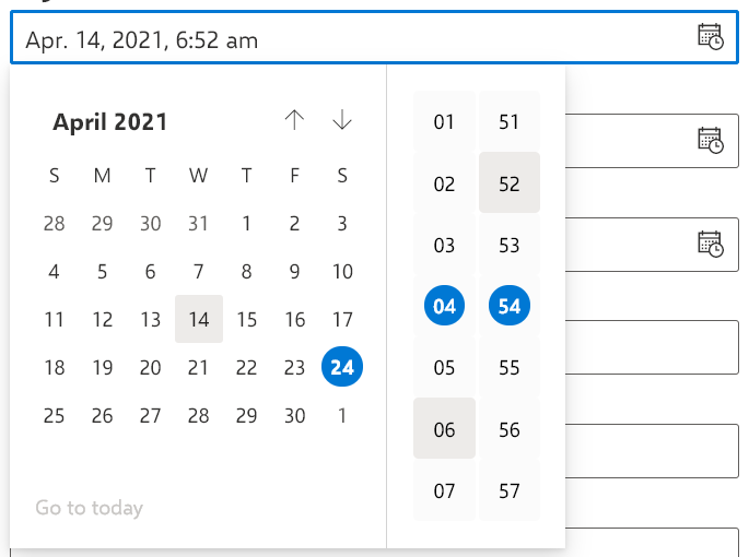
Import:
import { DateTimePicker } from 'nc-one-react-helpers'
Example of use:
<DateTimePicker
	date={new Date()}
	onDateTimeChange={(date) => console.log(date)}
	getDateTimeString={(date) => console.log(date)}
	format='MMMM DD, YYYY - hh:mm'
/>
Interface:
interface DateTimePickerProps extends ITextFieldProps {
	date?: Date
	stringDate?: string
	format?: string
	withIcon?: boolean
	onDateTimeChange?: (date?: Date) => void
	getDateTimeString?: (date?: string) => void
	CalendarStrings?: ICalendarStrings
}
| date | date | undefined | date and time to be recorded and selected automatically |
| stringDate | string | undefined | date and time which will be written and selected automatically as a string (string must be in the same format as format) |
| format | string | "MM.DD.YYYY, hh:mma" | format of the string in which the date and time will be displayed and output more here |
| withIcon | boolean | true | whether the time date icon will be shown |
| onDateTimeChange | (date?: Date) => void | undefined | Do something with the date time every time it changes |
| getDateTimeString | ICalendarStrings | initialCalendarStrings | the way the calendar lines will be displayed |
DateTimePickerProps is inherited from ITextFieldProps, so all TextField props will work fine!
2. Hooks:
2.1. useMediaQuery:
Import:.
import { useMediaQuery } from 'nc-one-react-helpers'
Example of use:
const matches = useMediaQuery('(min-width: 800px)')

if (matches) return <>Screen width greater than 800px</>
else return <>Screen width 800px or less</>
Type:
type useMediaQuery = (query: string) => boolean
Takes the string as in css @usemedia and returns true if the screen width satisfies the condition or false otherwise.
3. Various auxiliary elements:
3.1. functions:
3.1.1. UTCHoursPlus:
Import:.
import { UTCHoursPlus } from 'nc-one-react-helpers'
Example usage:
export const Time: React.FC = () => {
    const [time, setTime] = useState('')

    setTimeout(() => setTime(`${UTCHoursPlus(1)}:${new Date().getUTCMinutes()}:${new Date().getUTCSeconds()}`), 1000)

    return <>Storage time: {time} (UTC+01:00)</>
}
type:
type UTCHoursPlus = (plus: number) => number
Accepts how much to increase the current time and returns UTC clock+input parameter
3.1.2:
Import:
import { sleep } from 'nc-one-react-helpers'
Example of use:
onSubmit={async (values) => {
setProgressIndicator(true);
try {
sleep(500)
} catch (e) {
console.log(e)
} finally {
setProgressIndicator(false)
}
}}
Type:
type sleep = (ms: number) => Promise<unknown>
Wait for the entered number of milliseconds, and then execute the code below
3.2. Validations:
Import:
import { required, invalidEmail, invalidPassword, matchPassword, positiveNumber } from 'nc-one-react-helpers'
Type:
type required = (value: string, text?: string | undefined) => string | undefined

type invalidEmail = (value: string, text?: string | undefined) => string | undefined

type invalidPassword = (value: string, text?: string | undefined) => string | undefined

type matchPassword = (password: string, rePassword: string, text?: string | undefined) => string | undefined

type positiveNumber = (value: number, text?: string | undefined) => string | undefined
Example of use:
validate={({ email, position, password, repassword }) => {
    if (
        !required(email) &&
        !invalidEmail(email) &&
        !required(position) &&
        !positiveNumber(position) &&
        !required(password) &&
        !invalidPassword(password) &&
        !& required(repassword) &&
        !!invalidPassword(repassword) &&
        !!matchPassword(password, repassword)
    ) return {};

    return {
        email: required(email) || invalidEmail(email),
        position: required(position) || positiveNumber(position),
        password: required(password) || invalidPassword(password),
        repassword: required(repassword) || invalidPassword(repassword) || matchPassword(password, repassword)
    };
}}
required - Accepts value and returns error text if value is empty or undefined otherwise.invalidEmail - Accepts value and returns error text if value is not a valid email address or undefined otherwise.invalidPassword - Accepts value and returns error text if value fails validation check (too simple) or undefined otherwise.
password validation: minimum 8 characters, minimum 1 Latin letter A-Za-z, minimum 1 digit 0-9
matchPassword - Accepts password and rePassword and returns error text if passwords do not match or undefined otherwise.positiveNumber - Accepts a number and returns an error text if it is negative or undefined otherwise.
text - Optional parameter for all validations. It determines what the error message will be. If it is not specified, the default (in Polish) message will be displayed
=====================================
nc-one-react-helpers
Наработки front-end разаработчиков компании NC1
npm i nc-one-react-helpers или yarn add nc-one-react-helpers
Документация на Русском:
1. Компоненты:
1.1. DateTimePicker:
Импорт:
import { DateTimePicker } from 'nc-one-react-helpers'
Пример использования:
<DateTimePicker
	date={new Date()}
	onDateTimeChange={(date) => console.log(date)}
	getDateTimeString={(date) => console.log(date)}
	format='MMMM DD, YYYY - hh:mm'
/>
Интерфейс:
interface DateTimePickerProps extends ITextFieldProps {
	date?: Date
	stringDate?: string
	format?: string
	withIcon?: boolean
	onDateTimeChange?: (date?: Date) => void
	getDateTimeString?: (date?: string) => void
	CalendarStrings?: ICalendarStrings
}
| date | Date | undefined | Дата и время которые будут записаны и выбраны автоматически |
| stringDate | string | undefined | Дата и время которые будут записаны и выбраны автоматически в виде строки (строка должна быть в таком же формате что и format) |
| format | string | "MM.DD.YYYY, hh:mma" | Формат строки в котором будет отображаться и выводиться дата время подробнее здесь |
| withIcon | boolean | true | Будет ли показываться иконка даты времени |
| onDateTimeChange | (date?: Date) => void | undefined | Делать что-то с датой временем при каждом изменении |
| getDateTimeString | ICalendarStrings | initialCalendarStrings | То как будут отображаться строки календаря |
DateTimePickerProps наследуется от ITextFieldProps, поэтому все пропсы TextField будут прекрасно работать!
2. Хуки:
2.1. useMediaQuery:
Импорт:
import { useMediaQuery } from 'nc-one-react-helpers'
Пример использования:
const matches = useMediaQuery('(min-width: 800px)')

if (matches) return <>Ширина экрана больше 800px</>
else return <>Ширина экрана 800px или меньше</>
Тип:
type useMediaQuery = (query: string) => boolean
Принимает строку как в css @usemedia и возвращает true в случае если ширина экрана удовлетворяет условие или false в противном случае.
3. Различные вспомогательные элементы:
3.1. функции:
3.1.1. UTCHoursPlus:
Импорт:
import { UTCHoursPlus } from 'nc-one-react-helpers'
Пример использования:
export const Time: React.FC = () => {
    const [time, setTime] = useState('')

    setTimeout(() => setTime(`${UTCHoursPlus(1)}:${new Date().getUTCMinutes()}:${new Date().getUTCSeconds()}`), 1000)

    return <>Storage time: {time} (UTC+01:00)</>
}
Тип:
type UTCHoursPlus = (plus: number) => number
Принимает то насколько увеличить текущее время и возвращает часы UTC+ввёдый параметр
3.1.2. sleep:
Импорт:
import { sleep } from 'nc-one-react-helpers'
Пример использования:
onSubmit={async (values) => {
setProgressIndicator(true);
try {
sleep(500)
} catch (e) {
console.log(e)
} finally {
setProgressIndicator(false)
}
}}
Тип:
type sleep = (ms: number) => Promise<unknown>
Подождать введённое количество милисекунд, и только потом выполнить код ниже
3.2. Валидации:
Импорт:
import { required, invalidEmail, invalidPassword, matchPassword, positiveNumber } from 'nc-one-react-helpers'
Типы:
type required = (value: string, text?: string | undefined) => string | undefined

type invalidEmail = (value: string, text?: string | undefined) => string | undefined

type invalidPassword = (value: string, text?: string | undefined) => string | undefined

type matchPassword = (password: string, rePassword: string, text?: string | undefined) => string | undefined

type positiveNumber = (value: number, text?: string | undefined) => string | undefined
Пример использования:
validate={({ email, position, password, repassword }) => {
    if (
        !required(email) &&
        !invalidEmail(email) &&
        !required(position) &&
        !positiveNumber(position) &&
        !required(password) &&
        !invalidPassword(password) &&
        !required(repassword) &&
        !invalidPassword(repassword) &&
        !matchPassword(password, repassword)
    ) return {};

    return {
        email: required(email) || invalidEmail(email),
        position: required(position) || positiveNumber(position),
        password: required(password) || invalidPassword(password),
        repassword: required(repassword) || invalidPassword(repassword) || matchPassword(password, repassword)
    };
}}
required - Принимает value и возвращает текст ошибки в случае если value пустой или undefined в противном случае.invalidEmail - Принимает value и возвращает текст ошибки в случае если value не является валидным почтовым адресом (email) или undefined в противном случае.invalidPassword - Принимает value и возвращает текст ошибки в случае если value не проходит проверку валидации (слишком простой) или undefined в противном случае.
валидация пароля: минимум 8 символов, минимум 1 латинская буква A-Za-z, минимум 1 цифра 0-9
matchPassword - Принимает password и rePassword и возвращает текст ошибки в случае если пароли не совпадают или undefined в противном случае.positiveNumber - Принимает число и возвращает текст ошибки в случае если оно отрицательное или undefined в противном случае.
text - Необязательный параметр всех валидаций. Он отвечает за то каким будет сообщение об ошибке. Если он не указан будет выведено сообщение по умолчанию (на Польском)


