Research
Namastex.ai npm Packages Hit with TeamPCP-Style CanisterWorm Malware
Malicious Namastex.ai npm packages appear to replicate TeamPCP-style Canister Worm tradecraft, including exfiltration and self-propagation.
ng-drag-drop
Advanced tools
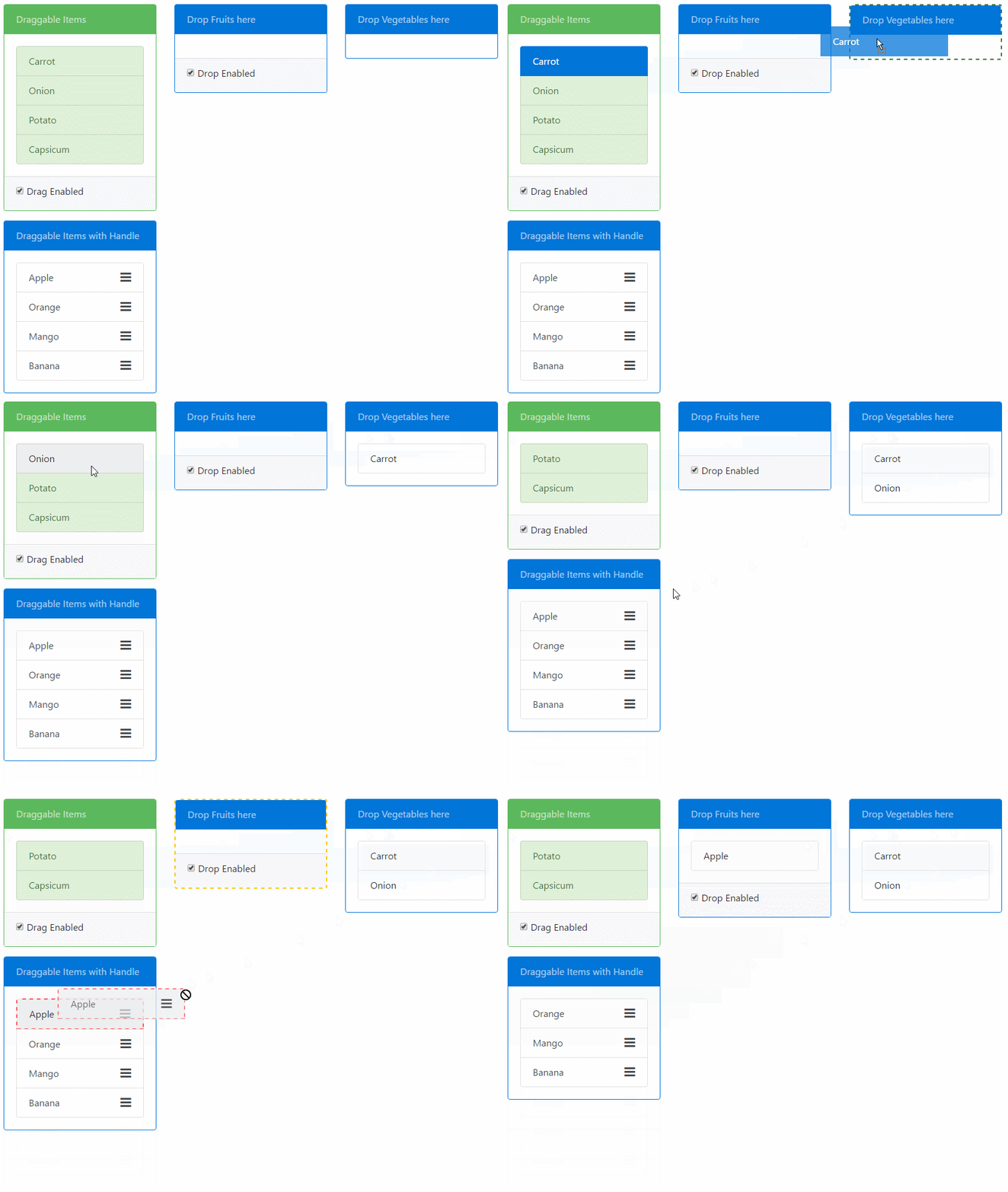
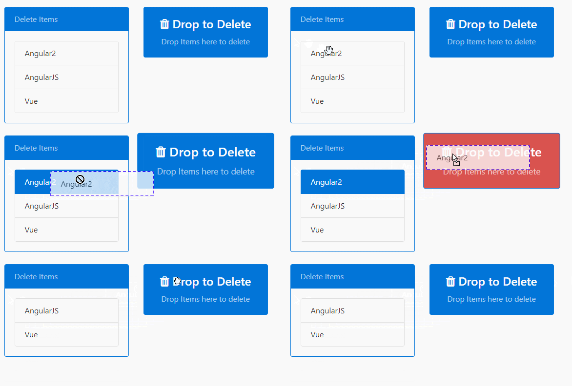
Drag & Drop for Angular, based on HTML5 with no external dependencies. Provides draggable & droppable directives. Features:
draggable to droppable.
Check out the Plunker demo.
The demo folder of the repository contains the same demo as Plunkr that uses SystemJS. To run that demo do an npm install in that folder followed by npm start to serve the demo app.
npm install ng-drag-drop --save
Import style.css into your index.html. It has a set of default styles that will be applied upon drag operations. This is totally optional and you can modify the styles as per your need. See the Adding visual cues Section.
<link rel="stylesheet" href="node_modules/ng-drag-drop/style.css">
If you use SystemJS as your module loader then you will need to update the config to load the ng-drag-drop module.
System.config({
    map: {
        'ng-drag-drop': 'node_modules/ng-drag-drop'
    },
    packages: {
        'ng-drag-drop':  { main: 'index.js',  defaultExtension: 'js' },
    }
});
NgDragDropModuleYou need to import the NgDragDropModule in the module of your app where you want to use it.
import { NgModule } from '@angular/core';
import { BrowserModule } from '@angular/platform-browser';
import { DemoComponent } from "./components/demo-component";
import { NgDragDropModule } from 'ng-drag-drop';


@NgModule({
  imports: [
      BrowserModule,
      NgDragDropModule.forRoot()
  ],
  declarations: [DemoComponent],
  bootstrap: [DemoComponent]
})
export class AppModule {}
draggable & droppable directivesPlace the draggable directive on an element that you want to be draggable. The following example makes the
List item draggable:
<ul>
  <li draggable>Coffee</li>
  <li draggable>Tea</li>
  <li draggable>Milk</li>
</ul>
Similarly use the droppable directive on an element where you want to drop draggable:
<div droppable>
  <p>Drop items here</p>
</div>
You can use the dragScope & dropScope property on draggable and droppable respectively to restrict user from dropping a draggable element into a droppable.
The Scope properties can be string, an Array of string (to indicate multiple scope) or a function. The scopes must match in both to indicate compatible drag-drop zones.
In the following example, only the draggable with the drink dropScope can be dropped on the first droppable and both drink and meal can be dropped in the second one.
<ul>
  <li draggable [dragScope]="'drink'">Coffee</li>
  <li draggable [dragScope]="'drink'">Tea</li>
  <li draggable [dragScope]="'meal'">Biryani</li>
  <li draggable [dragScope]="'meal'">Kebab</li>
  ...
</ul>
<div droppable [dropScope]="'drink'" [dragOverClass]="'drag-target-border'">
  <p>Only Drinks can be dropped in the above container</p>
</div>

<div droppable [dropScope]="['drink', 'meal']" [dragOverClass]="'drag-target-border'">
  <p>Both Meal and Drinks can be dropped in the above container</p>
</div>
The DropScope of the droppable can be a function whose return value will determine if drop is allowed.
This can be useful to implement complex logic that is otherwise not possible with string or array of string.
<div droppable [dropScope]="dropAllowed" [dragOverClass]="'drag-target-border'">
  <p>Only those items are droppable for which the `isDropAllowed()` function returns true</p>
</div>
Here is how the function is defined in the component:
export class MyComponent {
  val = 500;
  isDropAllowed = (dragData: any) => {
    return dragData > this.val;
  }
}
Notice how the function is defined as an Arrow Function. You need to do this so the
lexical scope of this is preserved. You also get the dragData in the parameter so you can compare it with whatever you want.
If DropScope is a function, it can also return an Observable, which needs to later resolve to true or false. This can help in cases when
you need to check asynchronously (eg: via http) whether the drop is allowed.
export class MyComponent {
  val = 500;
  isDropAllowed = (dragData: any) => {
    // Resolves to true or false after 1 second
    return Observable.of(dragData > this.val).delay(1000);
  }
}
You can transfer data from the draggable to the droppable via the dragData property on the draggable directive.
The data will be received in the (onDrop) event of the droppable:
import {Component} from '@angular/core';

@Component({
    selector: 'app',
    template: `
<h3>Transfer Data via Drag Drop</h3>
<div class="row">
    <div class="col-sm-3">
        <ul class="list-group">
            <li draggable *ngFor="let item of items" [dragData]="item" class="list-group-item">{{item.name}}</li>
        </ul>
    </div>

    <div class="col-sm-3">
    <div class="panel panel-default" droppable (onDrop)="onItemDrop($event)">
        <div class="panel-heading">Drop Items here</div>
            <div class="panel-body">
                <li *ngFor="let item of droppedItems" class="list-group-item">{{item.name}}</li>
            </div>
        </div>
    </div>
</div>
`
})
export class AppComponent {
    items = [
            {name: "Apple", type: "fruit"},
            {name: "Carrot", type: "vegetable"},
            {name: "Orange", type: "fruit"}];

    onItemDrop(e: any) {
        // Get the dropped data here
        this.droppedItems.push(e.dragData);
    }
    constructor() { }
}
Drag Handle can be defined for a draggable item which will restrict drag of the element unless the item is dragged from the specified element.
The handle should be a valid selector string. Example:
<li draggable [dragHandle]="'.drag-handle'">
   Not Draggable by list item but by the handle only.
   <div class="pull-right"><i class="drag-handle fa fa-bars fa-lg" aria-hidden="true"></i></div>
</li>
By default when an element is dragged, a translucent image is generated from the drag target. This image is generated automatically and varies with browser. A custom image can be used if desired. Pass the url of the image to [dragImage] on the draggable directive.
<li draggable [dragImage] = "'../../images/drag-helper.png'" >
   Not Draggable by list item but by the handle only.
   <div class="pull-right"><i class="drag-handle fa fa-bars fa-lg" aria-hidden="true"></i></div>
</li>
Compatibility: This only works on Chrome & Firefox. Not supported on Edge.

Both the draggable & droppable directives take a bunch of inputs that let you apply class on various events. You can find the list below. Another thing you can do is clone the style.css that comes with this package and customize it as per your requirement.
Draggable Directive
Droppable Directive
Here is how a custom class is applied to a draggable element:
<div draggable [dragHandleClass]="'my-draggable'">
  <p>Drop items here</p>
</div>
This library uses Native Html5 drag & drop API to accomplish what it does. Because of this, certain aspects are not customizable and some UI behaviour is browser specific.
So if you were to see the demo under Edge or Chrome/Firefox you'll see that these browsers show a different behaviour when an Item is being dragged. Simlarly Edge does not let you set a custom dragImage while others do. Another major issues is that we can't control the opacity of the ghost element of item being dragged.
To overcome these issues we'll need to implement our own drag drop functionality instead of relying on the Native Html API which at this point in time, is beyond the scope of this component. Libraries like Dragula, JQuery Draggable, Interact.js to name a few, can provide you with alternatives.
HTML5 Drag drop is not touch supported but you can use the DragDropTouch Polyfill.
To start the dev flow on your system, follow these steps:
npm install on the root of this repo.npm install in the demo folder. This is where the demo app resides. Sort of a test & play yard for ng-drag-drop package.npm link on the root of the repo followed by npm link ng-drag-drop in demo folder. You can read more about npm link here.npm run dev at the root. This will open up the demo app in browser.Note: The steps are a bit involved at this time and will be simplified to an npm script in later releases.
| Name | Type | Default Value | Description |
|---|---|---|---|
dragData | any | null | The data that will be avaliable to the droppable directive on its onDrop() event. |
dragScope | `string | Array` | 'default' |
dragClass (previously dragOverClass) | string | 'drag-border' | CSS class applied on the draggable that is applied when the item is being dragged. |
dragTransitClass | string | 'drag-transit' | CSS class applied on the drag helper translucent element clone. |
dragHandleClass | string | 'drag-handle' | The CSS class applied to a draggable element. If a dragHandle is defined then its applied to that handle element only. By default it is used to change the mouse over pointer. |
draghandle | string | null | The selector that defines the drag Handle. If defined drag will only be allowed if dragged from the selector element. |
dragImage | string | null | The url to image that will be used as custom drag image when the draggable is being dragged. |
dragEnabled | boolean | true | Defines if drag is enabled. true by default. |
| Name | Parameters | Description |
|---|---|---|
onDragStart | e: DOM event | Event fired when Drag is started |
onDrag | e: DOM event | Event fired while the element is being dragged |
onDragEnd | e: DOM event | Event fired when dragged ends |
For more information on Drag DOM Events: Drag Event
| Name | Type | Default Value | Description |
|---|---|---|---|
dropScope | `string | Array` | 'default' |
dragOverClass | string | 'drag-over-border' | CSS class applied on the droppable element when the item is being dragged over valid drop target. |
dragHintClass | string | 'drag-hint-border' | CSS class applied on this droppable when a compatible draggable item is being dragged. This can be used to visually show allowed drop zones. |
dropEnabled | boolean | true | Defines if drop is enabled. true by default. |
| Name | Parameters | Description |
|---|---|---|
onDragEnter | e: DOM event | Event fired when Drag dragged element enters a valid drop target. |
onDragOver | e: DOM event | Event fired when an element is being dragged over a valid drop target. |
onDragLeave | e: DOM event | Event fired when a dragged element leaves a valid drop target. |
onDrop | e: DropEvent | Event fired when an element is dropped on a valid drop target. |
MIT
FAQs
Drag & Drop for Angular - based on HTML5 with no external dependencies.
The npm package ng-drag-drop receives a total of 4,914 weekly downloads. As such, ng-drag-drop popularity was classified as popular.
We found that ng-drag-drop demonstrated a not healthy version release cadence and project activity because the last version was released a year ago. It has 1 open source maintainer collaborating on the project.
Did you know?

Socket for GitHub automatically highlights issues in each pull request and monitors the health of all your open source dependencies. Discover the contents of your packages and block harmful activity before you install or update your dependencies.

Research
Malicious Namastex.ai npm packages appear to replicate TeamPCP-style Canister Worm tradecraft, including exfiltration and self-propagation.

Product
Explore exportable charts for vulnerabilities, dependencies, and usage with Reports, Socket’s new extensible reporting framework.

Product
Socket for Jira lets teams turn alerts into Jira tickets with manual creation, automated ticketing rules, and two-way sync.