Research
/Security News
DuckDB npm Account Compromised in Continuing Supply Chain Attack
Ongoing npm supply chain attack spreads to DuckDB: multiple packages compromised with the same wallet-drainer malware.
ng-hub-ui-stepper
Advanced tools
A flexible and customizable stepper component for Angular applications
A flexible and customizable stepper component for Angular applications. Perfect for multi-step forms, wizards, and guided user experiences.
Install the package using npm:
npm install ng-hub-ui-stepper
StepperModule in your Angular module:import { StepperModule } from 'ng-hub-ui-stepper';
@NgModule({
imports: [StepperModule],
// ...
})
export class YourModule { }
<hub-stepper>
  <hub-step title="Step 1">
	<h2>Welcome to Step 1</h2>
	<p>This is the content of step 1.</p>
  </hub-step>
  <hub-step title="Step 2">
	<h2>Moving on to Step 2</h2>
	<p>Here's what you need to do in step 2.</p>
  </hub-step>
  <hub-step title="Step 3">
	<h2>Final Step</h2>
	<p>Congratulations! You've reached the last step.</p>
  </hub-step>
</hub-stepper>
| Input | Type | Default | Description |
|---|---|---|---|
backLabel | string | 'Back' | Label for the back button |
continueLabel | string | 'Continue' | Label for the continue button |
submitLabel | string | 'Submit' | Label for the submit button |
| Output | Type | Description |
|---|---|---|
completed | EventEmitter | Emitted when the stepper is completed |
previousStep | EventEmitter | Emitted when moving to the previous step |
nextStep | EventEmitter | Emitted when moving to the next step |
| Input | Type | Default | Description |
|---|---|---|---|
index | number | required | The index of this step |
title | string | optional | The title of this step |
disabled | boolean | false | Whether this step is disabled |
The stepper component can be customized using CSS variables and by providing custom templates for navigation and buttons.
:root {
  --stepper-direction: column;
  --stepper-primary-color: #009ef7;
  --stepper-secondary-color: #b5b5c3;
  --stepper-background-color: #f3f6f9;
  --stepper-text-color: #181c32;
  --stepper-disabled-color: #e1e3ea;
}
You can also customize the stepper appearance programmatically using the StepperThemeService:
import { StepperThemeService } from '@hub-ui/stepper';

@Component({...})
export class YourComponent implements OnInit {
  constructor(private themeService: StepperThemeService) {}

  ngOnInit() {
    this.themeService.setTheme({
      'primary-color': '#ff4081',
      'background-color': '#f0f0f0'
    });
  }
}
This allows you to change the theme dynamically based on user preferences or other conditions in your application.
You can customize the navigation buttons using the provided directives:
<hub-stepper>
  <!-- Step content -->
  <button previousButton>Custom Back</button>
  <button nextButton>Custom Next</button>
  <button submitButton>Custom Submit</button>
</hub-stepper>
These directives (previousButton, nextButton, and submitButton) automatically handle the navigation logic and apply default styling classes.
<hub-stepper [stepperNavTpt]="customNavTemplate">
  <!-- step content -->
</hub-stepper>

<ng-template #customNavTemplate let-steps="steps" let-currentIndex="currentIndex">
  <!-- Your custom navigation markup -->
</ng-template>
<hub-stepper>
  <hub-step title="Personal Info">
	<!-- Personal info form fields -->
  </hub-step>
  <hub-step title="Address">
	<!-- Address form fields -->
  </hub-step>
  <hub-step title="Confirmation">
	<!-- Confirmation step -->
  </hub-step>
</hub-stepper>
<hub-stepper [stepperNavTpt]="customNav">
  <!-- Steps content -->
</hub-stepper>

<ng-template #customNav let-steps="steps" let-currentIndex="currentIndex">
  <ul class="custom-nav">
	<li *ngFor="let step of steps; let i = index"
		[class.active]="i === currentIndex">
	  {{ step.title }}
	</li>
  </ul>
</ng-template>
We welcome contributions to ng-hub-ui-stepper! Here's how you can help:
git checkout -b feature/AmazingFeaturegit commit -m 'Add some AmazingFeature'git push origin feature/AmazingFeaturePlease make sure to update tests as appropriate and adhere to the Angular Style Guide.
If you find this project helpful and would like to support its development, you can buy me a coffee:
Your support is greatly appreciated and helps maintain and improve this project!
This project was inspired by the need for a flexible, customizable, and accessible stepper component in the Angular ecosystem. We drew inspiration from:
My goal was to create a component that combined the best features of existing solutions while adding my own improvements and focusing on customization and accessibility.
This project is licensed under the MIT License - see the LICENSE file for details.
Made with ❤️ by [Carlos Morcillo Fernández]
FAQs
A flexible and customizable stepper component for Angular applications
We found that ng-hub-ui-stepper demonstrated a healthy version release cadence and project activity because the last version was released less than a year ago. It has 0 open source maintainers collaborating on the project.
Did you know?

Socket for GitHub automatically highlights issues in each pull request and monitors the health of all your open source dependencies. Discover the contents of your packages and block harmful activity before you install or update your dependencies.

Research
/Security News
Ongoing npm supply chain attack spreads to DuckDB: multiple packages compromised with the same wallet-drainer malware.

Security News
The MCP Steering Committee has launched the official MCP Registry in preview, a central hub for discovering and publishing MCP servers.

Product
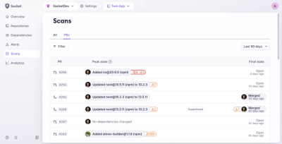
Socket’s new Pull Request Stories give security teams clear visibility into dependency risks and outcomes across scanned pull requests.