Research
Malicious NuGet Packages Typosquat Nethereum to Exfiltrate Wallet Keys
The Socket Threat Research Team uncovered malicious NuGet packages typosquatting the popular Nethereum project to steal wallet keys.
ng-simple-slideshow
Advanced tools
_ _ ___ _ _ ___ _ _ _ _
| \| |__ _/ __(_)_ __ _ __| |___/ __| (_)__| |___ __| |_ _____ __ __
| .` / _` \__ \ | ' \| '_ \ / -_)__ \ | / _` / -_|_-< ' \/ _ \ V V /
|_|\_\__, |___/_|_|_|_| .__/_\___|___/_|_\__,_\___/__/_||_\___/\_/\_/
|___/ |_|
A simple slideshow for Angular 4+.
Click here the check out the demo. Click here the see the slideshow in production on a StoragePug client site, which is what I originally made this slideshow package for.
Easy, just npm install:
npm i -S ng-simple-slideshow
Next, import the module:
import {SlideshowModule} from 'ng-simple-slideshow';

@NgModule({
  imports: [
    SlideshowModule,
    ...
  ],
  declarations: [
    ...
  ],
  exports: [
    ...
  ]
})
...
The simplest use case is the following:
<slideshow [imageUrls]="imageUrlArray"></slideshow>
A more complex example of how I use this in one of my own projects (full list of options in next section):
<slideshow [height]="height"
           [minHeight]="'525px'"
           [autoPlay]="true"
           [showArrows]="false"
           [imageUrls]="imageSources"
           [lazyLoad]="imageSources?.length > 1"
           [autoPlayWaitForLazyLoad]="true">
</slideshow>
The imageUrls input can be an array of strings, however in order to enable slides to have links, captions, or custom click functions, you must use an object of type IImage instead of a string. For example usage, see here.
| Option | Required | Default | Type | Description |
|---|---|---|---|---|
| imageUrls | yes | [] | string[] or IImage[] | array of image urls or IImage |
| height | no | '100%' | string | CSS height of slideshow |
| minHeight | no | string | CSS min-height of slideshow | |
| arrowSize | no | '30px' | string | length of arrow lines |
| showArrows | no | true | boolean | show or hide the arrows |
| disableSwiping | no | false | boolean | turn swipe detection on or off |
| autoPlay | no | false | boolean | turn autoPlay on or off |
| autoPlayInterval | no | 3333 | number | time in ms between autoPlay slides |
| stopAutoPlayOnSlide | no | true | boolean | stop autoPlay if slideshow is interacted with |
| autoPlayWaitForLazyLoad | no | false | boolean | autoplay to waits for images to lazy load before changing slides |
| backgroundSize | no | 'cover' | string | overwrite background-size property |
| backgroundPosition | no | 'center center' | string | overwrite background-position property |
| backgroundRepeat | no | 'no-repeat' | string | overwrite background-repeat property |
| showDots | no | false | boolean | show clickable dots at the bottom |
| dotColor | no | '#FFF' | string | color of clickable dots at the bottom |
| showCaptions | no | true | boolean | show or hide captions |
| captionColor | no | '#FFF' | string | color of caption text |
| captionBackground | no | 'rgba(0, 0, 0, .35)' | string | color of caption background |
| lazyLoad | no | false | boolean | turn on to lazy load images instead of preload |
| hideOnNoSlides | no | false | boolean | set the slideshow container display to none if imageUrls is empty, null, or undefined |
| fullscreen | no | false | boolean | activate full screen for the slideshow on true, go back to normal view on false |
| Event | Description |
|---|---|
| onSlideLeft | when the left arrow is clicked |
| onSlideRight | when the right arrow is clicked |
| onSwipeLeft | when a swipe left occurs |
| onSwipeRight | when a swipe right occurs |
| onFullscreenExit | when fullscreen exits |
| onIndexChanged | when slide index changes |
Note: all events emit the index number of the new slide
Take control of the slideshow if you want! Simply create a reference to your slideshow like so:
<slideshow #slideshow [imageUrls]="imageUrlArray"></slideshow>
and in your component.ts reference it as a ViewChild:
@ViewChild('slideshow') slideshow: any;
Now you can access the public members such as the goToSlide and onSlide:
this.slideshow.goToSlide(3); // go to slide index 3 (i.e. imageUrls[3])
this.slideshow.onSlide(1); // next slide
this.slideshow.onSlide(-1); // previous slide
[1.2.9] - 2019-03-21
FAQs
A simple, responsive slideshow for Angular 4+.
The npm package ng-simple-slideshow receives a total of 1,532 weekly downloads. As such, ng-simple-slideshow popularity was classified as popular.
We found that ng-simple-slideshow demonstrated a not healthy version release cadence and project activity because the last version was released a year ago. It has 1 open source maintainer collaborating on the project.
Did you know?

Socket for GitHub automatically highlights issues in each pull request and monitors the health of all your open source dependencies. Discover the contents of your packages and block harmful activity before you install or update your dependencies.

Research
The Socket Threat Research Team uncovered malicious NuGet packages typosquatting the popular Nethereum project to steal wallet keys.

Product
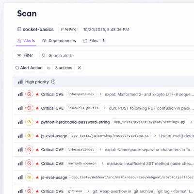
A single platform for static analysis, secrets detection, container scanning, and CVE checks—built on trusted open source tools, ready to run out of the box.

Product
Socket is launching experimental protection for the Hugging Face ecosystem, scanning for malware and malicious payload injections inside model files to prevent silent AI supply chain attacks.