Product
Announcing Socket Fix 2.0
Socket Fix 2.0 brings targeted CVE remediation, smarter upgrade planning, and broader ecosystem support to help developers get to zero alerts.
ngx-loading-x
Advanced tools

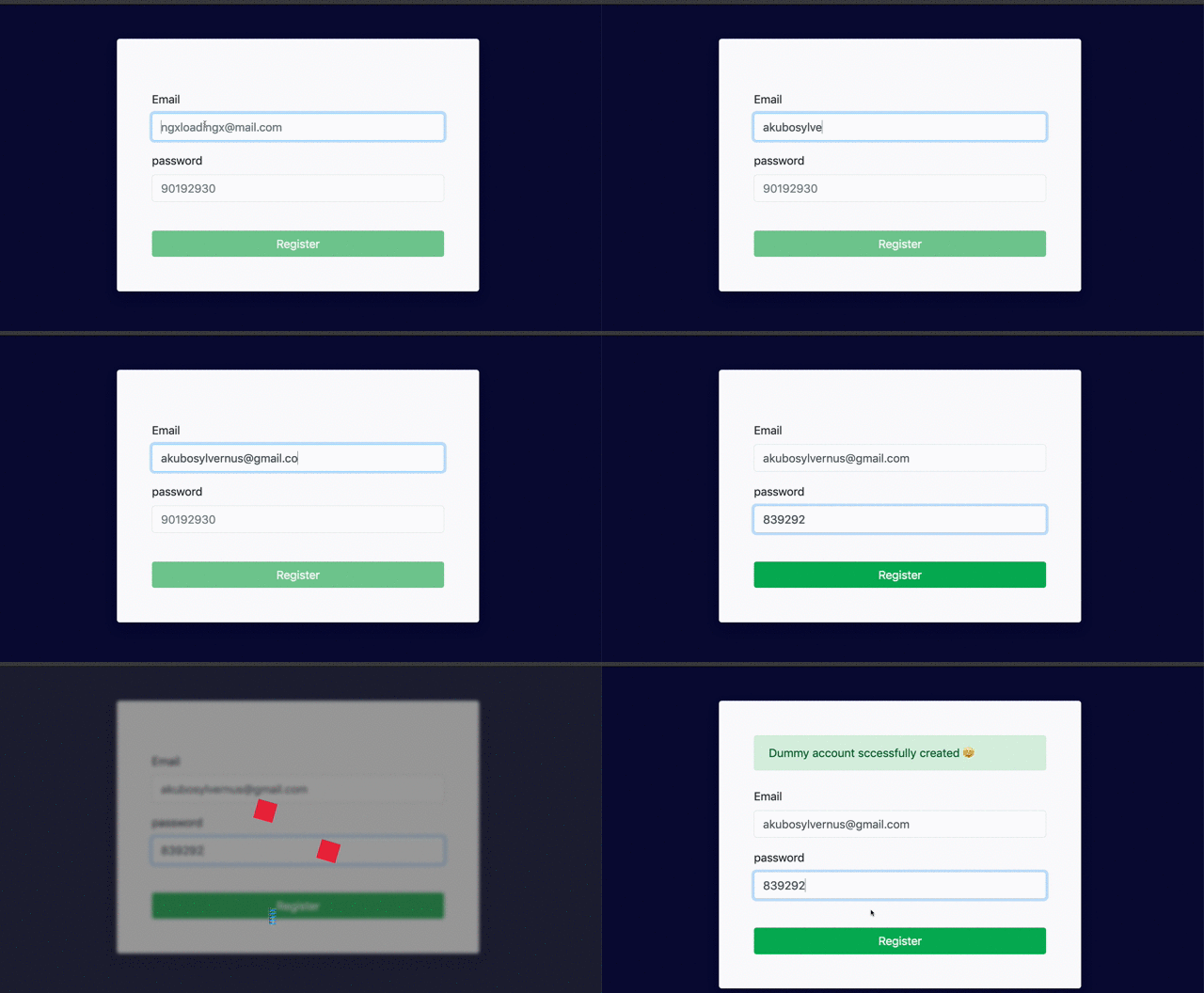
Check out the interactive live demo
Install ngx-loading-x from NPM using this command
npm install ngx-loading-x --save
Import NgxLoadingXModule into the root of your module
import { BrowserModule } from '@angular/platform-browser';
import { NgModule } from '@angular/core';
import { CoreModule } from './core/core.module';
import { NgxLoadingXModule } from 'ngx-loading-x';

@NgModule({
  declarations: [AppComponent],
  imports: [
    BrowserModule,
    // Import NgxLoadingXModule
    NgxLoadingXModule
  ],
  providers: [],
  bootstrap: [AppComponent]
})
export class AppModule { }
create a boolean variable that is accessible from the component which will contain ngx-loading-x. This boolean is used as an input into ngx-loading to determine when the loading spinner is visible.
import { Component, OnInit } from '@angular/core';

@Component({
    //...
})
export class AppComponent implements OnInit {
    //...
    public loading = false;

    constructor() { }

    ngOnInit() { }

    registerTest() {
        // loading triggered
        this.load = true;

        setTimeout(() => {
            // loader stops after 5s
            this.load = false,
            // ..
            this.register = true;
        }, 5000)
    }
}
Include ngx-loading-x component selector to your app component templates, Set the [show] input variable of ngx-loading-x to point to your boolean i.e load, which will determine the ngx-loading-x visibility.
<ngx-loading-x [show]="load"></ngx-loading-x>
ngx-loading-x component selector attributes
ngx-loading-x component selector Attributes| Attributes | Type | Required | Default | Description |
|---|---|---|---|---|
show | boolean | optional | false | Determines the visibility of the loader |
bgLogoUrl | string | optional | (empty string) | Logo Url |
bgOpacity | number | optional | 5 | background opacity |
bgLogoUrlPosition | number | optional | bottom-right | Logo position. available positions can be accessed via POSITION |
bgLogoUrlSize | number | optional | 100 | Logo size |
spinnerType | string | optional | wandering-cubes | Spinner animation type. available types can be accessed via SPINNER |
spinnerSize | number | optional | 120 | Spinner size |
spinnerColor | string | optional | #dd1b16 | Spinner color |
spinnerPosition | string | optional | center-center | Spinner position. available positions can be accessed via POSITION |
NgxLoadingXBlur DirectiveIf you want your page content is blurred/frosted while showing the loading background overlay.
<div NgxLoadingXBlur [show]="load">
  <!-- This page content will be blurred/frosted when loading background overlay is showed -->
</div>
<ngx-loading-x [show]="load"></ngx-loading-x>
| Attributes | Type | Required | Default | Description |
|---|---|---|---|---|
bgBlur | boolean | optional | 5 | blurred/frosted background |
NgxLoadingXModuleYou can override the default configuration via forRoot() method.
import { BrowserModule } from '@angular/platform-browser';
import { NgModule } from '@angular/core';
import { AppComponent } from './app.component';
import { NgxLoadingXConfig, POSITION, SPINNER, NgxLoadingXModule } from 'ngx-loading-x';


const ngxLoadingXConfig: NgxLoadingXConfig = {
  show: false,
  bgBlur: 2,
  bgOpacity: 5,
  bgLogoUrl: '',
  bgLogoUrlPosition: POSITION.topLeft,
  bgLogoUrlSize: 100,
  spinnerType: SPINNER.wanderingCubes,
  spinnerSize: 120,
  spinnerColor: '#dd0031',
  spinnerPosition: POSITION.centerCenter,
}

@NgModule({
  declarations: [
    AppComponent,
  ],
  imports: [
    BrowserModule,
    NgxLoadingXModule.forRoot(ngxLoadingXConfig)
  ],
  providers: [],
  bootstrap: [AppComponent]
})

export class AppModule { }
| Attributes | Type | Required | Default | Description |
|---|---|---|---|---|
show | boolean | optional | false | Determines the visibility of the loader |
bgLogoUrl | string | optional | (empty string) | Logo Url |
bgOpacity | number | optional | 5 | background opacity |
bgBlur | boolean | optional | 5 | blurred/frosted background |
bgLogoUrlPosition | number | optional | bottom-right | Logo position. available positions can be accessed via POSITION |
bgLogoUrlSize | number | optional | 100 | Logo size |
spinnerType | string | optional | wandering-cubes | Spinner animation type. available types can be accessed via SPINNER |
spinnerSize | number | optional | 120 | Spinner size |
spinnerColor | string | optional | #dd1b16 | Spinner color |
spinnerPosition | string | optional | center-center | Spinner position. available positions can be accessed via POSITION |
FAQs
Multiple Loaders / spinners in angular with an optional blurry overlay
We found that ngx-loading-x demonstrated a not healthy version release cadence and project activity because the last version was released a year ago. It has 1 open source maintainer collaborating on the project.
Did you know?

Socket for GitHub automatically highlights issues in each pull request and monitors the health of all your open source dependencies. Discover the contents of your packages and block harmful activity before you install or update your dependencies.

Product
Socket Fix 2.0 brings targeted CVE remediation, smarter upgrade planning, and broader ecosystem support to help developers get to zero alerts.

Security News
Socket CEO Feross Aboukhadijeh joins Risky Business Weekly to unpack recent npm phishing attacks, their limited impact, and the risks if attackers get smarter.

Product
Socket’s new Tier 1 Reachability filters out up to 80% of irrelevant CVEs, so security teams can focus on the vulnerabilities that matter.