Angular Multiple Dates

Multiple dates picker based on Angular Material.
Compatible with Angular / CDK / Material **>= 9.x.x**. See Versioning.
Demo


Installation
-
Install dependency:
npm install --save ngx-multiple-dates
-
Include NgxMultipleDatesModule to your module:
import { NgModule } from '@angular/core';
import { BrowserModule } from '@angular/platform-browser';
import { BrowserAnimationsModule } from '@angular/platform-browser/animations';
import { MatNativeDateModule } from '@angular/material/core';
import { MatDatepickerModule } from '@angular/material/datepicker';
import { MatIconModule } from '@angular/material/icon';
import { NgxMultipleDatesModule } from 'ngx-multiple-dates';
@NgModule({
imports: [
BrowserModule,
BrowserAnimationsModule,
MatNativeDateModule,
MatDatepickerModule,
MatIconModule,
NgxMultipleDatesModule
],
})
export class AppModule { }
-
Styles:
-
Add one of the prebuilt themes to angular.json or your styles file:
@import 'ngx-multiple-dates/prebuilt-themes/azure-blue.css';
-
Or you can use custom SCSS theme
- Angular < 12.x.x:
@import '~@angular/material/theming';
@import '~ngx-multiple-dates/theming';
@include mat-core();
$primary: mat-palette($mat-indigo);
$accent: mat-palette($mat-pink);
$theme: mat-light-theme($primary, $accent);
@include angular-material-theme($theme);
@include ngx-multiple-dates-theme($theme);
- Angular >= 12.x.x && < 18.x.x:
@use '@angular/material' as mat;
@import '~ngx-multiple-dates/theming';
@include mat.core;
$primary: mat.define-palette(mat.$indigo-palette);
$accent: mat.define-palette(mat.$pink-palette);
$theme: mat.define-light-theme($primary, $accent);
@include mat.all-component-themes($theme);
@include ngx-multiple-dates-theme($theme);
- Starting Angular Multiple Dates = 14.x.x SASS
@use rule supported:
@use '@angular/material' as mat;
@use 'ngx-multiple-dates' as ngxMultipleDates;
@include mat.core;
$primary: mat.define-palette(mat.$indigo-palette);
$accent: mat.define-palette(mat.$pink-palette);
$theme: mat.define-light-theme($primary, $accent);
@include mat.all-component-themes($theme);
@include ngxMultipleDates.multiple-dates-theme($theme);
- Angular Multiple Dates >= 15.x.x && < 18.x.x:
@use '@angular/material' as mat;
@use 'ngx-multiple-dates' as ngxMultipleDates;
@include mat.core;
$primary: mat.define-palette(mat.$indigo-palette);
$accent: mat.define-palette(mat.$pink-palette);
$theme: mat.define-light-theme((
color: (
primary: $primary,
accent: $accent
)
));
@include mat.all-component-themes($theme);
@include ngxMultipleDates.multiple-dates-theme($theme);
- Angular Multiple Dates >= 18.x.x:
@use '@angular/material' as mat;
@use 'ngx-multiple-dates' as ngxMultipleDates;
@include mat.core;
$my-theme: mat.define-theme(
(
color: (
theme-type: light,
primary: mat.$azure-palette,
tertiary: mat.$blue-palette
),
density: (
scale: 0
)
)
);
@include mat.all-component-themes($theme);
@include ngxMultipleDates.multiple-dates-theme($theme);
Available pre-built themes:
azure-blue.csscyan-orange.cssmagenta-violet.cssrose-red.css
Versioning
Library tested for Angular / CDK / Material versions >= 9.x.x.
Use Angular Multiple Dates 1.x.x for Angular Components <= 11.x.x
Later versions are consistant with major Angular Components version. E.g.:
Use v13.x.x with Angular Components 13.x.x.
Use v12.x.x with Angular Components 12.x.x.
Dependencies
- Angular
- Angular CDK
- Angular Material
- RxJs
Examples
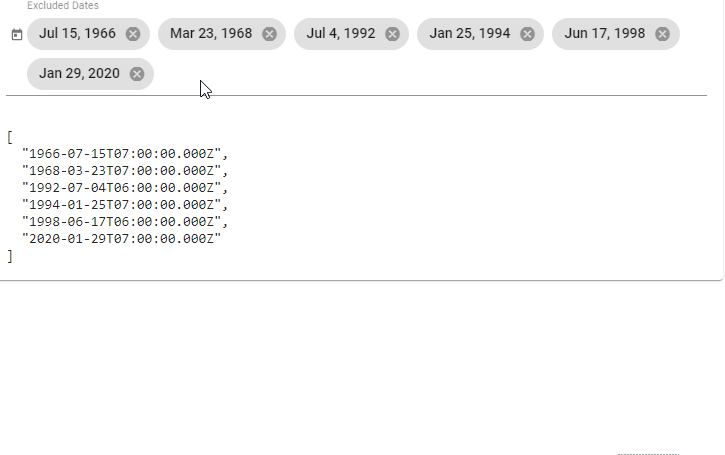
Date Picker
<mat-form-field>
  <ngx-multiple-dates [matDatepicker]="picker" placeholder="Excluded Dates" name="excludedDates"
                      [(ngModel)]="model">
  </ngx-multiple-dates>
  <mat-datepicker-toggle matPrefix [for]="picker"></mat-datepicker-toggle>
  <mat-datepicker #picker></mat-datepicker>
</mat-form-field>
Calendar (inline)
<mat-form-field class="full-width">
  <ngx-multiple-dates [matDatepicker]="picker" placeholder="Excluded Dates"
                      name="excludedDates" [(ngModel)]="excludedDates">
  </ngx-multiple-dates>
</mat-form-field>
<mat-calendar #picker></mat-calendar>
More
For more examples please visit the Demo page.
Its source code is located here.
API reference
MultipleDatesComponent<D = Date>
Selector: ngx-multiple-dates
Exported as: ngxMultipleDates
Properties
| Input | |
@Input()
value: D | null | The value of the ngx-multiple-dates control. |
@Input()
matDatepicker: MatDatepicker<D> | MatCalendar<D> | The datepicker (or calendar - for inline view) that this ngx-multiple-dates element is associated with. |
@Input()
color: ThemePalette | Theme color palette for the component. This API is supported in M2 themes only, it has no effect in M3 themes.
For information on applying color variants in M3, see Using component color variants. |
@Input()
placeholder: string | Placeholder to be shown if no value has been selected. |
@Input()
required: boolean | Whether the component is required. |
@Input()
disabled: boolean | Whether the component is disabled. |
@Input()
matDatepickerFilter: (date: D) => boolean | Function that can be used to filter out dates within the datepicker. |
@Input()
max: D | null | The maximum valid date. |
@Input()
min: D | null | The minimum valid date. |
@Input()
classes: Array<DateClass<D>> | Custom date classes. |
@Input()
id: string | Unique id of the element. |
@Input()
errorStateMatcher: ErrorStateMatcher | An object used to control when error messages are shown. |
@Input()
format: string | The date/time components to include, using predefined options or a custom format string.
See DatePipe Usage notes for more information. |
| Output | |
@Output()
dateChange: EventEmitter<MatDatepickerInputEvent<D>> | Emits when a change event is fired on this ngx-multiple-dates element. |
@Output()
remove: EventEmitter<DateRemoveEvent<D>> | Emits on a date removal. |
| Properties | |
resetModel: Date | Model used to reset datepicker selected value, so unselect just selected date will be possible. |
closeOnSelected: boolean | Whether datepicker should be closed on date selected, or opened to select more dates. |
empty: boolean | Whether the select has a value. |
shouldLabelFloat: boolean | Whether the MatFormField label should try to float. |
focused: boolean | Whether ngx-multiple-dates element has focus. |
errorState: boolean | Whether the control is in an error state. |
stateChanges: Observable<void> | Stream that emits whenever the state of the control changes such that the parent MatFormField needs to run change detection. |
ngControl: NgControl | Form control to manage component. |
controlType: 'ngx-multiple-dates' | A name for this control that can be used by mat-form-field. |
Methods
-
focus
Focuses the ngx-multiple-dates element.
-
blur
Used to leave focus from the ngx-multiple-dates element.
-
setDescribedByIds
Sets the list of element IDs that currently describe this control.
control: AbstractControl | The control to validate against. |
| Returns | |
ValidationErrors | null | A map of validation errors if validation fails, otherwise null. |
dateClass
Function used to add CSS classes to selected dates.
date: D | Date to check if classes should be applied. |
| Returns | |
MatCalendarCellCssClasses | CSS classes to apply. |
dateChanged
Fires when a change event is fired on the datepicker <input />.
event: MatDatepickerInputEvent<D> | Change event. |
remove
Removes selected chip from the list.
Build
Run npm run build to build the project. The build artifacts will be stored in the dist/ directory. Use the --prod flag for a production build.
Development server
Run npm start for a dev server. Navigate to http://localhost:4200/. The app will automatically reload if you change any of the source files.


