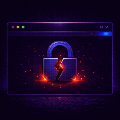
Socket
Book a DemoInstallSign in
Socket

npm-maintainer

Package Overview
Dependencies
Maintainers
1
Versions
3
Alerts
File Explorer

Advanced tools

Socket logo

Install Socket

Detect and block malicious and high-risk dependencies

Install

npm-maintainer

A web component which shows various statistics for a user in the NPM database.

latest
Source
npmnpm
Version
1.0.2
Version published
Maintainers
1
Created
Source

Github Build Codacy Badge Codebeat Badge CodeFactor Badge DeepScan grade Analytics

NPM Maintainer

Statistics for a NPM user. See the demo here

A web component which shows various statistics for a user in the NPM database.

Visitor stats

GitHub stars GitHub forks GitHub watchers GitHub followers

Code stats

GitHub code size in bytes GitHub repo size GitHub language count GitHub top language GitHub last commit

Install

npm i npm-maintainer

#or

yarn add npm-maintainer

Usage

// In your JS entrypoint
import 'npm-maintainer';
<!-- In your HTML file -->

<npm-maintainer
	user="scriptex"
	error="An unknown error occurred. Please try again later."
	loading="Loading data from NPM..."
></npm-maintainer>

Attributes

NameTypeRequiredDefaultDescription
userstringtrue''The user name from NPM
errorstringfalse'Error loading data.'Message shown when an error occurs
loadingstringfalse'Loading data...'Message shown when loading data

Styling

The npm-maintainer Web Component utilizes the ::part() pseudo-element. In order to add custom styles, you should use the corresponding parts of the components:

  • error - The element which shows the error message
  • loading - The element which shows the loading message
  • content - The element which shows the data table
  • table - The <table> itself
  • thead - The <thead> element
  • thead-row - The <tr> inside the <thead> element
  • tbody - The <tbody> element
  • tbody-row - The <tr> inside the <tbody> element
  • th - the <th> elements
  • td - the <td> elements

Here is an example:

npm-maintainer {
	display: block;
}

npm-maintainer::part(error),
npm-maintainer::part(loading) {
	text-align: center;
	min-height: 75vh;
	display: flex;
	align-items: center;
	align-content: center;
	justify-content: center;
}

npm-maintainer::part(error) {
	color: red;
}

npm-maintainer::part(table) {
	width: 100%;
	border-collapse: collapse;
	border-spacing: 0;
}

npm-maintainer::part(th),
npm-maintainer::part(td) {
	padding: 0.25rem;
	border: 1px solid;
}

npm-maintainer::part(link) {
	color: inherit;
	text-decoration: underline;
}

npm-maintainer::part(link):hover {
	text-decoration: none;
}

LICENSE

MIT

Connect with me:

Support and sponsor my work:

Keywords

Web component

FAQs

Package last updated on 07 Nov 2022

Did you know?

Socket

Socket for GitHub automatically highlights issues in each pull request and monitors the health of all your open source dependencies. Discover the contents of your packages and block harmful activity before you install or update your dependencies.

Install

Related posts