Product
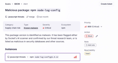
Introducing the Alert Details Page: A Better Way to Explore Alerts
Socket's new Alert Details page is designed to surface more context, with a clearer layout, reachability dependency chains, and structured review.
phosphor-react-native
Advanced tools

Phosphor is a flexible icon family for interfaces, diagrams, presentations — whatever, really. Explore all our icons at phosphoricons.com. Inspired by phosphor-react.
yarn add phosphor-react-native
or
npm install --save phosphor-react-native
Simply import the icons you need, and add them anywhere in your render method. Phosphor supports tree-shaking, so your bundle only includes code for the icons you use.
import React from "react";
import { View } from "react-native";
import { Horse, Heart, Cube } from "phosphor-react-native";

const App = () => {
  return (
    <View>
      <Horse />
      <Heart color="#AE2983" weight="fill" size={32} />
      <Cube color="teal" weight="duotone" />
    </View>
  );
};
Icon components accept all props that you can pass to a normal SVG element, including inline style objects, onClick handlers, and more. The main way of styling them will usually be with the following props:
string – Icon stroke/fill color. Can be any CSS color string, including hex, rgb, rgba, hsl, hsla, named colors.number | string – Icon height & width. As with standard React elements, this can be a number, or a string with units in px, %, em, rem, pt, cm, mm, in."thin" | "light" | "regular" | "bold" | "fill" | "duotone" – Icon weight/style. Can also be used, for example, to "toggle" an icon's state: a rating component could use Stars with weight="regular" to denote an empty star, and weight="fill" to denote a filled star.Phosphor takes advantage of React Context to make applying a default style to all icons simple. Create an IconContext.Provider at the root of the app (or anywhere above the icons in the tree) and pass in a configuration object with props to be applied by default to all icons:
import React from "react";
import { View } from "react-native";
import { IconContext, Horse, Heart, Cube } from "phosphor-react-native";

const App = () => {
  return (
    <IconContext.Provider
      value={{
        color: "limegreen",
        size: 32,
        weight: "bold",
      }}
    >
      <View>
        <Horse /> {/* I'm lime-green, 32px, and bold! */}
        <Heart /> {/* Me too! */}
        <Cube />  {/* Me three :) */}
      </View>
    </IconContext.Provider>
  );
};
You may create multiple Contexts for styling icons differently in separate regions of an application; icons use the nearest Context above them to determine their style.
You may wish to import all icons at once for use in your project, though depending on your bundler this could prevent tree-shaking and make your app's bundle larger.
import * as Icon from "phosphor-react-native";
...
<Icon.Smiley />
<Icon.Folder weight="thin" />
<Icon.BatteryHalf size="24px" />
mirrored prop.MIT
FAQs
Flexible icons for React Native
The npm package phosphor-react-native receives a total of 29,779 weekly downloads. As such, phosphor-react-native popularity was classified as popular.
We found that phosphor-react-native demonstrated a healthy version release cadence and project activity because the last version was released less than a year ago. It has 4 open source maintainers collaborating on the project.
Did you know?

Socket for GitHub automatically highlights issues in each pull request and monitors the health of all your open source dependencies. Discover the contents of your packages and block harmful activity before you install or update your dependencies.

Product
Socket's new Alert Details page is designed to surface more context, with a clearer layout, reachability dependency chains, and structured review.

Product
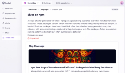
Campaign-level threat intelligence in Socket now shows when active supply chain attacks affect your repositories and packages.

Research
Malicious PyPI package sympy-dev targets SymPy users, a Python symbolic math library with 85 million monthly downloads.