Bubbly Grid System
This is not another 12-column grid system, this is an up-to-you-column grid system.
This is also not an HTML grid system, meaning you're gonna be able to keep your markup clean and tidy.
Made with calc() and Flexbox, so it will support the latest versions of Chrome, Firefox, Safari, Opera (not opera mini) & IE 11+.
Built in PostCSS, so it will work with the preprocessor of your choice.
Wanna see some nicer doc?
Wanna see some demos?
npm
Installation
npm install postcss-bubbly-grid
Usage
:arrow_up: back to top
How to use it :
const bubblyGrid = require('postcss-bubbly-grid')
module.exports = {
plugins: [
bubblyGrid()
]
}
Sym Grid (symmetrical only)
sym-grid: [col: number] [gutter?: value<px | % | em | rem>] [stretch?: 'stretch' | 'nostretch']
Make sure the parent container is set to display flex :
.container {
  display: flex;
  flex-wrap: wrap;
}
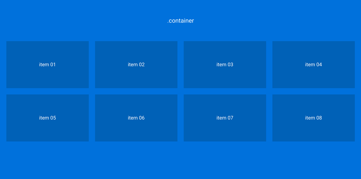
Col
:arrow_up: back to top
- number of columns per row
.container {
  display: flex;
  flex-wrap: wrap;
}

.item {
  sym-grid: 4 20px;
}
- You'll get 4 columns per row
- and a gutter of 20px between each column
The HTML :
<div class="container">
  <div class="item">
    item 01
  </div>
  ...
  <div class="item">
    item 08
  </div>
</div>
Gutter
:arrow_up: back to top
- width of the gutter (values can be in 'px', 'em', 'rem' or '%')
.item {
  sym-grid: 3 2em;
}
- You'll get 3 columns per row
- You'll get a gutter of 2em between each column
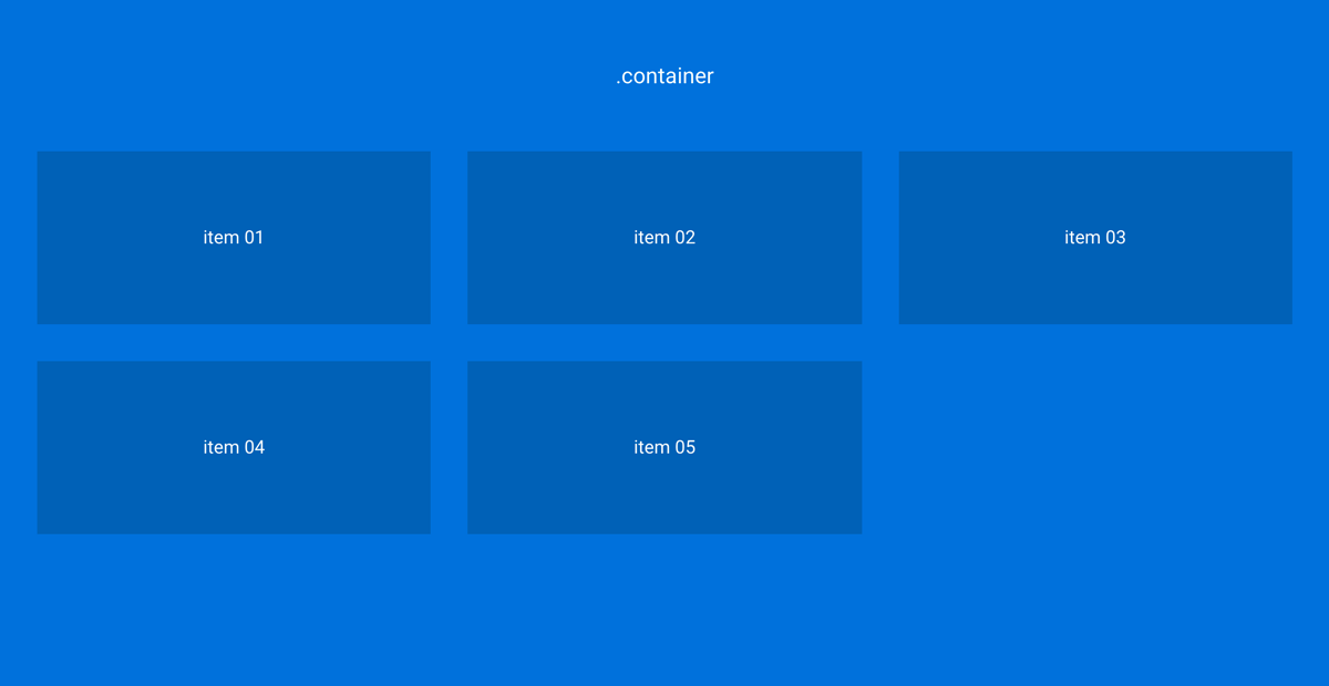
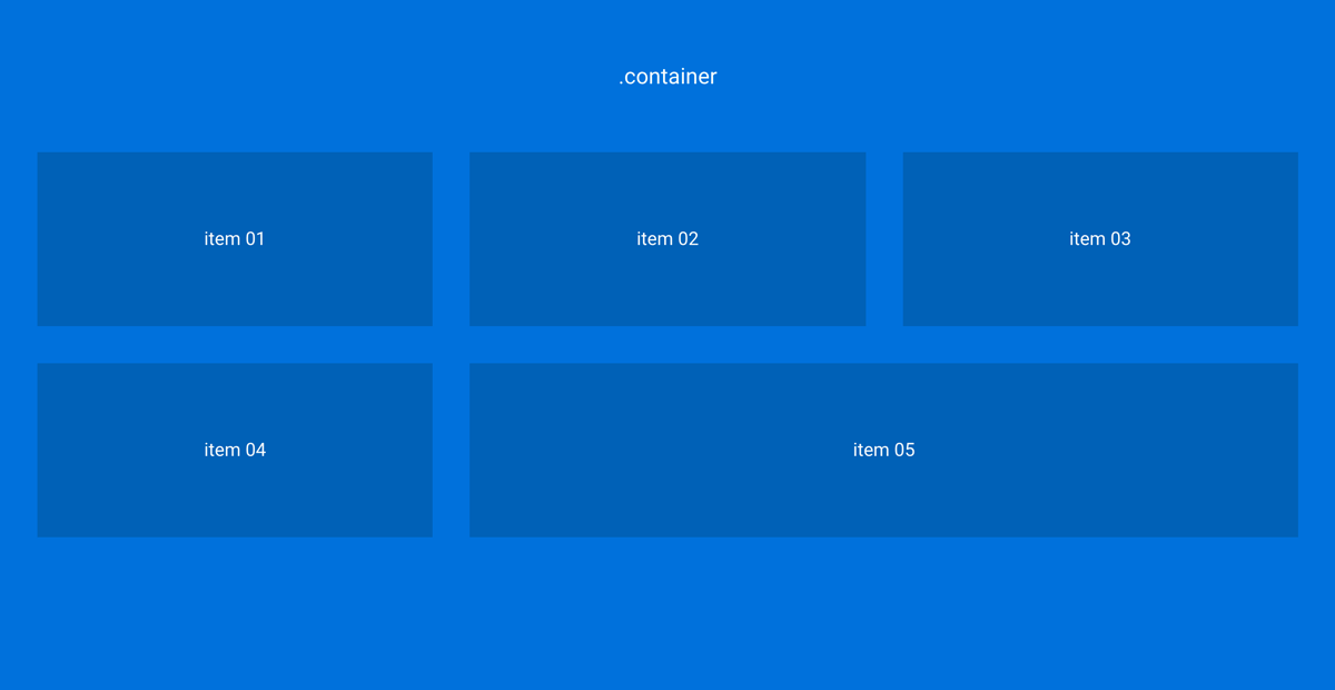
Stretch
:arrow_up: back to top
- Use it when you want the last item in the row to take the full width of the remaining space :
.item {
  sym-grid: 3 2em stretch;
}
The HTML :
<div class="container">
  <div class="item">
    item 01
  </div>
  ...
  <div class="item">
    item 05
  </div>
</div>
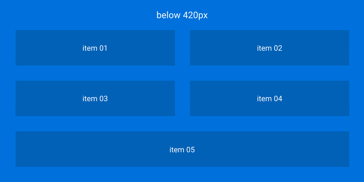
media-queries
:arrow_up: back to top
Media queries and new cycles :
Let's say that when the window width gets below 420px, you wanna change the number of cols per row :
.item {
  sym-grid: 4 20px;
}

@media screen and (max-width: 420px) {
  sym-grid: 2 2em stretch;
}
- First, we set a new cycle with:
2
- Then, we set a new value for the gutter:
2em
Media queries and stretch :
Let's say that when the window width gets below 420px, you wanna get rid of the stretching stuff :
.item {
  sym-grid: 4 20px stretch;
}

@media screen and (max-width: 420px) {
  sym-grid: 2 20px nostretch;
}
Asym Grid (asymmetrical grid)
:arrow_up: back to top
asym-grid: [ratio: <number / number>] [gutter?: value<px | ‰ | em | rem>] [last?: 'last']
- The gutter value must be the same across the different declarations defining a row
- To remove the margin-right on the last element of a row, we must pass the
last parameter
- You can set up another ratio everytime you defining a new row
- Make sure the parent container is set to display
flex
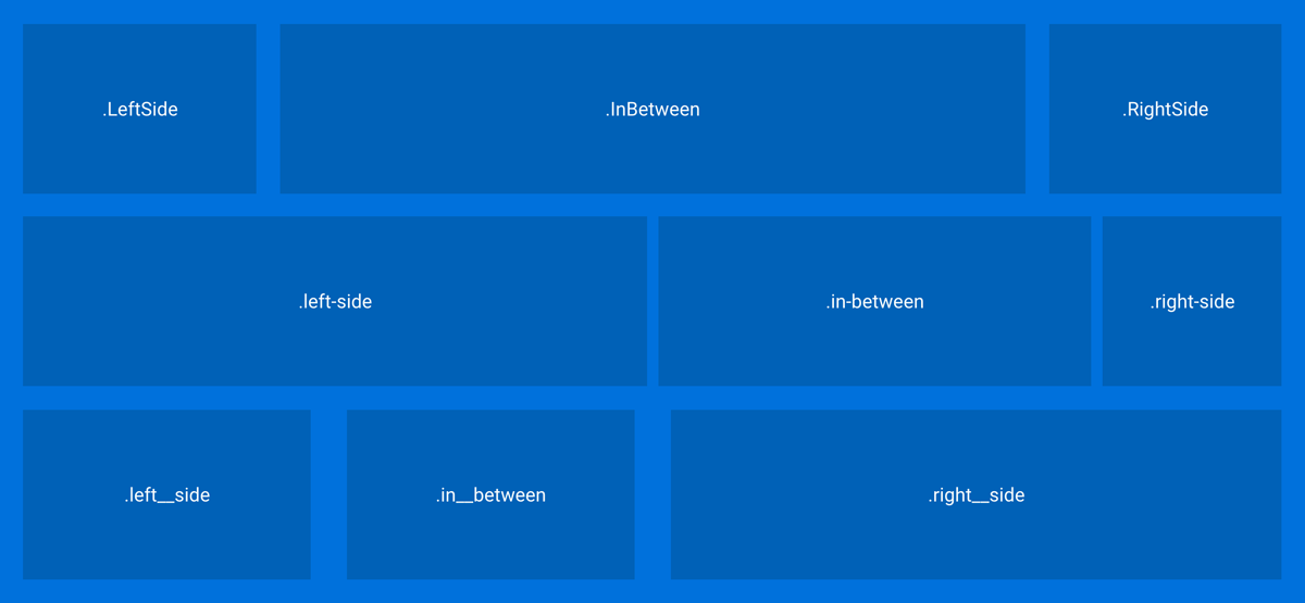
Let's make an asymmetrical grid :
.container {
display: flex;
flex-wrap: wrap;
}
.LeftSide {
asym-grid: 2/10 20px;
}
.InBetween {
asym-grid: 6/10 20px;
}
.RightSide {
asym-grid: 2/10 20px last;
}
.left-side {
asym-grid: 10/20 10px;
}
.in-between {
asym-grid: 7/20 10px;
}
.right-side {
asym-grid: 3/20 10px last;
}
.left__side {
asym-grid: 3/12 2em;
}
.in__between {
asym-grid: 3/12 2em;
}
.right__side {
asym-grid: 6/12 2em last;
}
The HTML :
<div class="container">
<div class="LeftSide">
LeftSide
</div>
<div class="InBetween">
InBetween
</div>
<div class="RightSide">
RightSide
</div>
<div class="left-side">
left-side
</div>
<div class="in-between">
in-between
</div>
<div class="right-side">
right-side
</div>
<div class="left__side">
left__side
</div>
<div class="in__between">
in__between
</div>
<div class="right__side">
right__side
</div>
</div>
Push
:arrow_up: back to top
push: [ratio: <number / number>] | [reset: 'reset']
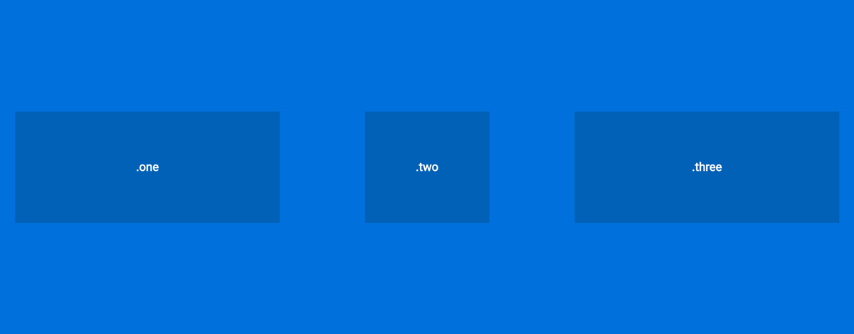
Wanna push that one col to the right so that it's centered? easy :
.one {
  asym-grid: 4/12 20px;
}

.two {
  asym-grid: 2/12 20px;
  push: 1/12;
}

.three {
  asym-grid: 4/12 20px last;
}
The HTML :
<div class="container">
  <div class="one">
    one
  </div>
  <div class="two">
    two
  </div>
  <div class="three">
    three
  </div>
</div>
Alternatively, you can also use negative values if you wanna push an element to the left, e.g., push: -1/12 is the same as pull: 1/12
Pull
:arrow_up: back to top
pull: [ratio: <number / number>] | [reset: 'reset']
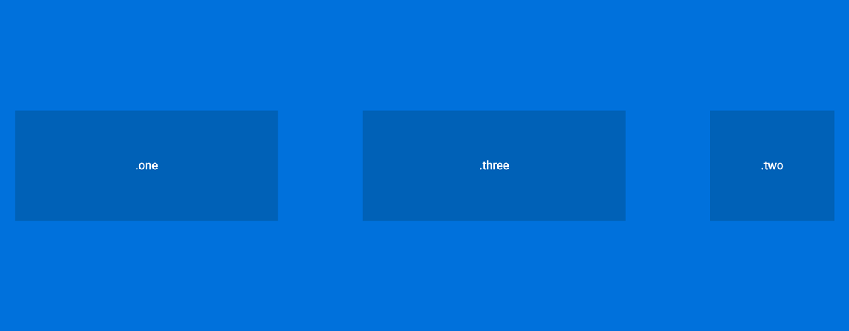
Wanna pull a col to the left? :
.one {
  asym-grid: 4/12 20px;
}

.two {
  asym-grid: 2/12 20px;
  push: 6/12;
}

.three {
  asym-grid: 4/12 20px;
  pull: 3/12;
}
The HTML :
<div class="container">
  <div class="one">
    one
  </div>
  <div class="two">
    two
  </div>
  <div class="three">
    three
  </div>
</div>
Alternatively, you can also use negative values if you wanna pull an element to the right, e.g., pull: -1/12 is the same as push: 1/12
Center
:arrow_up: back to top
center: [boolean];
If you wish to have an element centered and by itself on his own line, you can use center: true;
Media-queries
:arrow_up: back to top
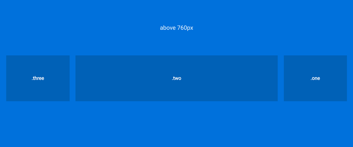
Above 760px :
.one {
  asym-grid: 2/10 20px;
  push: 8/10;
}

.two {
  asym-grid: 6/10 20px;
}

.three {
  asym-grid: 2/10 20px last;
  pull: 8/10;
}
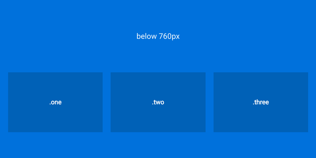
Below 760px :
If you get bored of all the pushing and pulling around, use push: reset; or pull: reset;
.one {
  @media screen and (max-width: 760px) {
    asym-grid: 1/3 20px;
    push: reset;
  }
}

.two {
  @media screen and (max-width: 760px) {
   asym-grid: 1/3 20px;
  }
}

.three {
  @media screen and (max-width: 760px) {
    asym-grid: 1/3 10px;
    pull: reset;
  }
}
The End
Et voilà, I guess this is it...Now it's your turn to build some crazy layouts :)
:arrow_up: back to top


