Company News
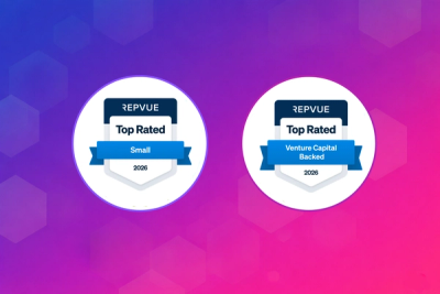
Socket Named Top Sales Organization by RepVue
Socket won two 2026 Reppy Awards from RepVue, ranking in the top 5% of all sales orgs. AE Alexandra Lister shares what it's like to grow a sales career here.
postcss-custom-media
Advanced tools
npm install postcss-custom-media --save-dev
PostCSS Custom Media lets you define @custom-media in CSS following the Custom Media Specification.
@custom-media --small-viewport (max-width: 30em);

@media (--small-viewport) {
	/* styles for small viewport */
}

/* becomes */

@media (max-width: 30em) {
	/* styles for small viewport */
}
true and falseWith @custom-media you can use the constants true and false.
These are especially handy when debugging.
If you are unsure how your page is affected when a certain media query matches or not you can use these, to quickly toggle the results. This plugin downgrades these queries to something that works in all browsers.
Quickly check the result as if the query matches:
@custom-media --small-viewport true;

@media (--small-viewport) {
	/* styles for small viewport */
}

/* becomes */

@media (max-color:2147477350) {
	/* styles for small viewport */
}
Quickly check the result as if the query does not match:
@custom-media --small-viewport false;

@media (--small-viewport) {
	/* styles for small viewport */
}

/* becomes */

@media (color:2147477350) {
	/* styles for small viewport */
}
It is impossible to accurately and correctly resolve complex @custom-media queries
as these depend on the browser the queries will eventually run in.
Some of these queries will have only one possible outcome but we have to account for all possible queries in this plugin.
[!NOTE] When handling complex media queries you will see that your CSS is doubled for each level of complexity.
GZIP works great to de-dupe this but having a lot of complex media queries will have a performance impact.
An example of a very complex (and artificial) use-case :
@custom-media --a-complex-query tty and (min-width: 300px);

@media not screen and ((not (--a-complex-query)) or (color)) {
	/* Your CSS */
}

/* becomes */


@media tty and (min-width: 300px) {
@media not screen and ((not (max-color:2147477350)) or (color)) {
	/* Your CSS */
}
}
@media not tty,not all and (min-width: 300px) {
@media not screen and ((not (color:2147477350)) or (color)) {
	/* Your CSS */
}
}
Add PostCSS Custom Media to your project:
npm install postcss postcss-custom-media --save-dev
Use it as a PostCSS plugin:
const postcss = require('postcss');
const postcssCustomMedia = require('postcss-custom-media');

postcss([
	postcssCustomMedia(/* pluginOptions */)
]).process(YOUR_CSS /*, processOptions */);
The preserve option determines whether the original notation
is preserved. By default, it is not preserved.
postcssCustomMedia({ preserve: true })
@custom-media --small-viewport (max-width: 30em);

@media (--small-viewport) {
	/* styles for small viewport */
}

/* becomes */

@custom-media --small-viewport (max-width: 30em);

@media (max-width: 30em) {
	/* styles for small viewport */
}

@media (--small-viewport) {
	/* styles for small viewport */
}
If you're using Modular CSS such as, CSS Modules, postcss-loader or vanilla-extract to name a few, you'll probably
notice that custom media queries are not being resolved. This happens because each file is processed separately so
unless you import the custom media query definitions in each file, they won't be resolved.
To overcome this, we recommend using the PostCSS Global Data plugin which allows you to pass a list of files that will be globally available. The plugin won't inject any extra code in the output but will provide the context needed to resolve custom media queries.
For it to run it needs to be placed before the PostCSS Custom Media plugin.
const postcss = require('postcss');
const postcssCustomMedia = require('postcss-custom-media');
const postcssGlobalData = require('@csstools/postcss-global-data');

postcss([
	postcssGlobalData({
		files: [
			'path/to/your/custom-media-queries.css'
		]
	}),
	postcssCustomMedia(/* pluginOptions */)
]).process(YOUR_CSS /*, processOptions */);
postcss-preset-env allows you to use future CSS features today by converting modern CSS into something most browsers can understand. It includes a variety of plugins, including the ability to use custom media queries. Compared to postcss-custom-media, postcss-preset-env offers a broader range of features but may be overkill if you only need custom media queries.
postcss-media-minmax lets you write simpler and more concise media queries by using the < and > operators. While it doesn't offer custom media queries, it simplifies the syntax of media queries, making them easier to read and write. It is a good alternative if you are looking for a way to simplify your media queries without defining custom ones.
FAQs
Use Custom Media Queries in CSS
The npm package postcss-custom-media receives a total of 6,285,315 weekly downloads. As such, postcss-custom-media popularity was classified as popular.
We found that postcss-custom-media demonstrated a healthy version release cadence and project activity because the last version was released less than a year ago. It has 5 open source maintainers collaborating on the project.
Did you know?

Socket for GitHub automatically highlights issues in each pull request and monitors the health of all your open source dependencies. Discover the contents of your packages and block harmful activity before you install or update your dependencies.

Company News
Socket won two 2026 Reppy Awards from RepVue, ranking in the top 5% of all sales orgs. AE Alexandra Lister shares what it's like to grow a sales career here.

Security News
NIST will stop enriching most CVEs under a new risk-based model, narrowing the NVD's scope as vulnerability submissions continue to surge.

Company News
/Security News
Socket is an initial recipient of OpenAI's Cybersecurity Grant Program, which commits $10M in API credits to defenders securing open source software.