PostCSS Media Minmax


Writing simple and graceful media queries!
The min-width, max-width and many other properties of media queries are really confusing. I want to cry every time I see them. But right now according to the new specs, you can use more intuitive <= or >= to replace the min-/max- prefixes in media queries.
V2.1.0 began to support > or < symbol.
This is a polyfill plugin which supports CSS Media Queries Level 4 and gives you access to the new features right away. Mom will never worry about my study any more. So amazing!
简体中文

Installation
$ npm install postcss-media-minmax
Quick Start
Example 1:
var fs = require('fs')
var postcss = require('postcss')
var minmax = require('postcss-media-minmax')

var css = fs.readFileSync('input.css', 'utf8')

var output = postcss()
  .use(minmax())
  .process(css)
  .css

console.log('\n====>Output CSS:\n', output)
Or just:
var output = postcss(minmax())
  .process(css)
  .css
input.css:
@media screen and (width >= 500px) and (width <= 1200px) {
  .bar {
    display: block;
  }
}
You will get:
@media screen and (min-width: 500px) and (max-width: 1200px) {
  .bar {
    display: block;
  }
}
CSS syntax
<mf-range> = <mf-name> [ '<' | '>' ]? '='? <mf-value>
           | <mf-value> [ '<' | '>' ]? '='? <mf-name>
           | <mf-value> '<' '='? <mf-name> '<' '='? <mf-value>
           | <mf-value> '>' '='? <mf-name> '>' '='? <mf-value>
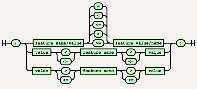
PostCSS Media Minmax hasn't implemented syntax such as 200px > = width or 200px < = width currently because its readability is not good enough yet.
The special values:
-
The value type is a positive (not zero or negative) followed by optional whitespace, followed by a solidus ('/'), followed by optional whitespace, followed by a positive . s can be ordered or compared by transforming them into the number obtained by dividing their first by their second .
@media screen and (device-aspect-ratio: 16 / 9) {
}
@media screen and (device-aspect-ratio: 16/9) {
}
-
The value type is an with the value 0 or 1. Any other integer value is invalid. Note that -0 is always equivalent to 0 in CSS, and so is also accepted as a valid value.
@media screen and (grid: -0) {
}
@media screen and (grid: 0) {
}
How to use
Shorthand
In Example 1, if a feature has both >= and <= logic, it can be written as follows:
@media screen and (500px <= width <= 1200px) {
.bar {
display: block;
}
}
@media screen and (1200px >= width >= 500px) {
.bar {
display: block;
}
}
Which will output:
@media screen and (min-width: 500px) and (max-width: 1200px) {
  .bar {
    display: block;
  }
}
Note: When the media feature name is in the middle, we must ensure that two <= or >= are in the same direction, otherwise which will not be converted.
E.g. in the example below, width is greater than or equal to 500px and is greater than or equal to 1200px, which is the wrong in both grammar and logic.
@media screen and (1200px <= width >= 500px) {
  .bar {
    display: block;
  }
}
Media feature names
The following properties support the min-/max- prefixes in the specifications at present, and will be automatically converted by PostCSS Media Minmax.
widthheightdevice-widthdevice-heightaspect-ratiodevice-aspect-ratiocolorcolor-indexmonochromeresolution
Using with @custom-media & Node Watch
var fs = require('fs')
var chokidar = require('chokidar')
var postcss = require('postcss')
var minmax = require('postcss-media-minmax')
var customMedia = require('postcss-custom-media')

var src = 'input.css'

console.info('Watching…\nModify the input.css and save.')


chokidar.watch(src, {
  ignored: /[\/\\]\./,
  persistent: true
}).on('all',
  function(event, path, stats) {
    var css = fs.readFileSync(src, 'utf8')
    var output = postcss()
      .use(customMedia())
      .use(minmax())
      .process(css)
      .css;
    fs.writeFileSync('output.css', output)
  })
input.css:
@custom-media --foo (width >= 20em) and (width <= 50em);
@custom-media --bar (height >= 300px) and (height <= 600px);

@media (--foo) and (--bar) {

}
output.css:
@media (min-width: 20em) and (max-width: 50em) and (min-height: 300px) and (max-height: 600px) {

}
Grunt
module.exports = function(grunt) {
grunt.initConfig({
pkg: grunt.file.readJSON('package.json'),
postcss: {
options: {
processors: [
require('autoprefixer-core')({ browsers: ['> 0%'] }).postcss,
require('postcss-media-minmax')(),
]
},
dist: {
src: ['src/*.css'],
dest: 'build/grunt.css'
}
}
});
grunt.loadNpmTasks('grunt-contrib-uglify');
grunt.loadNpmTasks('grunt-postcss');
grunt.registerTask('default', ['postcss']);
}
Gulp
var gulp = require('gulp');
var rename = require('gulp-rename');
var postcss = require('gulp-postcss');
var selector = require('postcss-media-minmax')
var autoprefixer = require('autoprefixer-core')
gulp.task('default', function () {
var processors = [
autoprefixer({ browsers: ['> 0%'] }),
minmax()
];
gulp.src('src/*.css')
.pipe(postcss(processors))
.pipe(rename('gulp.css'))
.pipe(gulp.dest('build'))
});
gulp.watch('src/*.css', ['default']);
Contributing
- Install all the dependent modules.
- Respect the coding style (Use EditorConfig).
- Add test cases in the test directory.
- Run the test cases.
$ git clone https://github.com/postcss/postcss-media-minmaxs.git
$ git checkout -b patch
$ npm install
$ npm test
Acknowledgements
-
Thank the author of PostCSS Andrey Sitnik for giving us such simple and easy CSS syntax analysis tools.
-
Thank Tab Atkins Jr. for writing the specs of Media Queries Level 4.
-
Thank ziyunfei for suggestions and help of this plugin.


