Product
Introducing Rust Support in Socket
Socket now supports Rust and Cargo, offering package search for all users and experimental SBOM generation for enterprise projects.
postcss-responsive-type
Advanced tools
PostCSS plugin for automagical responsive typography. Adds a responsive property to font-size, line-height and letter-spacing that generates complex calc and vw based font sizes.
Inspired by this post from @MikeRiethmuller, and Typographic.
Part of Rucksack - CSS Superpowers.

html {
  font-size: responsive;
}
Units can be in px, rem, or em. When using em units, be sure that the font-range is specified in em as well.
html {
  font-size: responsive 12px 21px; /* min-size, max-size */
  font-range: 420px 1280px; /* viewport widths between which font-size is fluid */
}
html {
  font-size: responsive;
  min-font-size: 12px;
  max-font-size: 21px;
  lower-font-range: 420px;
  upper-font-range: 1280px;
}
line-height and letter-spacing:PostCSS Responsive Type also allows you to set fluid sizes for the line-height and letter-spacing properties. They have the same syntax and work the same way as responsive font sizes.
html {
  line-height: responsive 1.2em 1.8em;
  line-height-range: 420px 1280px;

  /* or extended syntax: */
  line-height: responsive;
  min-line-height: 1.2em;
  max-line-height: 1.8em;
  lower-line-height-range: 420px;
  upper-line-height-range: 1280px;
}
html {
  letter-spacing: responsive 0px 4px;
  letter-spacing-range: 420px 1280px;

  /* or extended syntax: */
  letter-spacing: responsive;
  min-letter-spacing: 0px;
  max-letter-spacing: 4px;
  lower-letter-spacing-range: 420px;
  upper-letter-spacing-range: 1280px;
}
Note: Unitless line heights are not supported.
--
To get started you only need to specify the responsive property, all other values have sane defaults.
font-sizemin-font-size: 14px
max-font-size: 21px
lower-font-range: 420px
upper-font-range: 1280px
line-heightmin-line-height: 1.2em
max-line-height: 1.8em
lower-line-height-range: 420px
upper-line-height-range: 1280px
letter-spacingmin-letter-spacing: 0px
max-letter-spacing: 4px
lower-letter-spacing-range: 420px
upper-letter-spacing-range: 1280px
--
postcss-responsive-type just uses calc, vw units, and media queries behind the scenes, so it works on all modern browsers (IE9+). Although Opera Mini is not supported.
Legacy browsers will ignore the output responsive font-size. You can easily provide a simple static fallback:
.foo {
  font-size: 16px;
  font-size: responsive;
}
Alternatively, if you feel the need to fully support legacy browsers or Opera Mini, there are polyfills that can help!
respond for media query support.
calc-polyfill for calc support.
vminpoly for vw unit support.
--
postcss([ require('postcss-responsive-type')() ])
See PostCSS docs for examples for your environment.
You can use postcss-responsive-type with Stylus through PostStylus.
--
MIT © Sean King
v1.0.0 (2017-07-07)
FAQs
PostCSS plugin that adds responsive magic to font-size
The npm package postcss-responsive-type receives a total of 4,804 weekly downloads. As such, postcss-responsive-type popularity was classified as popular.
We found that postcss-responsive-type demonstrated a not healthy version release cadence and project activity because the last version was released a year ago. It has 1 open source maintainer collaborating on the project.
Did you know?

Socket for GitHub automatically highlights issues in each pull request and monitors the health of all your open source dependencies. Discover the contents of your packages and block harmful activity before you install or update your dependencies.

Product
Socket now supports Rust and Cargo, offering package search for all users and experimental SBOM generation for enterprise projects.

Product
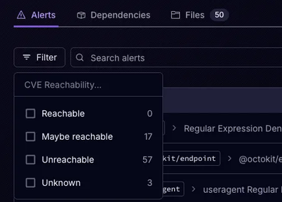
Socket’s precomputed reachability slashes false positives by flagging up to 80% of vulnerabilities as irrelevant, with no setup and instant results.

Product
Socket is launching experimental protection for Chrome extensions, scanning for malware and risky permissions to prevent silent supply chain attacks.