Product
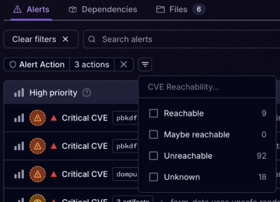
Introducing Tier 1 Reachability: Precision CVE Triage for Enterprise Teams
Socket’s new Tier 1 Reachability filters out up to 80% of irrelevant CVEs, so security teams can focus on the vulnerabilities that matter.
postcss-mediascope
Advanced tools
PostCSS plugin to declare postcss-advanced-variables for each media query.
This can be especially helpful for:
postcss([
postcssMediascope([
{
query: 'only screen and (max-width: 500px)',
variables: {
color: 'red',
media: 'phone'
}
},
{
query: 'only screen and (min-width: 501px) and (max-width: 900px)',
variables: {
color: 'blue',
media: 'tablet'
}
}
]),
postcssAdvancedVariables()
])
Running the following css code through postcssMediascope :
@mediascope {
    .$(media)-test {
        color: $color;
    }
}
produces intermediate result:
@media only screen and (max-width: 500px) {
    $color: red;
    $media: phone;
    .$(media)-test {
        color: $color;
    }
}
@media only screen and (min-width: 501px) and (max-width: 900px) {
    $color: blue;
    $media: tablet;
    .$(media)-test {
        color: $color;
    }
}
that then is processed through postcss-advanced-variables, so it becomes:
@media only screen and (max-width: 500px) {
    .phone-test {
        color: red;
    }
}
@media only screen and (min-width: 501px) and (max-width: 900px) {
    .tablet-test {
        color: blue;
    }
}
FAQs
Declare variables for each mediaquery
The npm package postcss-mediascope receives a total of 0 weekly downloads. As such, postcss-mediascope popularity was classified as not popular.
We found that postcss-mediascope demonstrated a not healthy version release cadence and project activity because the last version was released a year ago. It has 1 open source maintainer collaborating on the project.
Did you know?

Socket for GitHub automatically highlights issues in each pull request and monitors the health of all your open source dependencies. Discover the contents of your packages and block harmful activity before you install or update your dependencies.

Product
Socket’s new Tier 1 Reachability filters out up to 80% of irrelevant CVEs, so security teams can focus on the vulnerabilities that matter.

Research
/Security News
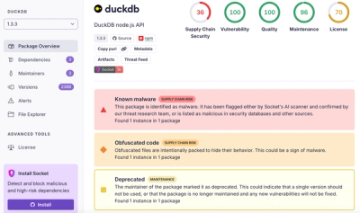
Ongoing npm supply chain attack spreads to DuckDB: multiple packages compromised with the same wallet-drainer malware.

Security News
The MCP Steering Committee has launched the official MCP Registry in preview, a central hub for discovering and publishing MCP servers.