What is rc-dropdown?
The rc-dropdown package is a React component that provides a flexible and customizable dropdown menu. It allows developers to create dropdown menus with various content, trigger behaviors, and alignment options.
What are rc-dropdown's main functionalities?
Basic Dropdown
This code sample demonstrates how to create a basic dropdown menu with selectable options. When an option is selected, it triggers an alert with the selected key. The visibility of the dropdown is logged to the console when it changes.
{"import React from 'react';\nimport Dropdown from 'rc-dropdown';\nimport Menu, { Item as MenuItem } from 'rc-menu';\n\nfunction onSelect({ key }) {\n alert(`selected ${key}`);\n}\n\nfunction onVisibleChange(visible) {\n console.log(visible);\n}\n\nconst menu = (\n <Menu onSelect={onSelect}>\n <MenuItem key='1'>Option 1</MenuItem>\n <MenuItem key='2'>Option 2</MenuItem>\n <MenuItem key='3'>Option 3</MenuItem>\n </Menu>\n);\n\nconst App = () => (\n <Dropdown\n overlay={menu}\n onVisibleChange={onVisibleChange}\n trigger={['click']}\n >\n <a className='ant-dropdown-link' onClick={e => e.preventDefault()}>\n Click me\n </a>\n </Dropdown>\n);\n\nexport default App;"}
Trigger Modes
This code sample shows how to create a dropdown that is triggered by hovering over the link instead of clicking. The menu appears when the user hovers over the 'Hover me' link.
{"import React from 'react';\nimport Dropdown from 'rc-dropdown';\nimport Menu, { Item as MenuItem } from 'rc-menu';\n\nconst menu = (\n <Menu>\n <MenuItem key='1'>Option 1</MenuItem>\n <MenuItem key='2'>Option 2</MenuItem>\n </Menu>\n);\n\nconst App = () => (\n <Dropdown\n overlay={menu}\n trigger={['hover']}\n >\n <a className='ant-dropdown-link' href='#'>\n Hover me\n </a>\n </Dropdown>\n);\n\nexport default App;"}
Alignment
This code sample illustrates how to align the dropdown menu relative to the trigger element. The 'align' prop is used to specify the alignment points, offset, and overflow behavior.
{"import React from 'react';\nimport Dropdown from 'rc-dropdown';\nimport Menu, { Item as MenuItem } from 'rc-menu';\n\nconst menu = (\n <Menu>\n <MenuItem key='1'>Option 1</MenuItem>\n <MenuItem key='2'>Option 2</MenuItem>\n </Menu>\n);\n\nconst App = () => (\n <Dropdown\n overlay={menu}\n align={{\n points: ['tr', 'br'],\n offset: [0, 4],\n overflow: { adjustX: 1, adjustY: 1 }\n }}\n >\n <a className='ant-dropdown-link' href='#'>\n Align me\n </a>\n </Dropdown>\n);\n\nexport default App;"}
Other packages similar to rc-dropdown
react-bootstrap-dropdown
This package provides dropdown components styled with Bootstrap. It is similar to rc-dropdown but integrates tightly with the Bootstrap framework for styling and components.
downshift
Downshift is a set of primitives to build simple, flexible, WAI-ARIA compliant React autocomplete, combobox or select dropdown components. It's more complex and provides more functionality compared to rc-dropdown, including autocomplete behavior.
react-select
React-select is a flexible and state-driven component for creating multi-select input fields. It offers a richer set of features compared to rc-dropdown, such as multi-select, async options loading, and more.
rc-dropdown
react dropdown component


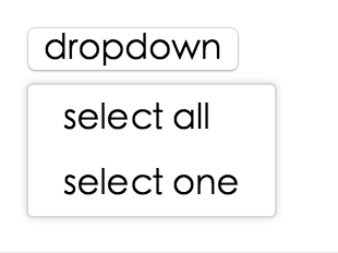
Screenshot
Example
online example: http://react-component.github.io/dropdown/examples/
install

Usage
var Dropdown = require('rc-dropdown');
API
props
| overlayClassName | String | | additional css class of root dom node |
| openClassName | String | `${prefixCls}-open` | className of trigger when dropdown is opened |
| prefixCls | String | rc-dropdown | prefix class name |
| transitionName | String | | dropdown menu's animation css class name |
| animation | String | | part of dropdown menu's animation css class name |
| placement | String | bottomLeft | Position of menu item. There are: top, topCenter, topRight, bottomLeft, bottom, bottomRight |
| onVisibleChange | Function | | call when visible is changed |
| visible | boolean | | whether tooltip is visible |
| defaultVisible | boolean | | whether tooltip is visible initially |
| overlay | rc-menu | | rc-menu element |
| onOverlayClick | function(e) | | call when overlay is clicked |
| minOverlayWidthMatchTrigger | boolean | true (false when set alignPoint) | whether overlay's width must not be less than trigger's |
| getPopupContainer | Function(menuDOMNode): HTMLElement | () => document.body | Where to render the DOM node of dropdown |
|---|
Note: Additional props are passed into the underlying rc-trigger component. This can be useful for example, to display the dropdown in a separate portal-driven window via the getDocument() rc-trigger prop.
Development
npm install
npm start
Test Case
npm test
npm run chrome-test
Coverage
npm run coverage
open coverage/ dir
License
rc-dropdown is released under the MIT license.


