Research
/Security News
Intercom’s npm Package Compromised in Ongoing Mini Shai-Hulud Worm Attack
Compromised intercom-client@7.0.4 npm package is tied to the ongoing Mini Shai-Hulud worm attack targeting developer and CI/CD secrets.
react-select
Advanced tools
The Select control for React. Initially built for use in KeystoneJS.
See react-select.com for live demos and comprehensive docs.
React Select is funded by Thinkmill and Atlassian. It represents a whole new approach to developing powerful React.js components that just work out of the box, while being extremely customisable.
For the story behind this component, watch Jed's talk at React Conf 2019 - building React Select
Features include:
The easiest way to use react-select is to install it from npm and build it into your app with Webpack.
yarn add react-select
Then use it in your app:
import React from 'react';
import Select from 'react-select';

const options = [
  { value: 'chocolate', label: 'Chocolate' },
  { value: 'strawberry', label: 'Strawberry' },
  { value: 'vanilla', label: 'Vanilla' },
];

class App extends React.Component {
  state = {
    selectedOption: null,
  };
  handleChange = (selectedOption) => {
    this.setState({ selectedOption }, () =>
      console.log(`Option selected:`, this.state.selectedOption)
    );
  };
  render() {
    const { selectedOption } = this.state;

    return (
      <Select
        value={selectedOption}
        onChange={this.handleChange}
        options={options}
      />
    );
  }
}
import React, { useState } from 'react';
import Select from 'react-select';

const options = [
  { value: 'chocolate', label: 'Chocolate' },
  { value: 'strawberry', label: 'Strawberry' },
  { value: 'vanilla', label: 'Vanilla' },
];

export default function App() {
  const [selectedOption, setSelectedOption] = useState(null);

  return (
    <div className="App">
      <Select
        defaultValue={selectedOption}
        onChange={setSelectedOption}
        options={options}
      />
    </div>
  );
}
Common props you may want to specify include:
autoFocus - focus the control when it mountsclassName - apply a className to the controlclassNamePrefix - apply classNames to inner elements with the given prefixisDisabled - disable the controlisMulti - allow the user to select multiple valuesisSearchable - allow the user to search for matching optionsname - generate an HTML input with this name, containing the current valueonChange - subscribe to change eventsoptions - specify the options the user can select fromplaceholder - change the text displayed when no option is selectednoOptionsMessage - ({ inputValue: string }) => string | null - Text to display when there are no optionsvalue - control the current valueSee the props documentation for complete documentation on the props react-select supports.
You can control the following props by providing values for them. If you don't, react-select will manage them for you.
value / onChange - specify the current value of the controlmenuIsOpen / onMenuOpen / onMenuClose - control whether the menu is openinputValue / onInputChange - control the value of the search input (changing this will update the available options)If you don't provide these props, you can set the initial value of the state they control:
defaultValue - set the initial value of the controldefaultMenuIsOpen - set the initial open value of the menudefaultInputValue - set the initial value of the search inputReact-select exposes two public methods:
focus() - focus the control programmaticallyblur() - blur the control programmaticallyCheck the docs for more information on:
The v5 release represents a rewrite from JavaScript to TypeScript. The types for v4 and earlier releases are available at @types. See the TypeScript guide for how to use the types starting with v5.
Thank you to everyone who has contributed to this project. It's been a wild ride.
If you like React Select, you should follow me on twitter!
Shout out to Joss Mackison, Charles Lee, Ben Conolly, Tom Walker, Nathan Bierema, Eric Bonow, Emma Hamilton, Dave Brotherstone, Brian Vaughn, and the Atlassian Design System team who along with many other contributors have made this possible ❤️
MIT Licensed. Copyright (c) Jed Watson 2022.
Downshift is a set of primitives to build simple, flexible, WAI-ARIA compliant enhanced input React components. Its major focus is on flexibility and providing the building blocks for creating custom dropdown components. It is more low-level than react-select and requires more boilerplate to achieve similar functionality.
React-autosuggest is a WAI-ARIA compliant React autosuggest component that provides a simple yet customizable input field with suggestions. While it is similar to react-select in providing suggestions, it does not offer as many features out of the box, such as multi-select or async options.
Ant Design (antd) is a design system with a set of high-quality React components, one of which is a Select component. It offers a comprehensive suite of features similar to react-select but is part of a larger framework, which might be more than needed if only a select component is required.
FAQs
A Select control built with and for ReactJS
The npm package react-select receives a total of 6,564,487 weekly downloads. As such, react-select popularity was classified as popular.
We found that react-select demonstrated a healthy version release cadence and project activity because the last version was released less than a year ago. It has 5 open source maintainers collaborating on the project.
Did you know?

Socket for GitHub automatically highlights issues in each pull request and monitors the health of all your open source dependencies. Discover the contents of your packages and block harmful activity before you install or update your dependencies.

Research
/Security News
Compromised intercom-client@7.0.4 npm package is tied to the ongoing Mini Shai-Hulud worm attack targeting developer and CI/CD secrets.

Research
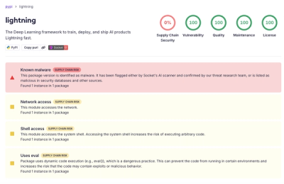
Socket detected a malicious supply chain attack on PyPI package lightning versions 2.6.2 and 2.6.3, which execute credential-stealing malware on import.

Research
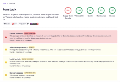
A brand-squatted TanStack npm package used postinstall scripts to steal .env files and exfiltrate developer secrets to an attacker-controlled endpoint.