
Product
Introducing Webhook Events for Alert Changes
Add real-time Socket webhook events to your workflows to automatically receive software supply chain alert changes in real time.
By Phil Gates-Idem - Nov 21, 2025
rc-progress
Advanced tools
Progress Bar.


https://progress.react-component.vercel.app/
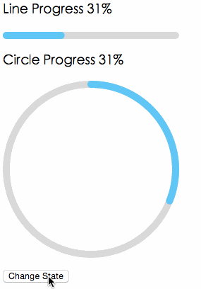

import { Line, Circle } from 'rc-progress';
export default () => (
<>
<Line percent={10} strokeWidth={4} strokeColor="#D3D3D3" />
<Circle percent={10} strokeWidth={4} strokeColor="#D3D3D3" />
</>
);
 IE / Edge |  Firefox |  Chrome |  Safari |  Electron |
|---|---|---|---|---|
| IE11, Edge | last 2 versions | last 2 versions | last 2 versions | last 2 versions |
| name | type | default | description |
|---|---|---|---|
| strokeWidth | Number | 1 | Width of the stroke. Unit is percentage of SVG canvas size. |
| strokeColor | String | #2db7f5 | Stroke color. |
| trailWidth | Number | 1 | Width of the trail stroke. Unit is percentage of SVG canvas size. Trail is always centered relative to actual progress path. If trailWidth is not defined, it is the same as strokeWidth. |
| trailColor | String | #D9D9D9 | Color for lighter trail stroke underneath the actual progress path. |
| strokeLinecap | String | 'round' | The shape to be used at the end of the progress bar: can be `butt`, `square` or `round`. |
| prefixCls | String | rc-progress | prefix className for component |
| className | String | customized className | |
| style | Object | style object will be added to svg element | |
| percent | Number | Number[] | 0 | the percent of the progress |
| gapDegree | Number | 0 | the gap degree of half circle, 0 - 360 |
| gapPosition | String | top | the gap position: can be `top`, `bottom`, `left`, or `right`. |
npm install --save rc-progress
npm install
npm start
rc-progress is released under the MIT license.
This package provides a circular progress bar component for React. It is similar to the Circle component of rc-progress but focuses solely on circular progress bars. It offers a different set of customization options and styles.
progressbar.js is a vanilla JavaScript library for creating both line and circle progress bars. It is not React-specific like rc-progress but can be integrated into React projects. It offers a wide range of customization options and animations.
nprogress is a lightweight JavaScript library for creating slim progress bars, typically used at the top of the page to indicate loading progress. Unlike rc-progress, it is not React-specific and does not offer circular progress bars, focusing instead on a minimalistic approach.
FAQs
progress ui component for react
We found that rc-progress demonstrated a not healthy version release cadence and project activity because the last version was released a year ago. It has 7 open source maintainers collaborating on the project.
Did you know?

Socket for GitHub automatically highlights issues in each pull request and monitors the health of all your open source dependencies. Discover the contents of your packages and block harmful activity before you install or update your dependencies.
Product
Add real-time Socket webhook events to your workflows to automatically receive software supply chain alert changes in real time.

Security News
ENISA has become a CVE Program Root, giving the EU a central authority for coordinating vulnerability reporting, disclosure, and cross-border response.

Product
Socket now scans OpenVSX extensions, giving teams early detection of risky behaviors, hidden capabilities, and supply chain threats in developer tools.