Product
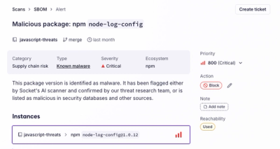
Introducing the Alert Details Page: A Better Way to Explore Alerts
Socket's new Alert Details page is designed to surface more context, with a clearer layout, reachability dependency chains, and structured review.
react-abstract-button
Advanced tools
An abstract (unstyled) button element that dynamicly switches between a ``, an `` and a `<Link>` from [react-router](https://reacttraining.com/react-router/web/guides/philosophy). The idea is to make it easier for you to have a consistent style
An abstract (unstyled) button element that dynamicly switches between a <button>, an <a> and a <Link> from react-router. The idea is to make it easier for you to have a consistent style for all the "clickable" things on your web app. Whether something is a link or a button is mostly an implementation detail, so this component lets you use a single styled-components style to style all of them, and then if you provide a to property it will render using a link element, and if you don't it renders as a button.
yarn add react-abstract-button
// button.js

import styled from 'styled-components';
import AbstractButton from 'react-abstract-button';

export const Button = styled(AbstractButton)`
  background: lightgray;
  border: none;
  border-radius: 4px;
  color: inherit;
  cursor: pointer;
  display: inline-block;
  font: inherit;
  margin: 0em;
  padding: 0.4em 0.8em;
  text-align: center;

  &:focus,
  &:hover {
    outline: none;
    background: gray;
  }
  &:active {
    background: dimgray;
  }

  &.active {
    background: blue;
  }
`;
export const Link = styled(AbstractButton)`
  background: none;
  border: none;
  color: inherit;
  cursor: pointer;
  display: inline;
  font: inherit;
  margin: 0em;
  padding: 0;
  text-align: inherit;

  &:focus,
  &:hover,
  &:active {
    outline: none;
    text-decoration: underline;
  }

  &.active {
    color: darkblue;
  }
`;
// app.js
import {Button, Link} from './button';

export default function App() {
  return (
    <React.Fragment>
      <form>
        <label>
          Enter your name:
          <input name="name" />
        </label>
        <Button type="submit">Submit this form</Button>
      </form>
      <Button onClick={() => alert('clicked!')}>Click this button</Button>
      <Button to="/other/page">
        Use react-router to navigate to this page
      </Button>
      <Button to="http://example.com">Go to this external website</Button>
      <p>
        All the above buttons/links look the same, even though some are
        implemented as "button" elements and others as "a" elements. You can do
        the same thing with{' '}
        <Link onClick={() => alert('clicked!')}>Buttons</Link> and
        <Link to="/other/page">Links</Link> that appear inline as links in text.
      </p>
    </React.Fragment>
  );
}
If you're using service works it can take a long time to get users on the latest version of your website. You can improve this by temporarily disabling local navigation once a new service worker is ready.
import {makeAllLinksExternal} from 'react-abstract-button';
import register from '@moped/register-service-worker';

register({
  serviceWorkerNotInstalling() {
    console.log('Service worker not installing.');
  },
  newContentAvailable() {
    // we can ensure that the next navigation triggers a full page reload by
    // making all links external now that new content is ready
    makeAllLinksExternal();
  },
  contentCached() {
    // At this point, everything has been precached.
    // It's the perfect time to display a
    // "Content is cached for offline use." message.
    console.log('Content is cached for offline use.');
  },
  noInternetConnectionFound() {
    // Only called in development mode, when the backend is
    // not currently running.
    console.log(
      'No internet connection found. App is running in offline mode.',
    );
  },
  errorRegisteringServiceWorker(err: Error) {
    console.error('Error during service worker registration:', error);
  },
});
This library does not bundle any style because that is so dependant on your application. However, you can use something like the following:
.button {
  background: lightgray;
  border: none;
  border-radius: 4px;
  box-sizing: border-box;
  color: inherit;
  cursor: pointer;
  display: inline-block;
  font: inherit;
  letter-spacing: normal;
  margin: 0em;
  padding: 0.4em 0.8em;
  text-align: center;
  text-decoration: inherit;
  text-indent: 0px;
  text-rendering: auto;
  text-shadow: none;
  text-transform: none;
  touch-action: manipulation;
  word-spacing: normal;
}

.button:focus,
.button:hover {
  outline: none;
  background: gray;
}
.button:active {
  background: dimgray;
}
Key things to note:
font to inherit because on buttons it defaults to a different font that you probably don't want.text-decoration and color to inherit because on links they default to underlined and blue. If we want our button to look like a link, we would explicitly specify the text-decoration and color.:focus and :hover as keyboard users will see the :focus style. The :active style is used while the button is being pressed.If you are making a navigation button, you could do something like the following to make the active button blue:
&.active {
  background: blue;
}
The active class is automatically added to Button elements that have a to property.
MIT
FAQs
Did you know?

Socket for GitHub automatically highlights issues in each pull request and monitors the health of all your open source dependencies. Discover the contents of your packages and block harmful activity before you install or update your dependencies.

Product
Socket's new Alert Details page is designed to surface more context, with a clearer layout, reachability dependency chains, and structured review.

Product
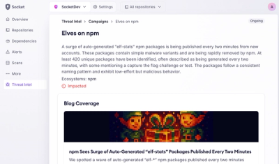
Campaign-level threat intelligence in Socket now shows when active supply chain attacks affect your repositories and packages.

Research
Malicious PyPI package sympy-dev targets SymPy users, a Python symbolic math library with 85 million monthly downloads.