React Advance Datepicker

A modern date range picker component for React using Tailwind 3 and dayjs.
Contents
Features
- ✅ Theming options
- ✅ Dark mode
- ✅ Single Date
- ✅ Single date use Range
- ✅ Shortcuts
- ✅ TypeScript support
- ✅ Localization(i18n)
- ✅ Date formatting
- ✅ Disable specific dates
- ✅ Minimum Date and Maximum Date
- ✅ Custom shortcuts
Documentation
Go to full documentation
Installation
⚠️ React Advance Datepicker uses Tailwind CSS 3 (with the
@tailwindcss/forms plugin) &
Dayjs under the hood to work.
Install via npm
$ npm install react-advance-datepicker
Install via yarn
$ yarn add react-advance-datepicker
Make sure you have installed the peer dependencies as well with the below versions.
"dayjs": "^1.11.6",
"react": "^17.0.2 || ^18.2.0"
Simple Usage
Tailwindcss Configuration
Add the datepicker to your tailwind configuration using this code
module.exports = {
content: [
"./src/**/*.{js,jsx,ts,tsx}",
"./node_modules/react-advance-datepicker/dist/index.esm.js"
]
};
Then use react-tailwindcss-select in your app:
import React, { useState } from "react";
import Datepicker from "react-advance-datepicker";

const App = () => {
    const [value, setValue] = useState({
        startDate: new Date(),
        endDate: new Date().setMonth(11)
    });

    const handleValueChange = newValue => {
        console.log("newValue:", newValue);
        setValue(newValue);
    };

    return (
        <div>
            <Datepicker value={value} onChange={handleValueChange} />
        </div>
    );
};

export default App;
Theming options
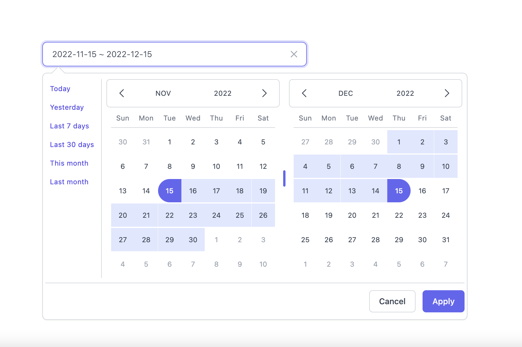
Light Mode
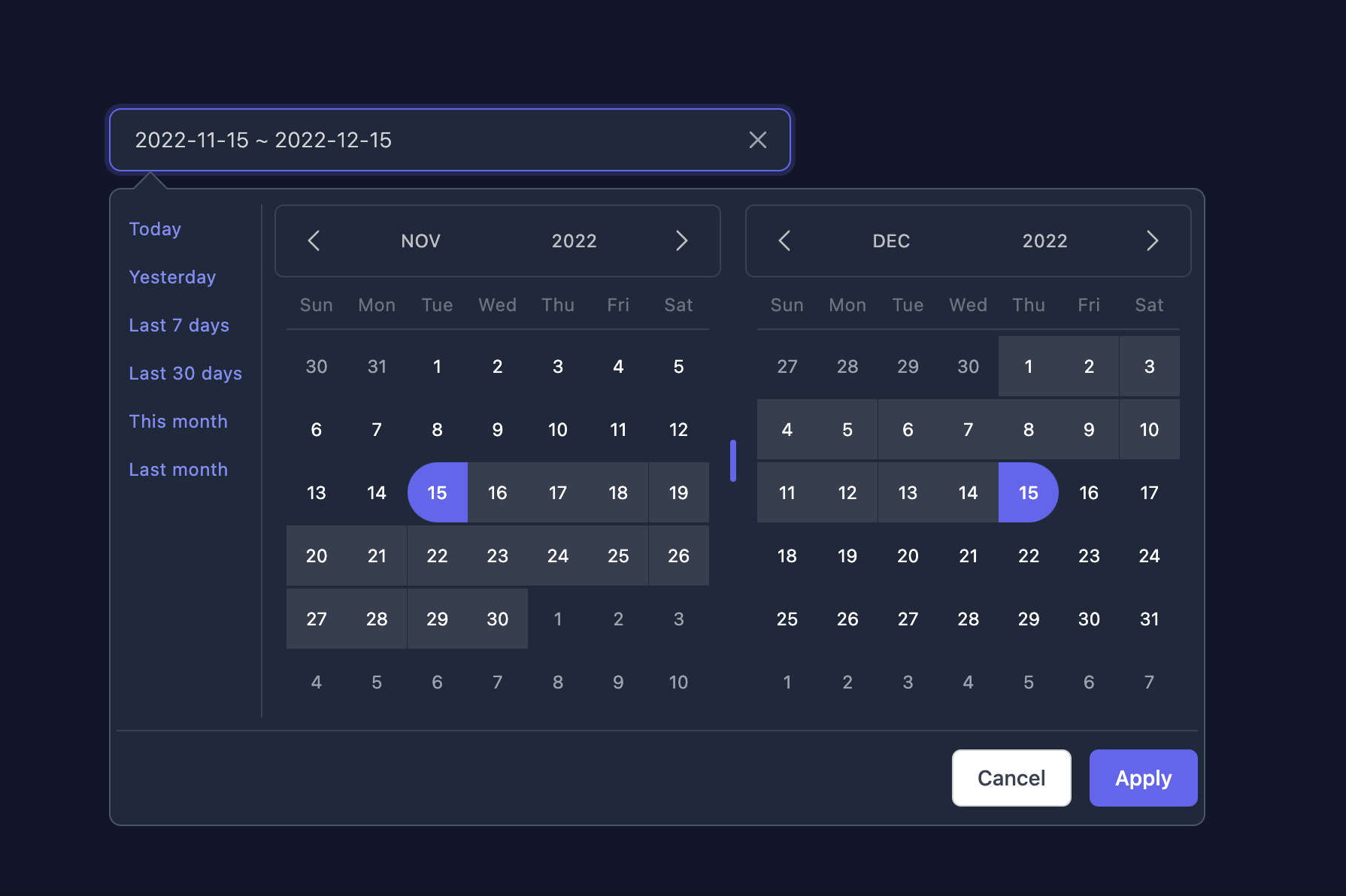
Dark Mode
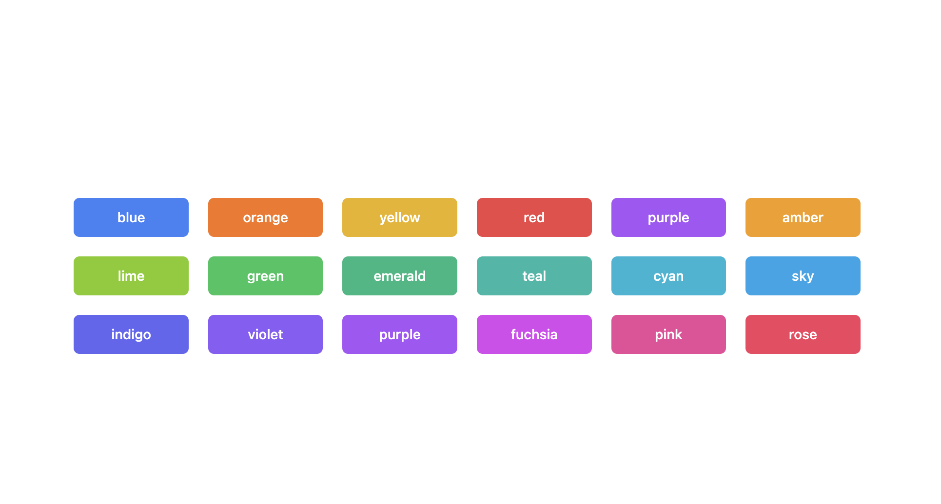
Supported themes
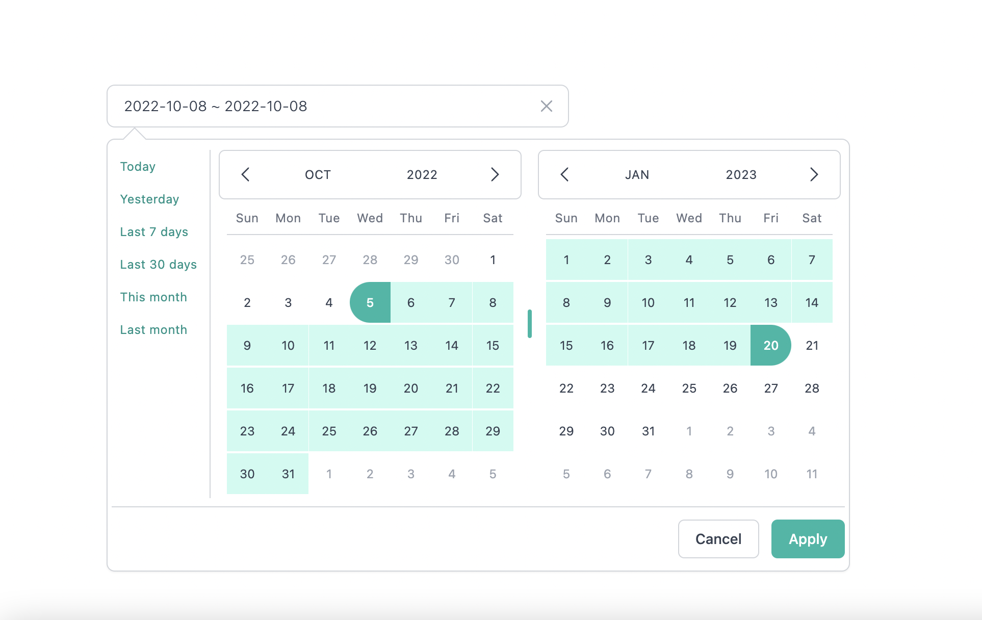
Teal themes example
You can find the demo at here
Info
👉 To discover the other possibilities offered by this library, you can consult the
full documentation.
PlayGround
Clone the master branch and run commands:
npm install && npm dev
yarn install && yarn dev
Open a browser and navigate to http://localhost:8888
Contributing
See
CONTRIBUTING.md
Official Documentation repo
Documentation
Thanks to
I thank you in advance for your contribution to this project.
License
MIT Licensed. Copyright (c) Anubhavjain786 2022.


