Research
/Security News
Intercom’s npm Package Compromised in Ongoing Mini Shai-Hulud Worm Attack
Compromised intercom-client@7.0.4 npm package is tied to the ongoing Mini Shai-Hulud worm attack targeting developer and CI/CD secrets.
react-aria
Advanced tools
A library of React Hooks that provides accessible UI primitives for your design system.
The easiest way to start building a component library with React Aria is by following our getting started guide. It walks through all of the steps needed to install the hooks from npm, and create your first component.
Here is a very basic example of using React Aria.
import {useButton} from '@react-aria/button';
function Button(props) {
let ref = React.useRef();
let {buttonProps} = useButton(props, ref);
return (
<button {...buttonProps} ref={ref}>
{props.children}
</button>
);
}
<Button onPress={() => alert('Button pressed!')}>Press me</Button>
React Aria is part of a family of libraries that help you build adaptive, accessible, and robust user experiences. Learn more about React Spectrum and React Stately on our website.
react-a11y is a package that provides accessibility warnings in the console during development. It helps developers identify and fix accessibility issues in their React components. Unlike react-aria, it does not provide hooks or components to manage ARIA attributes and interactions.
Reakit is a low-level component library for building accessible web apps. It provides primitive components that can be composed to create more complex UI elements. Reakit focuses on flexibility and composability, similar to react-aria, but offers a different API and set of components.
FAQs
Spectrum UI components in React
The npm package react-aria receives a total of 3,588,342 weekly downloads. As such, react-aria popularity was classified as popular.
We found that react-aria demonstrated a healthy version release cadence and project activity because the last version was released less than a year ago. It has 2 open source maintainers collaborating on the project.
Did you know?

Socket for GitHub automatically highlights issues in each pull request and monitors the health of all your open source dependencies. Discover the contents of your packages and block harmful activity before you install or update your dependencies.

Research
/Security News
Compromised intercom-client@7.0.4 npm package is tied to the ongoing Mini Shai-Hulud worm attack targeting developer and CI/CD secrets.

Research
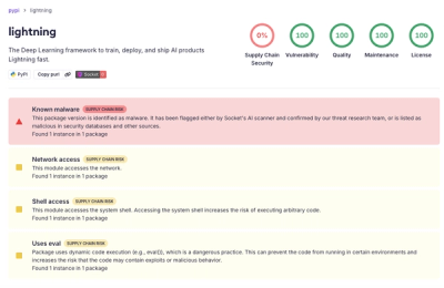
Socket detected a malicious supply chain attack on PyPI package lightning versions 2.6.2 and 2.6.3, which execute credential-stealing malware on import.

Research
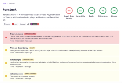
A brand-squatted TanStack npm package used postinstall scripts to steal .env files and exfiltrate developer secrets to an attacker-controlled endpoint.