
Product
Introducing .NET Support in Socket
Socket now supports .NET, bringing supply chain security and SBOM accuracy to NuGet and MSBuild-powered C# projects.
By Eli Insua, Rakesh Chatrath - Apr 21, 2025
react-bootstrap-tree-editor
Advanced tools

Read the official documentation.
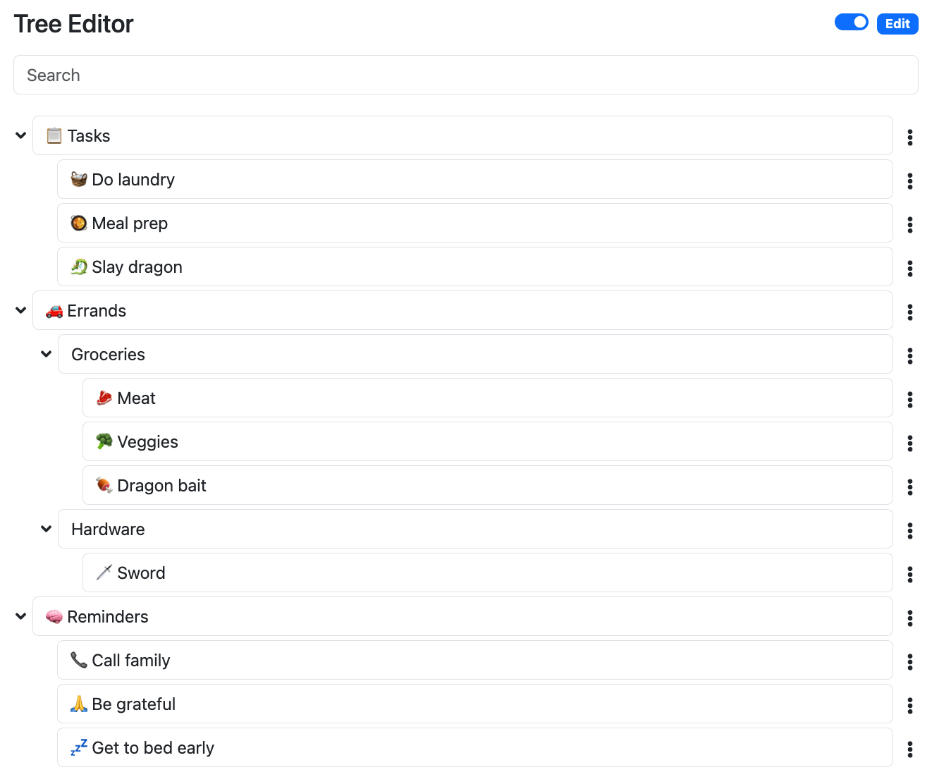
An interactive tree editor built on react-bootstrap and powered by versatile-tree.
If this project helped you, please consider buying me a coffee. Your support is much appreciated!


npm i react-bootstrap-tree-editor
It's highly recommended you check out the demo and its source to quickly get yourself up and running.
Import the following:
import {
  BasicTreeNodeComponent,
  defaultTreeControllerOptions,
  defaultTreeData,
  useTreeController,
  useTreeShortcuts,
  useTreeState,
} from 'react-bootstrap-tree-editor';
Inside your function component:
const treeOptions = defaultTreeControllerOptions;
const [tree, setTree] = useTreeState(defaultTreeData);
const treeController = useTreeController(tree, setTree, treeOptions);
const shortcuts = useTreeShortcuts(treeController, document);

// Ensure there's always at least one item to edit
React.useEffect(() => {
  if (!treeController.tree.hasChildren()) {
    const newNodeData = treeController.options.createNewData();
    const node = treeController.mutations.addChildNodeData(treeController.tree, newNodeData);
    treeController.focus.setFocusedNode(node);
  }
}, [treeController.focus, treeController.mutations, treeController.tree, treeController.options]);
Render the component:
<BasicTreeNodeComponent
  node={treeController.tree}
  treeController={treeController}
  editable={true}
  shortcuts={shortcuts}
  showBullets={false}
  showPointer={false}
/>
See also:
React.useState().By default, tree nodes have an ID with property name id, and titles with property name title. New node data is created with an ID set to a random v4 UUID. For example, e7a422f6-d6f0-4c71-8545-9b2c71c50491.
The default options can be imported via the following:
import { defaultTreeControllerOptions } from 'react-bootstrap-tree-editor';
To customize options, you can provide useTreeController with your own tree options. For example, let's suppose we'd like to use uid as the ID prop and name as the title prop, and generate our own custom IDs. To support this, you can create your own custom tree controller options like so:
// Custom ID generator
const customIdGenerator = () => `${Date.now()}`;

// Custom tree controller options
const customTreeControllerOptions = {
  idPropertyName: 'uid',
  titlePropertyName: 'name',
  createNewData: () => ({ uid: customIdGenerator(), name: '' }),
};

// ...
const treeController = useTreeController(tree, setTree, treeOptions);
Type definitions have been included for TypeScript support.
Favicon by Twemoji.
Open source software is awesome and so are you. 😎
Feel free to submit a pull request for bugs or additions, and make sure to update tests as appropriate. If you find a mistake in the docs, send a PR! Even the smallest changes help.
For major changes, open an issue first to discuss what you'd like to change.
If you found this project helpful, let the community know by giving it a star: 👉⭐
See LICENSE.md.
FAQs
An interactive tree editor built on react-bootstrap.
The npm package react-bootstrap-tree-editor receives a total of 32 weekly downloads. As such, react-bootstrap-tree-editor popularity was classified as not popular.
We found that react-bootstrap-tree-editor demonstrated a healthy version release cadence and project activity because the last version was released less than a year ago. It has 0 open source maintainers collaborating on the project.
Did you know?

Socket for GitHub automatically highlights issues in each pull request and monitors the health of all your open source dependencies. Discover the contents of your packages and block harmful activity before you install or update your dependencies.
Product
Socket now supports .NET, bringing supply chain security and SBOM accuracy to NuGet and MSBuild-powered C# projects.

Research
Malicious npm packages posing as Telegram bot libraries install SSH backdoors and exfiltrate data from Linux developer machines.

Security News
pip, PDM, pip-audit, and the packaging library are already adding support for Python’s new lock file format.