Security News
curl Shuts Down Bug Bounty Program After Flood of AI Slop Reports
A surge of AI-generated vulnerability reports has pushed open source maintainers to rethink bug bounties and tighten security disclosure processes.
react-chrono
Advanced tools

The Ultimate Timeline Component for React Applications
Build stunning, interactive timelines with rich media support, accessibility-first design, and comprehensive customization options
Timeline Modes & Layouts4 Flexible Modes • Nested Timelines • Responsive |
Rich Media & ContentImages • Videos • YouTube • Custom Components |
Theming & CustomizationDark Mode • 36 Properties • Google Fonts |
Developer ExperienceTypeScript • Zero Dependencies • Vanilla Extract |
User ExperienceSlideshow • Search • Keyboard Navigation |
Accessibility & i18nWCAG AA • 60+ i18n Elements • Mobile First |
React Chrono v3.0 represents a complete evolution of the timeline component with architectural improvements and powerful new features:
layout, interaction, content, display, media, animation, style, accessibility, i18n) for intuitive configuration and better IDE autocompletecardHeight: 'auto' for content-based sizingAll v2.x props remain fully supported with automatic mapping to the new grouped API, ensuring seamless upgrades without breaking changes.
Get started with React Chrono in seconds:
# Using npm
npm install react-chrono

# Using yarn
yarn add react-chrono

# Using pnpm (recommended)
pnpm add react-chrono
Requirements: React 18.2+ or 19+ | Node.js 22+ | TypeScript 4.0+ (optional) | Modern browsers
Browse interactive examples in Storybook.
Get started with just two lines of code:
import { Chrono } from 'react-chrono';

const items = [
  { title: 'May 1940', cardTitle: 'Dunkirk', cardDetailedText: 'Allied evacuation from France' },
  { title: 'June 1944', cardTitle: 'D-Day', cardDetailedText: 'Normandy invasion begins' }
];

<Chrono items={items} />
Horizontal Timeline with Custom Theme
<Chrono
  items={items}
  mode="horizontal"
  theme={{ primary: '#0070f3', cardBgColor: '#f5f5f5' }}
/>
Vertical Timeline with Media
const items = [
  {
    title: 'January 2024',
    cardTitle: 'Product Launch',
    cardDetailedText: 'Released version 3.0 with new features',
    media: {
      type: 'IMAGE',
      source: { url: 'https://example.com/launch.jpg' },
      name: 'Product launch event'
    }
  }
];

<Chrono items={items} mode="vertical" />
Alternating Timeline with Slideshow
<Chrono
  items={items}
  mode="alternating"
  animation={{
    slideshow: {
      enabled: true,
      duration: 3000,
      type: 'fade'
    }
  }}
/>
The new grouped API organizes configuration into logical sections for better discoverability and maintainability:
<Chrono
  items={items}
  mode="alternating"

  layout={{
    cardWidth: 450,
    cardHeight: 'auto',  // NEW: Automatic sizing based on content
    responsive: { enabled: true, breakpoint: 768 }
  }}

  content={{
    alignment: {  // NEW: Control content alignment
      horizontal: 'center',
      vertical: 'center'
    }
  }}

  interaction={{
    keyboardNavigation: true,
    pointClick: true,
    autoScroll: true
  }}

  display={{
    borderless: false,
    toolbar: { enabled: true, sticky: true }
  }}

  animation={{
    slideshow: { enabled: true, duration: 4000, type: 'fade' }
  }}

  theme={{
    primary: '#0070f3',
    cardBgColor: '#ffffff',
    cardTitleColor: '#1f2937'
  }}
/>
Quick Start Examples by Use Case:
// Corporate Timeline
<Chrono items={milestones} mode="horizontal" theme={{ primary: '#1a73e8' }} />

// Project Roadmap
<Chrono
  items={tasks}
  mode="vertical"
  display={{ toolbar: { enabled: true, sticky: true } }}
/>

// Photo Timeline with Auto Height
<Chrono
  items={memories}
  mode="alternating"
  layout={{ cardHeight: 'auto' }}  // Cards size automatically to content
  media={{ height: 300, fit: 'cover' }}
/>

// Documentation Timeline
<Chrono
  items={releases}
  mode="vertical"
  content={{ allowHTML: true, readMore: true }}
/>
🚀 Migration Made Easy: All existing v2.x props work alongside the new grouped API for seamless upgrades.
React Chrono offers four thoughtfully designed layout modes, each optimized for specific content types and user experiences:
Left-to-right chronological flow. Ideal for historical narratives and project phases where the journey matters.
Top-to-bottom scroll-friendly layout. Perfect for feeds, news timelines, and mobile experiences.
Cards alternate left and right of a central axis. Great for portfolios and company milestones with balanced visual rhythm.
Shows all timeline items at once. Perfect for dashboards, comparisons, and seeing the complete picture.
Vertical Mode - Scroll-friendly chronological flow:

Vertical Mode (High Text Density) - Compact view showing detailed information:

Alternating Mode - Cards alternate left and right with visual balance:

Dark Mode - Complete theme control with 36 customizable properties:

Horizontal All - Dashboard view showing complete timeline:

React Chrono requires minimal configuration to get started:
| Property | Type | Description |
|---|---|---|
items | TimelineItem[] | Array of timeline data |
mode | string | Layout mode: 'horizontal' | 'vertical' | 'alternating' | 'horizontal-all' |
theme | Theme | Customize colors and appearance |
Need complete prop documentation? See our comprehensive Props Reference
Images load intelligently using intersection observers - only when entering the viewport - ensuring fast initial loads even with dozens of high-resolution photos. Videos auto-play when timeline items become active, creating cinematic storytelling experiences. The component handles responsive sizing, buffering states, accessibility attributes, and performance optimization automatically.
Slideshow Mode: Auto-playing presentations with customizable durations, transition effects, and progress indicators - perfect for kiosks and guided storytelling.
Keyboard Navigation: Full accessibility with arrow keys for navigation, Home/End for quick jumps to first/last items, and Escape for closing modals. Smooth animations respect user motion preferences.
Real-time Search: Instantly highlights matching content across titles, descriptions, and metadata, helping users find specific events without losing context.
Adapt to any visual identity with a comprehensive theming system. Dark mode is a first-class feature with dedicated properties for shadows, glows, and interaction states. Google Fonts integration handles loading optimization and fallback strategies automatically, making typography customization effortless.
Customize every piece of user-facing text for any language or locale. The i18n system uses intelligent fallbacks - configure only what you need to change. Template strings support variable interpolation with full type safety.
<Chrono
  items={items}
  i18n={{
    texts: {
      navigation: { first: 'Premier élément', next: 'Suivant', previous: 'Précédent' },
      search: { placeholder: 'Rechercher dans la chronologie', noResults: 'Aucun résultat trouvé' }
    }
  }}
/>
Nested Timelines: Create multi-level narratives where major events contain detailed sub-timelines - ideal for historical periods, project phases, or biographical chapters.
Custom Components: Embed fully interactive React components within timeline cards - data visualizations, interactive maps, widgets, or custom UI elements.
Fundamentally adapts to each device: precision hover states and multi-column layouts on desktop, optimized touch targets on tablets, and content-prioritized interfaces on mobile with smart font sizing and spacing.
Upgrading is seamless with full backward compatibility:
// ✅ Both syntaxes work
<Chrono
  cardWidth={400}           // Legacy prop
  disableNavOnKey={false}   // Legacy prop
  theme={{ primary: '#blue' }}
/>

// 🚀 New grouped API (recommended)
<Chrono
  layout={{ cardWidth: 400 }}
  interaction={{ keyboardNavigation: true }}
  theme={{ primary: '#blue' }}
/>
🔗 Complete migration guide: Props Reference
Explore our comprehensive demo site with interactive examples. Run pnpm run dev locally to access:
# Clone the repository
git clone https://github.com/prabhuignoto/react-chrono.git
cd react-chrono

# Install dependencies
pnpm install
# Start development server with hot reload
pnpm run dev

# Build for production
pnpm run build

# Run unit tests
pnpm test

# Lint and format code
pnpm run clean
React Chrono uses a comprehensive testing approach:
We welcome contributions! Please see our Contributing Guide for details.
pnpm run find-bugspnpm run clean|
Core Technologies
|
Development Tools |
Love React Chrono? Help us grow!
⭐ Star on GitHub | 🐦 Follow on Twitter | 🐛 Report Issues
Made with ❤️ by Prabhu Murthy and contributors
FAQs
A Modern Timeline component for React
The npm package react-chrono receives a total of 11,023 weekly downloads. As such, react-chrono popularity was classified as popular.
We found that react-chrono demonstrated a healthy version release cadence and project activity because the last version was released less than a year ago. It has 1 open source maintainer collaborating on the project.
Did you know?

Socket for GitHub automatically highlights issues in each pull request and monitors the health of all your open source dependencies. Discover the contents of your packages and block harmful activity before you install or update your dependencies.

Security News
A surge of AI-generated vulnerability reports has pushed open source maintainers to rethink bug bounties and tighten security disclosure processes.

Product
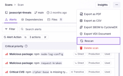
Scan results now load faster and remain consistent over time, with stable URLs and on-demand rescans for fresh security data.

Product
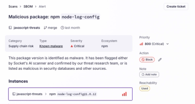
Socket's new Alert Details page is designed to surface more context, with a clearer layout, reachability dependency chains, and structured review.