react-columns


React component for rendering columns from a list of children with horizontal ordering
Installation
npm install --save react-columns
Features
- Static number of columns
- Dynamic number of columns based on media queries (matchMedia)
- Height aware ordering of items
- Put gap between columns
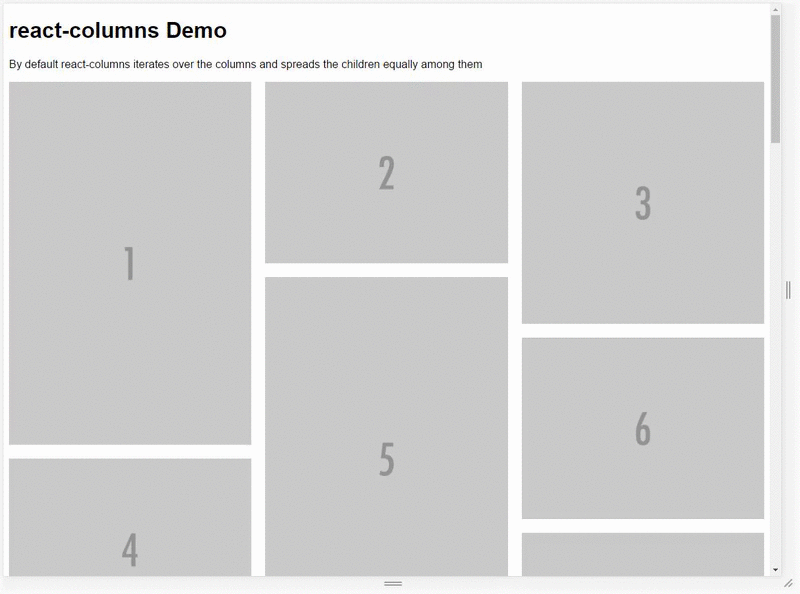
Demo
See this component in action
Usage
Simply pass a list of nodes to the <Columns> component and either set a fixed number of columns or pass in a set of media queries for it to respond to.
If you know the dimensions of your nodes upfront you can pass those in as a separate property and Columns will fill up the columns more intelligently by looping through the nodes and always adding it to the shortest column.
Using fixed number of columns
var Columns = require('react-columns');
function Component(){
  return (
  <Columns columns="5">
    <img src="http://placehold.it/800x1200?text=1" alt="" />
    <img src="http://placehold.it/800x600?text=2" alt="" />
    <img src="http://placehold.it/800x800?text=3" alt="" />
    <img src="http://placehold.it/800x600?text=4" alt="" />
    <img src="http://placehold.it/800x1200?text=5" alt="" />
    <img src="http://placehold.it/800x600?text=6" alt="" />
    <img src="http://placehold.it/800x400?text=7" alt="" />
    <img src="http://placehold.it/800x400?text=8" alt="" />
    <img src="http://placehold.it/800x400?text=9" alt="" />
    <img src="http://placehold.it/800x800?text=10" alt="" />
  </Columns>
  );
}
Using media queries to adjust the amount of columns
var Columns = require('react-columns');
function Component(){
  var queries = [{
    columns: 2,
    query: 'min-width: 500px'
  }, {
    columns: 3,
    query: 'min-width: 1000px'
  }];
  return (
  <Columns queries={queries}>
    <img src="http://placehold.it/800x1200?text=1" alt="" />
    <img src="http://placehold.it/800x600?text=2" alt="" />
    <img src="http://placehold.it/800x800?text=3" alt="" />
    <img src="http://placehold.it/800x600?text=4" alt="" />
    <img src="http://placehold.it/800x1200?text=5" alt="" />
    <img src="http://placehold.it/800x600?text=6" alt="" />
    <img src="http://placehold.it/800x400?text=7" alt="" />
    <img src="http://placehold.it/800x400?text=8" alt="" />
    <img src="http://placehold.it/800x400?text=9" alt="" />
    <img src="http://placehold.it/800x800?text=10" alt="" />
  </Columns>
  );
}
Using dimensions for more intelligent ordering
var Columns = require('react-columns');
function Component(){
  var dimensions = [
    { width:800, height: 1200 },
    { width: 800, height: 600 },
    { width: 800, height: 800 },
    { width: 800, height: 600 },
    { width: 800, height: 1200 },
    { width: 800, height: 600 },
    { width: 800, height: 400 },
    { width: 800, height: 400 },
    { width: 800, height: 400 },
    { width: 800, height: 800 },
  ];
  return (
  <Columns dimensions={dimensions}>
    <img src="http://placehold.it/800x1200?text=1" alt="" />
    <img src="http://placehold.it/800x600?text=2" alt="" />
    <img src="http://placehold.it/800x800?text=3" alt="" />
    <img src="http://placehold.it/800x600?text=4" alt="" />
    <img src="http://placehold.it/800x1200?text=5" alt="" />
    <img src="http://placehold.it/800x600?text=6" alt="" />
    <img src="http://placehold.it/800x400?text=7" alt="" />
    <img src="http://placehold.it/800x400?text=8" alt="" />
    <img src="http://placehold.it/800x400?text=9" alt="" />
    <img src="http://placehold.it/800x800?text=10" alt="" />
  </Columns>
  );
}
Properties
-
className {String} (default: '')
Lets you pass in a class for the most outer element of the component.
-
rootStyles {Object} (default: { overflowX: 'hidden' })
Styles applied to the most outer element. This avoids horizontal scrolling when using gap since the negative margin technique is used to create the gaps. You might want to remove this and handle it at a node higher up in the DOM tree.
-
columns {Number} (default: 3)
Sets the amount of columns statically.
-
queries {Array} (default: [])
Takes an array of objects defining how many columns should be used when a specific media query matches.
The last matching media query will be used, just like when you're writing CSS.
-
dimensions {Array} (default: [])
List of dimensions corresponding to the child nodes passed into the component
Columns calculates the aspect ratio and uses that to determine the relative heights of the nodes and columns. If you're dealing with images you can pass in the original size of the image.
-
gap {String} (default: 0px)
Gap between columns as number or string with unit.
License
MIT
v1.0.1 (January 07, 2017)
- Bug Fix
- Fix Travis build
- Re-add missing gh-pages module


