Security News
CISA Rebuffs Funding Concerns as CVE Foundation Draws Criticism
CISA denies CVE funding issues amid backlash over a new CVE foundation formed by board members, raising concerns about transparency and program governance.
react-core-ts
Advanced tools
The AutoComplete component offers a user-friendly input experience by presenting suggestions based on their input, allowing for efficient and interactive form filling. This component can work with both local and asynchronous data, and provides single and multi-select functionality.
Before you can use the AutoComplete component, ensure you've imported it properly.
npm install react-core-ts
import { AutoComplete } from 'react-core-ts';

function ExampleComponent() {
  return (
    <AutoComplete
      label="Search"
      onChange={handleChange}
      getData={fetchSuggestions}
      required={true}
      placeholder="Type to search..."
      type="auto_complete"
      async={true}
    />
  );
}
You can also use the ExpandableAutoComplete component, which will allow you to show all selected items and have the option to inline search.
import { ExpandableAutoComplete } from 'react-core-ts';

function ExampleExpandableComponent() {
  return (
    <ExpandableAutoComplete
      label="Search"
      onChange={handleChange}
      getData={fetchSuggestions}
      placeholder="Type to search..."
      type="auto_suggestion"
      selectedItems={selectedItems}
      async={true}
      isMultiple={true}
      expandable={true}
    />
  );
}
You can also use the AutoCompleteWithSelectedList component, which will allow you to show all selected items at the bottom part of the suggection box. Also enabled these features along with this component, selected items count, clear all and expand more and tab menu features
import { AutoCompleteWithSelectedList } from 'react-core-ts';

function ExampleSelectedListComponent() {
  return (
    <AutoCompleteWithSelectedList
      label="Search"
      onChange={handleChange}
      getData={fetchSuggestions}
      placeholder="Type to search..."
      type="auto_suggestion"
      selectedItems={selectedItems}
      async={true}
      isMultiple={true}
      countOnly={true}
    />
  );
}

function ExampleSelectedListWithTabComponent() {
  return (
    <AutoCompleteWithSelectedList
      label="Search"
      onChange={handleChange}
      getData={fetchSuggestions}
      placeholder="Type to search..."
      type="auto_suggestion"
      selectedItems={selectedItems}
      async={true}
      isMultiple={true}
      countOnly={true}
      typeOnlyFetch={true}
      tab={tabMenu}
    />
  );
}
You can pass the following props to the AutoComplete component:
getData function is asynchronous.No Results Found message.Show code at the right area of the dropdown items.Additional props for the ExpandableAutoComplete component:
10. If the text count is higher than this, it will show ... prefix.1. If more than this count is selected, then will show a + count more button with tooltip.Type to search.Additional props for the AutoCompleteWithSelectedList component:
async: true.{id: nummber | string, label: string }2. If more than this count is selected, then will show the scroll bar.If you'd like to contribute to the improvement of the AutoComplete component, please follow the standard contribution guidelines for this project. Your feedback and contributions are valuable!
FAQs
React Components
We found that react-core-ts demonstrated a healthy version release cadence and project activity because the last version was released less than a year ago. It has 1 open source maintainer collaborating on the project.
Did you know?

Socket for GitHub automatically highlights issues in each pull request and monitors the health of all your open source dependencies. Discover the contents of your packages and block harmful activity before you install or update your dependencies.

Security News
CISA denies CVE funding issues amid backlash over a new CVE foundation formed by board members, raising concerns about transparency and program governance.

Product
We’re excited to announce a powerful new capability in Socket: historical data and enhanced analytics.

Product
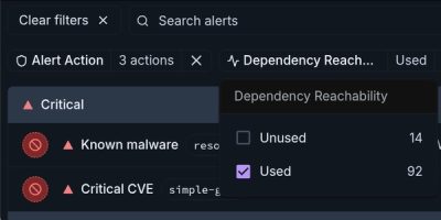
Module Reachability filters out unreachable CVEs so you can focus on vulnerabilities that actually matter to your application.