Security Fundamentals
Turtles, Clams, and Cyber Threat Actors: Shell Usage
The Socket Threat Research Team uncovers how threat actors weaponize shell techniques across npm, PyPI, and Go ecosystems to maintain persistence and exfiltrate data.
react-core-ts
Advanced tools
The AutoComplete component offers a user-friendly input experience by presenting suggestions based on their input, allowing for efficient and interactive form filling. This component can work with both local and asynchronous data, and provides single and multi-select functionality.
Before you can use the AutoComplete component, ensure you've imported it properly.
npm install react-core-ts
import { AutoComplete } from 'react-core-ts';

function ExampleComponent() {
  return (
    <AutoComplete
      label="Search"
      onChange={handleChange}
      getData={fetchSuggestions}
      required={true}
      placeholder="Type to search..."
      type="auto_complete"
      async={true}
    />
  );
}
You can also use the ExpandableAutoComplete component, which will allow you to show all selected items and have the option to inline search.
import { ExpandableAutoComplete } from 'react-core-ts';

function ExampleExpandableComponent() {
  return (
    <ExpandableAutoComplete
      label="Search"
      onChange={handleChange}
      getData={fetchSuggestions}
      placeholder="Type to search..."
      type="auto_suggestion"
      selectedItems={selectedItems}
      async={true}
      isMultiple={true}
      expandable={true}
    />
  );
}
You can also use the AutoCompleteWithSelectedList component, which will allow you to show all selected items at the bottom part of the suggection box. Also enabled these features along with this component, selected items count, clear all and expand more and tab menu features
import { AutoCompleteWithSelectedList } from 'react-core-ts';

function ExampleSelectedListComponent() {
  return (
    <AutoCompleteWithSelectedList
      label="Search"
      onChange={handleChange}
      getData={fetchSuggestions}
      placeholder="Type to search..."
      type="auto_suggestion"
      selectedItems={selectedItems}
      async={true}
      isMultiple={true}
      countOnly={true}
    />
  );
}

function ExampleSelectedListWithTabComponent() {
  return (
    <AutoCompleteWithSelectedList
      label="Search"
      onChange={handleChange}
      getData={fetchSuggestions}
      placeholder="Type to search..."
      type="auto_suggestion"
      selectedItems={selectedItems}
      async={true}
      isMultiple={true}
      countOnly={true}
      typeOnlyFetch={true}
      tab={tabMenu}
    />
  );
}
You can pass the following props to the AutoComplete component:
getData function is asynchronous."No Results Found message.Additional props for the ExpandableAutoComplete component:
10. If the text count is higher than this, it will show ... prefix.1. If more than this count is selected, then will show a + count more button with tooltip.Type to search.Additional props for the AutoCompleteWithSelectedList component:
async: true.{id: nummber | string, label: string }2. If more than this count is selected, then will show the scroll bar.If you'd like to contribute to the improvement of the AutoComplete component, please follow the standard contribution guidelines for this project. Your feedback and contributions are valuable!
FAQs
React Components
The npm package react-core-ts receives a total of 454 weekly downloads. As such, react-core-ts popularity was classified as not popular.
We found that react-core-ts demonstrated a healthy version release cadence and project activity because the last version was released less than a year ago. It has 1 open source maintainer collaborating on the project.
Did you know?

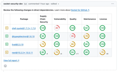
Socket for GitHub automatically highlights issues in each pull request and monitors the health of all your open source dependencies. Discover the contents of your packages and block harmful activity before you install or update your dependencies.

Security Fundamentals
The Socket Threat Research Team uncovers how threat actors weaponize shell techniques across npm, PyPI, and Go ecosystems to maintain persistence and exfiltrate data.

Security News
At VulnCon 2025, NIST scrapped its NVD consortium plans, admitted it can't keep up with CVEs, and outlined automation efforts amid a mounting backlog.

Product
We redesigned our GitHub PR comments to deliver clear, actionable security insights without adding noise to your workflow.