A fully customizable custom react rating component
Customizable react star ratings. It allows use of different precisions and supports custom icon like heart icon
npm install react-custom-rating-component
Or
yarn add react-custom-rating-component
Motivation
I wanted a star rating component that was highly customizable and could do half stars, and I wanted it to be declarative. I couldn't find one that I liked, so I made one.
Demo
Check out the playground with different use cases Play Ground
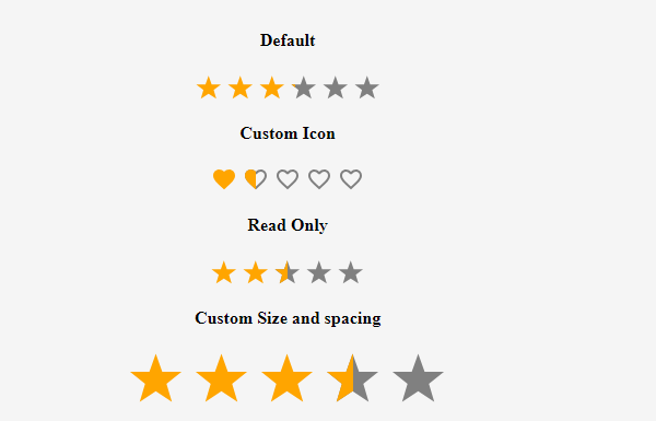
Demo Example Image
Usage
import { Rating } from 'react-custom-rating-component'

const App = () => {
  return (
    <div
      style={{
        display: 'flex',
        justifyContent: 'center',
        alignItems: 'center',
        margin: '40px 20px',
      }}
    >
      <Rating
        defaultValue={2.5}
        size='30px'
        spacing='10px'
        activeColor='red'
        onChange={(newRating) => console.log('newRating', newRating)}
        onHover={(hoveredRating) => console.log('hoveredRating', hoveredRating)}
      />
    </div>
  )
}
All Props
| Prop | Type | Default | Description |
|---|
defaultValue | string | 0 | Required. This is the value of the rating displayed by default. Supply this if your rating is also a readOnly |
precision | number | 1 | The value to increment rating when hovered or clicked |
count | number | 5 | The number of Icons to display |
shape | star or heart | star | This is the shape displayed as icon |
onChange | function | - | This is the function that is called when the rating value changes |
onHover | function | - | This is the function that is called when the rating Icon is hovered |
className | string | '' | classes passed to the parent component |
readOnly | boolean | false | This sets the component to be non editable |
size | string | 24px | This defines the size of the Icons used |
spacing | string | 5px | This defines the fap between the Icons used |
activeColor | string | orange | This is the color of the icon in the active state |
defaultColor | string | gray | This is the color of the icon in the inactive state |
titleArray | string[] | ['Poor', 'Good', 'Very Good', 'Best', 'Excellent'] | These are displayed as titles when icons are hovered |
showTitle | boolean | false | This defines whether to display the titles or not |
Browser Support
This library is supported by all the major browsers. If you find any issues please raise an issue on the repo and I will attend to it as soon as possible.
Contribute
If you have any ideas on how to make this library better, please feel free to contribute by raising a PR or an issue. I will be happy to review and merge.


