Security News
curl Shuts Down Bug Bounty Program After Flood of AI Slop Reports
A surge of AI-generated vulnerability reports has pushed open source maintainers to rethink bug bounties and tighten security disclosure processes.
react-datagrid
Advanced tools
A carefully crafted DataGrid for React
See demo at zippyui.github.io/react-datagrid
$ npm install react-datagrid --save
See changelog
Please include the stylesheet index.css in your project. If you are using webpack with css-loader, you can require it: require('react-datagrid/index.css')
For optimal performance, make sure you use react-datagrid with the production version of React, not the dev version. The dev version contains a lot of checks, which slow down grid scrolling/rendering quite a bit.
Of course for development, you can use React dev version, but this is just a warning so you won't be put off if you see some jank in dev mode. It will dissapear when you switch to production (minified) version. We are working on this, to make the datagrid usage experience as optimal as possible even in development.
var React = require('react')
var DataGrid = require('react-datagrid')

var data = [
  { id: '1', firstName: 'John', lastName: 'Bobson'},
  { id: '2', firstName: 'Bob', lastName: 'Mclaren'}
]
var columns = [
  { name: 'firstName'},
  { name: 'lastName'}
]

<DataGrid idProperty="id" dataSource={data} columns={columns} />
For more examples, see examples site
There are a lot of props that can be configured for the datagrid. We'll try to categorize them so they are easy to follow
dataSource: Array/String/Function/Promise - for local data, an array of object to render in the grid. For remote data, a string url, or a function that returns a promise.idProperty: String - the name of the property where the id is found for each object in the data arraycolumns: Array - an array of columns that are going to be rendered in the gridEach column should have a name property, and optionally a title property. If no title property is specified, a humanized version of the column name will be used.
name: String
title: String/ReactElement - a title to show in the header. If not specified, a humanized version of name will be used. Can be a string or anything that React can render, so you can customize it as you please.
render: Function - if you want custom rendering, specify this property
var columns = [
  { name: 'index', render: function(v){return 'Index ' + v} }
]
style: Object - if you want cells in this column to be have a custom style
textAlign: String - one of 'left', 'right', 'center'
Sorting the data array is not done by the grid. You can however pass in sort info so the grid renders with sorting icons as needed
Example
var sortInfo = [{name: 'firstName', dir: 'asc'}]
var sorty = require('sorty')
//sorty is a package which sorts an array on multiple properties

function sort(arr){
  return sorty(sortInfo, arr)
}

function onSortChange(info){
  sortInfo = info
  data = sort(data)
  //now refresh the grid
}

var data = [...]

data = sort(data)
<DataGrid
  sortInfo={sortInfo}
  onSortChange={onSortChange}
  dataSource={data} idProperty='id' columns={columns} />
Column customization/styling can be done with different properties on the column object:
style: Object - a style object to be applied to all cells in this columntextAlign: String - one of 'left', 'right', 'center'className: String - a className to be applied to all cells in this column.render: Function(value, data, cellProps) - if you want custom rendering, specify this property var columns = [
{ name: 'index', render: function(v){return 'Index ' + v} }
]
The column.render function is called with 3 args:
data[column.name])Example:
var data = [...]
var columns = [
  {
    name: 'firstName',
    className: 'first-column',
    textAlign: 'center',
    style: { fontWeight: 'bold' }
  },
  {
    name: 'lastName',
    render: function(value){
      return <span>
        <b>Last name:</b> value
      </span>
    }
]
<DataGrid idProperty="id" dataSource={data} columns={columns} />
When a column is shown/hidden, you can be notified using the onColumnVisibilityChange callback prop.
onColumnVisibilityChange: Function(column, visibility)You can specify a column is visible/hidden with the following props on column objects:
onColumnVisibilityChange)If you prefer to use the "hidden" alternatives, you can use defaultHidden and hidden.
If you want to enable column reordering, just specify the onColumnOrderChange prop on the grid:
onColumnOrderChange: Function(index, dropIndex)
Example
function handleColumnOrderChange(index, dropIndex){
  var col = columns[index]
  columns.splice(index, 1) //delete from index, 1 item
  columns.splice(dropIndex, 0, col)
  this.setState({})
}

<DataGrid onColumnOrderChange={handleColumnOrderChange} />
rowStyle: Object/Function - you can specify either a style object to be applied to all rows, or a function. The function is called with (data, props) (so you have access to props.index for example) and is expected to return a style object.
rowProps: Object - props to be passed to all rows
rowProps.overClassName - a css class name to be applied when mouse is over the rowrowProps.selectedClassNamerowProps.classNamerowFactory: Function - a factory function for rows. It can return undefined if you only want to change the props object passed to the function and rely on the default rendering.
For an example, see examples/restore-grid-state
When you have remote data, pagination is setup by default. If you want to disable pagination, specify the pagination prop with a false value.
defaultPageSize. When pageSize changes, onPageSizeChange(pageSize) is calleddefaultPage. When page changes, onPageChange(page) is calledUse Github issues for feature requests and bug reports.
We actively welcome pull requests.
For setting up & starting the project locally, use:
$ git clone https://github.com/zippyui/react-datagrid
$ cd react-datagrid
$ npm install
$ npm run dev # or npm run hot
Now navigate to localhost:9090
If you want to have react-hot-loader enabled, and see code changes pushed instantly, without losing page state, use npm run hot instead of npm run dev.
Before building a new version, make sure you run
$ npm run build
which compiles the src folder (which contains jsx files) into the lib folder (only valid EcmaScript 5 files).
FAQs
React DataGrid
The npm package react-datagrid receives a total of 413 weekly downloads. As such, react-datagrid popularity was classified as not popular.
We found that react-datagrid demonstrated a not healthy version release cadence and project activity because the last version was released a year ago. It has 1 open source maintainer collaborating on the project.
Did you know?

Socket for GitHub automatically highlights issues in each pull request and monitors the health of all your open source dependencies. Discover the contents of your packages and block harmful activity before you install or update your dependencies.

Security News
A surge of AI-generated vulnerability reports has pushed open source maintainers to rethink bug bounties and tighten security disclosure processes.

Product
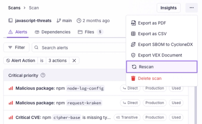
Scan results now load faster and remain consistent over time, with stable URLs and on-demand rescans for fresh security data.

Product
Socket's new Alert Details page is designed to surface more context, with a clearer layout, reachability dependency chains, and structured review.