Product
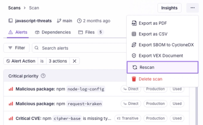
Introducing Immutable Scans
Scan results now load faster and remain consistent over time, with stable URLs and on-demand rescans for fresh security data.
By Nolan Lawson - Jan 23, 2026
react-date-field
Advanced tools
React DateField
Input integration for react-date-picker.
$ npm i --save react-date-field
import DatePicker from 'react-date-picker'
import DateField from 'react-date-field'

import 'react-date-picker/index.css'

let value = ...

<DateField>
  <DatePicker date={value} onChange={this.onChange} />
</DateField>
For the basic setup, you don't need to configure the DateField with any additional props. Only render a DatePicker inside it.
displayFormat: String - the display in which dates will be displayed in the input. If none specified, the dateFormat from DatePicker will be used.renderInput: Function - you can use the renderInput function to render your own input field. This function will be called with all the necessary props to render the input. You can change the props, and return undefined to allow the default rendering logic go through, or you can return something different than undefined to render whatever you want. By default, the field that will be rendered is readOnlyclearIcon: Boolean/ReactNode - Defaults to true. If false, no clear icon will be rendered. If a ReactNode is specified, it will be rendered.renderClearIcon: Function - a function to render a custom clear icon.renderCalendarIcon: Function - a function to render a custom calendar icon.expandOnFocus: Boolean - defaults to true.collapseOnChange: Boolean - defaults to true.expanded: Boolean - if you want to control the expanded prop (when this is true, the picker is visible). Generally you won't need to specify this.defaultExpanded: Boolean - defaults to false. Uncontrolled version of expandedonFocus: FunctiononBlur: FunctionYou don't have an onChange prop on the DateField. Instead, use the onChange you specify on the DatePicker.
If you render a <DateField /> with a clear icon, when the user clicks the icon, the onChange function of the picker will be called like onChange('', null, event) - dateText as empty string, moment instance as null and the additional event.
Please use react-date-field with the latest version of react-date-picker. Inside the field, you need to render the picker, which only works correctly if the picker has a default prop isDatePicker: true. This means you could provide your own date picker, as long as it has such a property and it exposes the same signature to the onChange prop/method.
FAQs
React DateField
The npm package react-date-field receives a total of 158 weekly downloads. As such, react-date-field popularity was classified as not popular.
We found that react-date-field demonstrated a not healthy version release cadence and project activity because the last version was released a year ago. It has 3 open source maintainers collaborating on the project.
Did you know?

Socket for GitHub automatically highlights issues in each pull request and monitors the health of all your open source dependencies. Discover the contents of your packages and block harmful activity before you install or update your dependencies.
Product
Scan results now load faster and remain consistent over time, with stable URLs and on-demand rescans for fresh security data.
Product
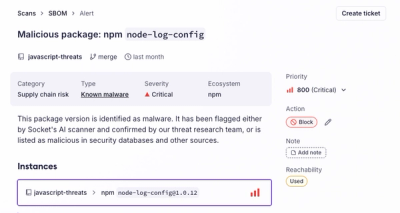
Socket's new Alert Details page is designed to surface more context, with a clearer layout, reachability dependency chains, and structured review.
Product
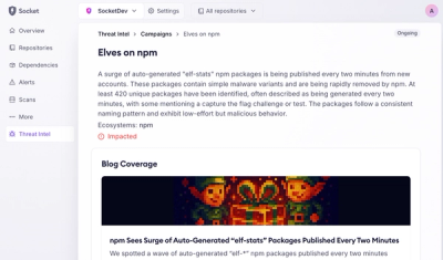
Campaign-level threat intelligence in Socket now shows when active supply chain attacks affect your repositories and packages.