Product
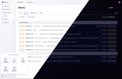
A Fresh Look for the Socket Dashboard
We’ve redesigned the Socket dashboard with simpler navigation, less visual clutter, and a cleaner UI that highlights what really matters.
react-email-components
Advanced tools
A collection of React components to help build consistent cross-client emails. As well as the layout components, there is a function that inlines your styles before the page is rendered.
A collection of React components to help build consistent cross-client emails. As well as the layout components, there is a function that inlines your styles before the page is rendered.
Note: This was built for a Stylus workflow, additional work will have to be done to get this working with vanilla CSS or another preprocessor.
ReactEmailComponents is split up into two modules:
react-email-componentsreact-email-components-stylusAlthough they are both necessary, their setup is entirely different and therefore separated. To get started, follow the steps below for each.
This module contains all of the React components necessary to get ReactEmailComponents to work.
Install using NPM or Yarn:
npm install react-email-components
Import the desired components into your React app:
import { Container, Block, Row, Column, Spacer } from 'react-email-components'
This module contains all of the Stylus necesssary to get ReactEmailComponents to work.
Install using NPM or Yarn:
npm install react-email-components-stylus
Require the Stylus module in your main stylesheet:
@require 'react-email-components-stylus'
There are 5 layout components: Container, Block, Row, Column and Spacer. All of the components have different uses, and are configured to speed up the development process and mess of creating table-based layouts.
The Container component should be used as a direct child of the <body>. It is a single-use component and only has one function: to center your email within a fixed width container.
Example
<body>
  <Container width={600}>
    …
  </Container>
</body>
This component creates a faux body which can be styled by targetting the .container class. The inner content (the centered bit) can be styled by targetting the .container__inner class.
Props
width - Specify a maximum width for the inner content as a number. This width should ideally be the same as your desktop breakpoint on responsive emails.
The Block component can be used to divide content. Blocks are always the same width as their parent.
Example
<Block className="header" padding={[ 10, 20 ]}>
  <Block className="logo" align="center" valign="middle">
    <img src="…" alt="…" />
  </Block>
</Block>
Props
className - Specify classes for your Block as a string.
padding - Specify padding for your Block as an array. Padding can be applied in a similar way to standard CSS, for example: {[ 10, 50, 20 ]} is the shorthand way of saying {[ 10, 50, 20, 50 ]}.
align - Specify the horizontal alignment of your Block as a string. This can be: left, center or right.
valign - Specify the vertical alignment of your Block as a string. This can be: top, middle or bottom.
The Row component is the first part of a grid-based layout. It must be used to contain Column components.
Example
<Row className="row" padding={[ 20 ]}>
  <Column>
    …
  </Column>
  <Column>
    …
  </Column>
</Row>
Props
className - Specify classes for your Row as a string.
padding - Specify padding for your Row as an array. Padding can be applied in a similar way to standard CSS, for example: {[ 10, 50, 20 ]} is the shorthand way of saying {[ 10, 50, 20, 50 ]}.
reverse - Specify if the columns within the Row should be reversed in order.
The Column component is the second part of a grid-based layout. It must be wrapped in a Row.
Example
<Row>
  <Column className="one-half" padding={[ 10 ]}>
    …
  </Column>
  <Column className="one-half" padding={[ 10 ]}>
    …
  </Column>
</Row>
Props
className - Specify classes for your Column as a string.
padding - Specify padding for your Column as an array. Padding can be applied in a similar way to standard CSS, for example: {[ 10, 50, 20 ]} is the shorthand way of saying {[ 10, 50, 20, 50 ]}.
align - Specify the horizontal alignment of your Column as a string. This can be: left, center or right.
valign - Specify the vertical alignment of your Column as a string. This can be: top, middle or bottom.
fullDesktop - Specify whether this column is supposed to be full width on desktop clients. Although this does not do the necessary styling for a full width column, it adds conditional comments necessary for full width columns on Outlook.
The Spacer component can be used to add vertical space between elements where padding is not available.
Example
<h1>Welcome</h1>
<Spacer height={20} />
<p>This is a test email</p>
Props
className - Specify classes for your Spacer as a string.
height - Specify the height for your Spacer as a number.
In order to render your email as HTML with inline styles, you must use the renderHTML function built into ReactEmailComponents.
Example
import { renderHTML } from 'react-email-components'
import Email from './Email'
import css from './style.css'

const options = {
  extraCss: css
}

renderHTML(<Email>, options)
The renderHTML function requires a React component to render and some CSS to inline. In the example above, we are importing our main Email component and our processed/vanilla CSS.
Options
The options that you can specify are for Juice - the tool we are using to inline CSS. For a full list of options, check out Juice's documentation: https://github.com/Automattic/juice#options
FAQs
A collection of React components to help build consistent cross-client emails. As well as the layout components, there is a function that inlines your styles before the page is rendered.
The npm package react-email-components receives a total of 180 weekly downloads. As such, react-email-components popularity was classified as not popular.
We found that react-email-components demonstrated a not healthy version release cadence and project activity because the last version was released a year ago. It has 1 open source maintainer collaborating on the project.
Did you know?

Socket for GitHub automatically highlights issues in each pull request and monitors the health of all your open source dependencies. Discover the contents of your packages and block harmful activity before you install or update your dependencies.

Product
We’ve redesigned the Socket dashboard with simpler navigation, less visual clutter, and a cleaner UI that highlights what really matters.

Industry Insights
Terry O’Daniel, Head of Security at Amplitude, shares insights on building high-impact security teams, aligning with engineering, and why AI gives defenders a fighting chance.

Security News
MCP spec updated with structured tool output, stronger OAuth 2.1 security, resource indicators, and protocol cleanups for safer, more reliable AI workflows.