You're Invited:Meet the Socket Team at BlackHat and DEF CON in Las Vegas, Aug 4-6.RSVP →
react-error-boundaries
Advanced tools
react-error-boundaries - npm Package Compare versions
Comparing version 0.1.1 to 0.1.2
| { | ||
| "name": "react-error-boundaries", | ||
| "version": "0.1.1", | ||
| "version": "0.1.2", | ||
| "description": "React HOC for error boundaries.", | ||
@@ -5,0 +5,0 @@ "main": "index.js", |
104
README.md
@@ -1,53 +0,77 @@ | ||
| # react-popconfirm | ||
| # react-error-boundaries | ||
| [](http://npm.im/react-popconfirm) | ||
| [](http://npm-stat.com/charts.html?package=react-popconfirm&from=2017-04-07) | ||
| [](http://opensource.org/licenses/MIT) | ||
| [](http://npm.im/react-popconfirm) | ||
| [](http://npm-stat.com/charts.html?package=react-popconfirm&from=2017-04-07) | ||
| [](http://opensource.org/licenses/MIT) | ||
| A popover confirm dialog for react, [react-bootstrap](https://react-bootstrap.github.io/components.html#popovers) and [react-confirm](https://github.com/haradakunihiko/react-confirm) are used with. | ||
| Base on React 16.2.0, babel required: | ||
| 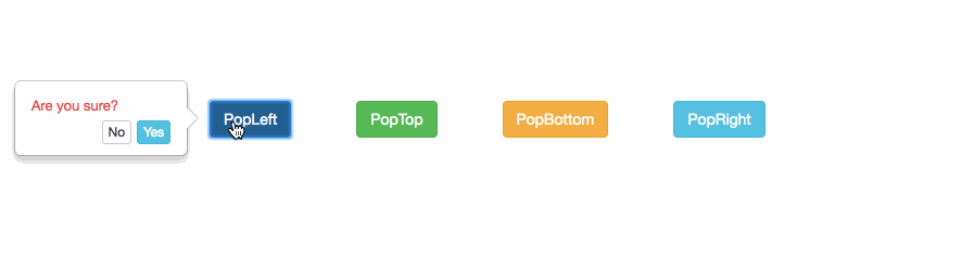 | ||
| ```json | ||
| { | ||
| "presets": [ | ||
| "stage-3", | ||
| "react" | ||
| ], | ||
| "plugins": [ | ||
| "transform-decorators-legacy", | ||
| "transform-class-properties", | ||
| "transform-object-rest-spread" | ||
| ] | ||
| } | ||
| ``` | ||
| ## Usage | ||
| Use as a component container: | ||
| ```js | ||
| // import first | ||
| import PopConfirm from 'react-popconfirm' | ||
| import React from 'react' | ||
| import ReactDOM from 'react-dom' | ||
| import ErrorBoundary from 'react-error-boundaries' | ||
| const App = () => { | ||
| return ( | ||
| <ErrorBoundary> | ||
| <YourComponents /> | ||
| </ErrorBoundary> | ||
| ); | ||
| } | ||
| // call it! | ||
| /** | ||
| * options: | ||
| * { | ||
| * element, // require | ||
| * confirmation, // require | ||
| * placement = 'top', // require | ||
| * okLabbel = 'Yes', // optional (default 'Yes') | ||
| * cancelLabel = 'No', // optional (default 'No') | ||
| * positionLeft, // optional (auto calculate by element position and width,height) | ||
| * positionTop, // optional (auto calculate by element position and width,height) | ||
| * width = 160, // optional (default 160) | ||
| * height = 70 // optional (default 70) | ||
| * confirmationColor = '#e83f3f', // optional (default '#e83f3f') | ||
| * okStyle = 'info', // optional (default 'info', available: default|primary|success|info|warning|danger|link) | ||
| * cancelStyle = 'default' // optional (default 'default', available: default|primary|success|info|warning|danger|link) | ||
| * } | ||
| */ | ||
| PopConfirm({ | ||
| confirmation:'Are you sure?', | ||
| okLabbel: 'Yes', | ||
| cancelLabel: 'No', | ||
| placement:'top', | ||
| element:target // target is the element you clicked | ||
| }).then( | ||
| (result) => { | ||
| // `proceed` callback | ||
| console.log('proceed called'); | ||
| }, | ||
| (result) => { | ||
| // `cancel` callback | ||
| console.log('cancel called'); | ||
| ReactDOM.render(<App />, document.getElementById('root')); | ||
| ``` | ||
| Use as class decorator: | ||
| ```js | ||
| // import first | ||
| import { errorHandlerDecorator } from 'react-error-boundaries' | ||
| @errorHandlerDecorator | ||
| export default class FilterableProductTable extends React.PureComponent { | ||
| constructor(props) { | ||
| super(props); | ||
| } | ||
| render() { | ||
| return ( | ||
| <div> | ||
| contents | ||
| </div> | ||
| ); | ||
| } | ||
| } | ||
| ``` | ||
| Define your errorCallback function and FallbackComponent: | ||
| ```js | ||
| // import first | ||
| import { withErrorHandler } from 'react-error-boundaries' | ||
| const yourErrorHandler = withErrorHandler( | ||
| errorCallback, // report Error to service | ||
| FallbackComponent // Component to display errors | ||
| ) | ||
| // nothing will be called when `dismiss` is triggered. | ||
| ``` | ||
@@ -54,0 +78,0 @@ |
@@ -52,4 +52,3 @@ // Fallback.jsx | ||
| export default function Fallback(props) { | ||
| const { error, errorInfo, closeErrorModal, ..._props } = props; | ||
| console.log('Fallback.props', props);////// | ||
| const { error, errorInfo, closeErrorModal } = props; | ||
@@ -61,25 +60,19 @@ return ( | ||
| <div> | ||
| <h2>Something went wrong.</h2> | ||
| <hr /> | ||
| <p> | ||
| ErrorMessage | ||
| </p> | ||
| <pre style={{...preSty, color: '#ff0404'}}>{error.message}</pre> | ||
| <hr /> | ||
| <p> | ||
| Stack | ||
| </p> | ||
| <pre style={{...preSty, color: '#ff0404'}}>{error.stack}</pre> | ||
| <hr /> | ||
| <p> | ||
| ComponentStack | ||
| </p> | ||
| <pre style={{...preSty, color: '#f3d429'}}>{errorInfo.componentStack}</pre> | ||
| <hr /> | ||
| {/* <p> | ||
| Props | ||
| </p> | ||
| <details style={detailSty}> | ||
| <pre>{_props && stringify(_props)}</pre> | ||
| </details> */} | ||
| <h2>Something went wrong.</h2> | ||
| <hr /> | ||
| <p> | ||
| ErrorMessage | ||
| </p> | ||
| <pre style={{...preSty, color: '#ff0404'}}>{error.message}</pre> | ||
| <hr /> | ||
| <p> | ||
| Stack | ||
| </p> | ||
| <pre style={{...preSty, color: '#ff0404'}}>{error.stack}</pre> | ||
| <hr /> | ||
| <p> | ||
| ComponentStack | ||
| </p> | ||
| <pre style={{...preSty, color: '#f3d429'}}>{errorInfo.componentStack}</pre> | ||
| <hr /> | ||
| </div> | ||
@@ -86,0 +79,0 @@ </div> |
No alert changes
Improved metrics
- Number of lines in readme file
93
34.78%Worsened metrics
- Total package byte prevSize
18661
-3.31%- Lines of code
437
-1.58%No dependency changes