React Font Awesome Icon Picker
Overview
react-fa-icon-picker is a strongly typed React icon picker for font-awesome icons. It contains both a picker component and an icon renderer.
The icons are also strongly typed.
Motivation
I feel like an icon picker is a pretty common requirement so I was surprised to find a lack of sufficient icon pickers in the React Ecosystem. The existing ones I found were not that great. As a result, I decided to roll my own.
Installation
Install via npm
npm install react-fa-icon-picker
or yarn
yarn add react-fa-icon-picker
Usage
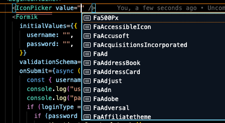
The IconPicker component is just like any other picker component. The value prop is the icon that is displayed on the picker. When a new icon is selected, the onChange handler is fired.
import * as React from 'react'
import { IconPicker } from 'react-fa-icon-picker'

export default () => {
  const [value, setValue] = useState("")
  return (
    <IconPicker value={value} onChange={(v) => setValue(v)} />
  )
}
You can also use the IconPickerItem component to render the icon. This uses react-icons under the hood.
import * as React from 'react'
import { IconPickerItem } from 'react-fa-icon-picker'

export default () => (
  <IconPickerItem icon="FaAdobe" size={24} color="#000" onClick={onClick} />
  )
All valid configurations/props of the package
PickerList
| value | string | false | The current font awesome icon displayed on the picker. |
| onChange | (v: string) => void | false | A change handler that is executed when a new icon is selected. |
| hideSearch | boolean | false | If true, the search input is not displayed. Default is false. |
| containerStyles | CSSProperties | false | Styles for the picker container |
| buttonStyles | CSSProperties | false | Styles for the picker button |
| buttonIconStyles | CSSProperties | false | Styles for the picker button icon |
| pickerIconStyles | CSSProperties | false | Styles for the icons inside of the picker |
| searchInputStyles | CSSProperties | false | Styles for the search input inside of the picker |
PickerListItem
| icon | string | true | The name of the icon to render. Example: "FaAdobe" |
| size | number | false | The size of the icon. Default: 24 |
| color | string | false | The color of the icon. Default: "#000" |
| onClick | (v: string) => void | false | An onClick handler for the icon. |
| containerStyles | CSSProperties | false | An onClick handler for the icon. |
Contribution Guide
If you are interested in contributing, please submit a PR.
Contributors