react-form-stepper


A simple react stepper component for multi-step forms inspired by the Stepper component from Material-UI.
Examples
For examples of react-form-stepper go to: https://m0ky.github.io/react-form-stepper/.
Getting started
Install the library by running:
npm install react-form-stepper --save
or
yarn add react-form-stepper
Usage
import { Stepper } from 'react-form-stepper';
There are 2 possible ways of defining the steps in the Stepper component:
- Using the
steps prop
- Using the
Stepper as a HOC with Step as children
Using the steps prop
<Stepper
  steps={[{ label: 'Step 1' }, { label: 'Step 2' }, { label: 'Step 3' }]}
  activeStep={2}
/>
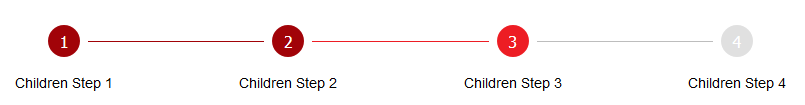
Using the Stepper as a HOC with Step as children
<Stepper activeStep={1}>
  <Step label="Children Step 1" />
  <Step label="Children Step 2" />
  <Step label="Children Step 3" />
</Stepper>
Using with SSR
When developing an SSR application with a framework like Next.js you might face your console being polluted with the following message
Warning: [JSS] Rule is not linked. Missing sheet option "link: true". caused by the underlying dependency react-jss.
A workaround is to use the dynamic import module like in the example below.
const CustomStepper = () => {
return <Stepper steps={[{ label: 'Step 1' }, { label: 'Step 2' }]} activeStep={1} />;
};
export default CustomStepper;
import dynamic from 'next/dynamic';
const StepperComponent = dynamic(() => import('./CustomStepper'), {
ssr: false,
});
Stepper props
| steps | [StepsDTO] | none | Array of objecst defining the steps |
| activeStep | number | 0 | Value defining the active step |
| connectorStateColors | boolean | false | Use different colors for connector lines based on adjacent steps state |
| className | string | none | Add css classes to the Stepper component |
| stepClassName | string | none | Add css classes to Step components |
| hideConnectors | boolean |'inactive' | false | Value defining connectors visibility |
| nonLinear | boolean | false | Allow users to enter the flow at any point |
| styleConfig | StepStyleDTO | --- | Object containing Step style defaults |
| connectorStyleConfig | ConnectorStyleProps | --- | Object containing Connector style defaults |
ConnectorStyleProps
| disabledColor | string | '#bdbdbd' | Define the disabled connector line color |
| activeColor | string | '#ed1d24' | Define the active connector line color |
| completedColor | string | '#a10308' | Define the completed connector line color |
| size | React.ReactText | 1 | Define the thickness of the connector line |
| stepSize | React.ReactText | '2em' | Value defaulting to the step size, used to calculate the padded space between the step and connector line start |
| style | string | 'solid' | Define the style of the connector line |
StepsDTO
| label | string | '' | Value to be displayed under each step |
| active | boolean | false | Value to indicate should the step be displayed as active |
| completed | boolean | false | Value to indicate should the step be displayed as completed |
StepStyleDTO
| activeBgColor | string | '#ed1d24' | Define the background color for active steps |
| activeTextColor | string | '#ffffff' | Define the text color for active steps |
| completedBgColor | string | '#a10308' | Define the background color for completed steps |
| completedTextColor | string | '#ffffff' | Define the background color for completed steps |
| inactiveBgColor | string | '#e0e0e0' | Define the background color for inactive steps |
| inactiveTextColor | string | '#ffffff' | Define the background color for inactive steps |
| size | string or number | '2em' | Value representing the width and height of the step |
| circleFontSize | string or number | '1rem' | Font size of the step content |
| labelFontSize | string or number | '0.875rem' | Font size of step labels |
| borderRadius | string or number | '50%' | Step border radius |
| fontWeight | string or number | 500 | Step label font weight |
Step props
| label | string | '' | Value to be displayed under each step |
| active | boolean | false | Value to indicate should the step be displayed as active |
| completed | boolean | false | Value to indicate should the step be displayed as completed |
| index | number | 0 | Index value of the step |
| className | string | none | Add css classes to the Step component |
| children | React.ReactNode | Step index | Value inside the step |


