React-hint
React-hint is a small tooltip component for React which is developed with simplicity and performance in mind. It also plays nicely with Preact and Inferno. There is a demo page.

How to install
npm i -S react-hint
How to use
| className | String | react-hint | <ReactHint /> is a singleton component. You can completely override the default tooltip style by passing className property with a new base class name. |
| data-rh | String or #element-id | | To show a tooltip on any DOM element and its children add data-rh attribute with a tooltip text to the element. Pass #element-id instead of a text to show the element's HTML content. |
| data-rh-at | top, left, right, bottom | top | The default placement of a tooltip is at the top, but you can add data-rh-at attribute to change the placement. |
| data-rh-cls | String | | To customize a single tooltip add data-rh-cls with a class name which will be added to the tooltip. |
import React from 'react'
import {render} from 'react-dom'
import ReactHint from 'react-hint'
import 'react-hint/css/index.css'
class Demo extends React.Component {
state = {count: 0}
componentDidMount() {
setInterval(() => {
this.setState({count: this.state.count + 1})
ReactHint.instance.forceUpdate()
}, 1000)
}
render() {
const {count} = this.state
return (
<div>
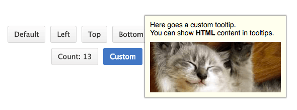
<button data-rh="Default">Default</button>
<button data-rh="Left" data-rh-at="left">Left</button>
<button data-rh="Top" data-rh-at="top">Top</button>
<button data-rh="Bottom" data-rh-at="bottom">Bottom</button>
<button data-rh="Right" data-rh-at="right">Right</button>
<button data-rh={`Count: ${count}`}>Count: {count}</button>
<button data-rh="#custom" data-rh-cls="react-hint--custom">Custom</button>
<ReactHint />
<div style={{display: 'none'}} id="custom">
Here goes a custom tooltip.<br />
You can show <b>HTML</b> content in tooltips.
<img src="//placekitten.com/260/100" />
</div>
</div>
)
}
}
render(<Demo />, document.getElementById('demo'))
How to rerender
React-hint uses shouldComponentUpdate under the hood to decide if it needs to be updated. You can use ReactHint.instance.forceUpdate() in case you want to force an update.
License
MIT