React-hint

React-hint is a small tooltip component for React which is developed with simplicity and performance in mind. It also plays nicely with Preact and Inferno.
How to install
npm i -S react-hint
How to use
| attribute | String | "data-rh" | Allows to set a custom tooltip attribute instead of a default data-rh. |
| className | String | "react-hint" | You can completely override a tooltip style by passing a className property. |
| delay | Number | 0 | The default delay before showing a tooltip. |
| events | Boolean | false | Enables/disables mouseOver events. Disabling events is useful in case you want to trigger a tooltip programmatically. |
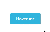
| hover | Boolean | false | Enables to hover a mouse cursor over a tooltip. |
| position | "top", "left", "right", "bottom" | "top" | Allows to customize a default placement of tooltips. |
| ref | Function | | You can get a reference to an instance by passing a function which will set it for you, e.g. <ReactHint ref={(ref) => this.instance = ref} />. This might be needed to programmatically trigger a tooltip by calling this.instance.setState({target}) or update it's content by calling this.instance.forceUpdate(). |
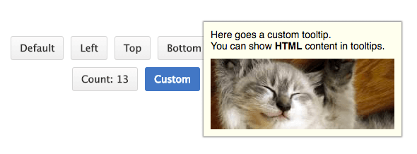
| data-rh | String or #element-id | | To show a tooltip on any DOM element and its children add data-rh attribute with a tooltip text to the element. Pass #element-id instead of a text to show the element's HTML content. |
| data-rh-at | "top", "left", "right", "bottom" | "top" | Allows overriding the default tooltip placement. |
import React from 'react'
import {render} from 'react-dom'
import {ReactHintFactory} from 'react-hint'
import 'react-hint/css/index.css'
const ReactHint = ReactHintFactory(React)
class App extends Component {
toggleCustomHint = ({target}) => {
if (this.instance.state.target) target = null
this.instance.setState({target})
}
render() {
return <div>
<ReactHint events delay={100} />
<ReactHint attribute="data-custom" className="custom-hint"
ref={(ref) => this.instance = ref} />
<button data-rh="Default">Default</button>
<button data-rh="Top" data-rh-at="top">Top</button>
<button data-rh="Right" data-rh-at="right">Right</button>
<button data-rh="Bottom" data-rh-at="bottom">Bottom</button>
<button data-rh="Left" data-rh-at="left">Left</button>
<button data-custom="#content" data-custom-at="bottom"
onClick={this.toggleCustomHint}>Click Me</button>
<div id="content" style={{display: 'none'}}>
Here goes a custom tooltip.<br />
You can show <b>HTML</b> content in tooltips.<br />
<img data-rh="Cat" data-rh-at="bottom"
src="https://images.pexels.com/photos/20787/pexels-photo.jpg?w=240" />
</div>
</div>
}
}
render(<App />, demo)
License
MIT


