Product
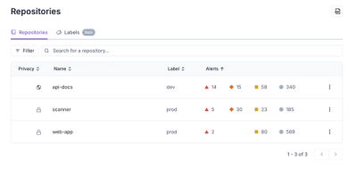
Redesigned Repositories Page: A Faster Way to Prioritize Security Risk
Our redesigned Repositories page adds alert severity, filtering, and tabs for faster triage and clearer insights across all your projects.
react-image-carousel-viewer
Advanced tools
Simple library with Image Carousel Viewer component for React
Simple library with Image Carousel Viewer component for React.
npm i react-image-carousel-viewer
https://codesandbox.io/s/react-image-carousel-viewer-example-1-461uc1
import { useState } from "react";
import { ReactImageCarouselViewer } from "react-image-carousel-viewer";
import "./styles.css";

function App() {
  const [isOpen, setIsOpen] = useState(false);
  const [index, setIndex] = useState(0);
  const images = [
    {
      src: "http://placeimg.com/1200/800/nature",
      description: "image-1"
    },
    { src: "http://placeimg.com/800/1200/nature", description: "image-2" },
    { src: "http://placeimg.com/1920/1080/nature" },
    { src: "http://placeimg.com/1500/500/nature" }
  ];

  return (
    <>
      <p className="title">react-image-carousel-viewer</p>
      <div className="container">
        {images.map((image, index) => (
          <img
            className="image"
            src={image.src}
            alt=""
            key={index}
            onClick={() => {
              setIndex(index);
              setIsOpen(true);
            }}
          />
        ))}

        <ReactImageCarouselViewer
          open={isOpen}
          onClose={() => setIsOpen(false)}
          images={images}
          startIndex={index}
        />
      </div>
    </>
  );
}

export default App;
| Property | Type | Description |
|---|---|---|
| images | {src: string; description?: string; id?: string}[] | Array that contains image src and optional description. |
| startIndex | number | First image from the array to display in the viewer. |
| open | boolean | Trigger to open/close modal. |
| onClose | () => void | Handle modal closing action. |
| leftArrow | JSX.Element | Custom component for left arrow (optional). |
| rightArrow | JSX.Element | Custom component for right arrow (optional). |
| loadingElement | JSX.Element | Custom component for loading animation (optional). |
| extraTopElement | JSX.Element | Custom component for an element in the modal (optional). |
| disableScroll | boolean | Trigger for scrolling action (optional). |
ESC - Closes modal
Scroll - Changes current image
Left Arrow - Show the previous image
Right Arrow - Shows the next image
FAQs
Simple library with Image Carousel Viewer component for React
The npm package react-image-carousel-viewer receives a total of 52 weekly downloads. As such, react-image-carousel-viewer popularity was classified as not popular.
We found that react-image-carousel-viewer demonstrated a not healthy version release cadence and project activity because the last version was released a year ago. It has 1 open source maintainer collaborating on the project.
Did you know?

Socket for GitHub automatically highlights issues in each pull request and monitors the health of all your open source dependencies. Discover the contents of your packages and block harmful activity before you install or update your dependencies.

Product
Our redesigned Repositories page adds alert severity, filtering, and tabs for faster triage and clearer insights across all your projects.

Security News
Slopsquatting is a new supply chain threat where AI-assisted code generators recommend hallucinated packages that attackers register and weaponize.

Security News
Multiple deserialization flaws in PyTorch Lightning could allow remote code execution when loading untrusted model files, affecting versions up to 2.4.0.