Product
Introducing Socket MCP for Claude Desktop
Add secure dependency scanning to Claude Desktop with Socket MCP, a one-click extension that keeps your coding conversations safe from malicious packages.
react-loader-placeholder
Advanced tools

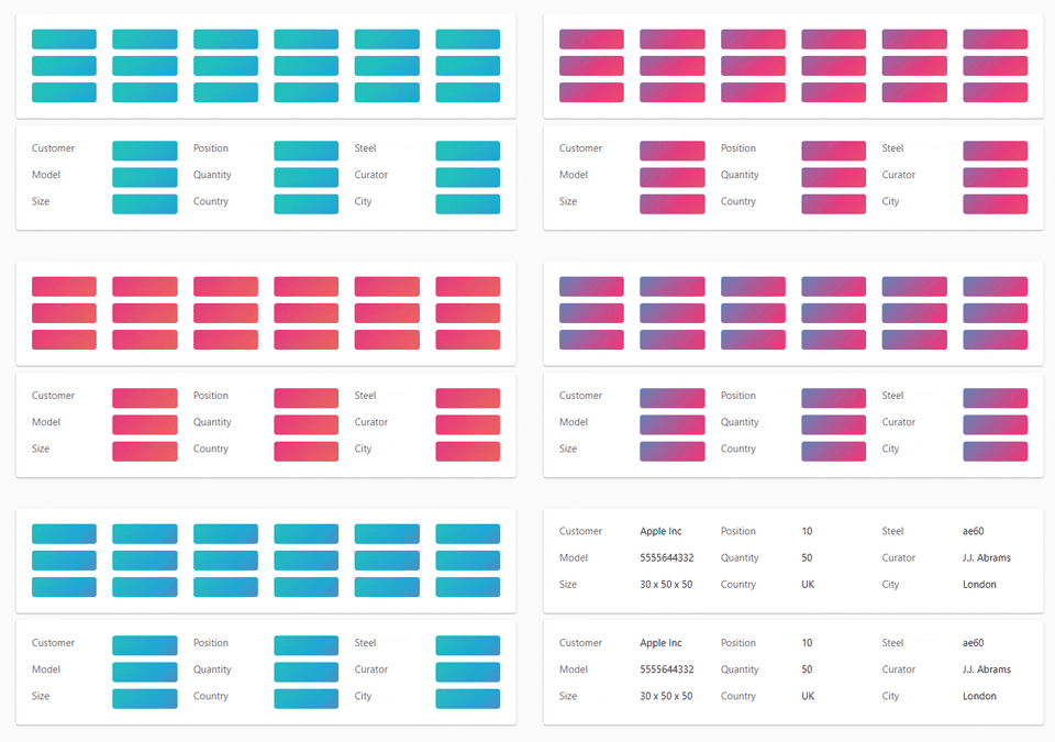
Make beautiful, animated loading that easy adapt to your app.

npm install react-loader-placeholder
The <ReactLoaderPlaceholder> uses HTML data attribute for mark items and CSS for style that items.

<ReactLoaderPlaceholder>.loading prop.data-react-loader-placeholder={true} attribute.If you need to enable or disable not all marked items, just set data-react-loader-placeholder} to true or false.
##Props
The <ReactLoaderPlaceholder> component props:
boolean required - Enable or disable placeholder.string optional - Background color of placeholder item.boolean optional - Enable or disable animation.string optionalObject optionalFAQs
A React library used to make your loader awesome
We found that react-loader-placeholder demonstrated a healthy version release cadence and project activity because the last version was released less than a year ago. It has 0 open source maintainers collaborating on the project.
Did you know?

Socket for GitHub automatically highlights issues in each pull request and monitors the health of all your open source dependencies. Discover the contents of your packages and block harmful activity before you install or update your dependencies.

Product
Add secure dependency scanning to Claude Desktop with Socket MCP, a one-click extension that keeps your coding conversations safe from malicious packages.

Product
Socket now supports Scala and Kotlin, bringing AI-powered threat detection to JVM projects with easy manifest generation and fast, accurate scans.

Application Security
/Security News
Socket CEO Feross Aboukhadijeh and a16z partner Joel de la Garza discuss vibe coding, AI-driven software development, and how the rise of LLMs, despite their risks, still points toward a more secure and innovative future.