Research
/Security News
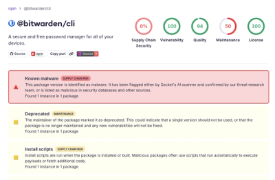
Bitwarden CLI Compromised in Ongoing Checkmarx Supply Chain Campaign
Bitwarden CLI 2026.4.0 was compromised in the Checkmarx supply chain campaign after attackers abused a GitHub Action in Bitwarden’s CI/CD pipeline.
react-material-ui-form-validator
Advanced tools
Simple validator for forms designed with material-ui components.
Simple form validation component for material-ui library inspired by formsy-react
Supported types:
Default validation rules:

You can pass any props of field components except errorText, use errorMessages instead.
Your component must provide a theme.
import React from 'react';
import RaisedButton from 'material-ui/RaisedButton';
import { ValidatorForm, TextValidator} from 'react-material-ui-form-validator';

class MyForm extends React.Component {

    constructor(props) {
        super(props);

        this.handleChange = this.handleChange.bind(this);
    }

    handleChange(event) {
        const email = event.target.value;
        this.setState({ email });
    }

    handleSubmit() {
        // your submit logic
    }

    render() {
        const { email } = this.state;
        return (
            <ValidatorForm
                ref="form"
                onSubmit={this.handleSubmit}
            >
                <TextValidator
                    floatingLabelText="Email"
                    onChange={this.handleChange}
                    name="email"
                    value={email}
                    validators={['required', 'isEmail']}
                    errorMessages={['this field is required', 'email is not valid']}
                />
                <RaisedButton type="submit" />
            </ValidatorForm>
        );
    }
}
You can add your custom rules:
import React from 'react';
import RaisedButton from 'material-ui/RaisedButton';
import { ValidatorForm, TextValidator} from 'react-material-ui-form-validator';

class ResetPasswordForm extends React.Component {

    constructor(props) {
        super(props);
        this.state = {
            user: {},
        };
        this.handleChange = this.handleChange.bind(this);
    }

    componentWillMount() {
        // custom rule will have name 'isPasswordMatch'
        ValidatorForm.addValidationRule('isPasswordMatch', (value) => {
            if (value !== this.state.user.password) {
                return false;
            }
            return true;
        });
    }

    handleChange(event) {
        const { user } = this.state;
        user[event.target.name] = event.target.value;
        this.setState({ user });
    }

    handleSubmit() {
        // your submit logic
    }

    render() {
        const { user } = this.state;

        return (
            <ValidatorForm
                onSubmit={this.handleSubmit}
            >
                <TextValidator
                    floatingLabelText="Password"
                    onChange={this.handleChange}
                    name="password"
                    type="password"
                    validators={['required']}
                    errorMessages={['this field is required']}
                    value={user.password}
                />
                <TextValidator
                    floatingLabelText="Repeat password"
                    onChange={this.handleChange}
                    name="repeatPassword"
                    type="password"
                    validators={['isPasswordMatch', 'required']}
                    errorMessages={['password mismatch', 'this field is required']}
                    value={user.repeatPassword}
                />
                <RaisedButton type="submit" />
            </ValidatorForm>
        );
    }
Currently material-ui doesn't support error messages for switches, but you can easily add your own:
import React from 'react';
import Checkbox from 'material-ui/Checkbox';
import { ValidatorComponent } from 'react-material-ui-form-validator';

export default class CustomCheckboxValidator extends ValidatorComponent {

    render() {
        const { errorMessages, validators, requiredError, ...rest } = this.props;
        const { isValid } = this.state;
        const errorMessage = !isValid && this.getErrorMessage();
        return (
            <div>
                <Checkbox {...rest} />
                {errorMessage}
            </div>
        );
    }
}
| Prop | Required | Type | Default value | Description |
|---|---|---|---|---|
| onSubmit | true | function | Callback for form that fires when all validations are passed | |
| instantValidate | false | bool | false | If true, form will be validated after each field change. If false, form will be validated only after clicking submit button. |
| Prop | Required | Type | Default value | Description |
|---|---|---|---|---|
| validators | false | array | Array of validators. See list of default validators above. | |
| errorMessages | false | array | Array of error messages. Order of messages should be the same as validators prop. | |
| name | true | string | Name of input |
This component covers all my needs, but feel free to contribute.
FAQs
Simple validator for forms designed with material-ui v1/v3/v4/v5 components.
We found that react-material-ui-form-validator demonstrated a healthy version release cadence and project activity because the last version was released less than a year ago. It has 1 open source maintainer collaborating on the project.
Did you know?

Socket for GitHub automatically highlights issues in each pull request and monitors the health of all your open source dependencies. Discover the contents of your packages and block harmful activity before you install or update your dependencies.

Research
/Security News
Bitwarden CLI 2026.4.0 was compromised in the Checkmarx supply chain campaign after attackers abused a GitHub Action in Bitwarden’s CI/CD pipeline.

Research
/Security News
Docker and Socket have uncovered malicious Checkmarx KICS images and suspicious code extension releases in a broader supply chain compromise.

Product
Stay on top of alert changes with filtered subscriptions, batched summaries, and notification routing built for triage.