
Security News
New React Server Components Vulnerabilities: DoS and Source Code Exposure
New DoS and source code exposure bugs in React Server Components and Next.js: what’s affected and how to update safely.
By Sarah Gooding - Dec 12, 2025
react-mobile-datepicker-typescript
Advanced tools


a lightweight react date picker for mobile, Not more than 4k
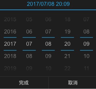
react-mobile-datepicker provides a component that can set year, month, day, hour, minute and second by sliding up or down.
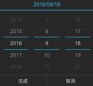
set dateConfig to configure year, month, day, hour, minute.
[{
  type: 'year',
  format: 'YYYY',
  caption: 'Year',
  step: 1,
}, {
  type: 'month',
  format: 'MM',
  caption: 'Mon',
  step: 1,
}, {
  type: 'date',
  format: 'DD',
  caption: 'Day',
  step: 1,
}, {
  type: 'hour',
  format: 'hh',
  caption: 'Hour',
  step: 1,
}, {
  type: 'minute',
  format: 'mm',
  caption: 'Min',
  step: 1,
},
'second': {
  type: 'second',
  format: 'hh',
  caption: 'Sec',
  step: 1,
}]
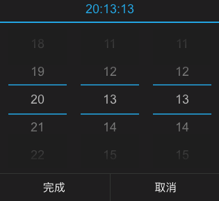
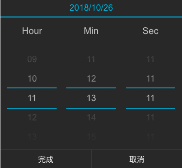
set dateConfig to configure hour, minute and second.
[{
  type: 'hour',
  format: 'hh',
  caption: 'Hour',
  step: 1,
}, {
  type: 'minute',
  format: 'mm',
  caption: 'Min',
  step: 1,
}, {
  type: 'second',
  format: 'hh',
  caption: 'Sec',
  step: 1,
}]
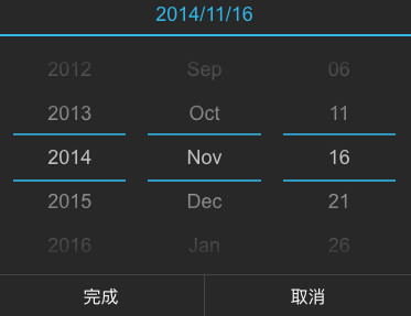
customize the content mapping shown in the month.
const monthMap = {
  '1': 'Jan',
  '2': 'Feb',
  '3': 'Mar',
  '4': 'Apr',
  '5': 'May',
  '6': 'Jun',
  '7': 'Jul',
  '8': 'Aug',
  '9': 'Sep',
  '10': 'Oct',
  '11': 'Nov',
  '12': 'Dec',
};

const dateConfig = [{
  type: 'year',
  format: 'YYYY',
  caption: 'Year',
  step: 1,
}, {
  type: 'month',
  format: value => monthMap[value.getMonth() + 1],
  caption: 'Mon',
  step: 1,
}, {
  type: 'date',
  format: 'DD',
  caption: 'Day',
  step: 1,
}];

<DatePicker
  dateConfig={dateConfig}
/>
set showCaption to display date captions, matches the dateConfig property's caption.
const dateConfig = [{
  type: 'hour',
  format: 'hh',
  caption: 'Hour',
  step: 1,
}, {
  type: 'minute',
  format: 'mm',
  caption: 'Min',
  step: 1,
},
  type: 'second',
  format: 'hh',
  caption: 'Sec',
  step: 1,
}];

<DatePicker
  showCaption={true}
  dateConfig={dateConfig}
/>
Using npm:
$ npm install react-mobile-datepicker --save
The following guide assumes you have some sort of ES2015 build set up using babel and/or webpack/browserify/gulp/grunt/etc.
// Using an ES6 transpiler like Babel
import  React from 'react';
import ReactDOM from 'react-dom';
import DatePicker from 'react-mobile-datepicker';
class App extends React.Component {
  state = {
    time: new Date(),
    isOpen: false,
  }

  handleClick = () => {
    this.setState({ isOpen: true });
  }

  handleCancel = () => {
    this.setState({ isOpen: false });
  }

  handleSelect = (time) => {
    this.setState({ time, isOpen: false });
  }

  render() {
    return (
      <div className="App">
        <a
          className="select-btn"
          onClick={this.handleClick}>
          select time
        </a>

        <DatePicker
          value={this.state.time}
          isOpen={this.state.isOpen}
          onSelect={this.handleSelect}
          onCancel={this.handleCancel} />
      </div>
    );
  }
}


ReactDOM.render(<App />, document.getElementById('react-box'));
| Property | Type | Default | Description |
|---|---|---|---|
| isPopup | Boolean | true | whether as popup add a overlay |
| isOpen | Boolean | false | whether to open datepicker |
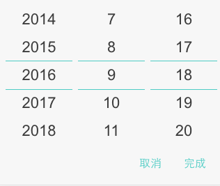
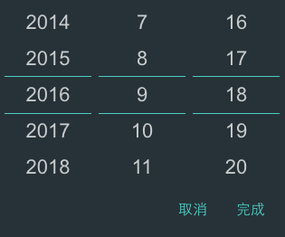
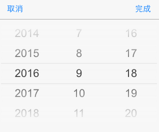
| theme | String | default | theme of datepicker, include 'default', 'dark', 'ios', 'android', 'android-dark' |
dateConfig instead) | Array | ['YYYY', 'M', 'D'] | according to year, month, day, hour, minute, second format specified display text. E.g ['YYYY年', 'MM月', 'DD日'] |
dateConfig instead | Array | [1, 1, 1] | set step for each time unit |
| dateConfig | Object | See DateConfig format for details | configure date unit information |
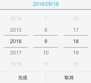
headerFormat instead) | String | 'YYYY/MM/DD' | customize the format of the display title |
| headerFormat | String | 'YYYY/MM/DD' | customize the format of the display title |
| value | Date | new Date() | date value |
| min | Date | new Date(1970, 0, 1) | minimum date |
| max | Date | new Date(2050, 0, 1) | maximum date |
| showHeader | Boolean | true | whether to show the header |
| showFooter | Boolean | true | whether to show the footer |
| customHeader | ReactElement | undefined | customize the header, if you set this property, it will replace showFormat |
| confirmText | String | 完成 | customize the selection time button text |
| cancelText | String | 取消 | customize the cancel button text |
| onSelect | Function | () => {} | the callback function after click button of done, Date object as a parameter |
| onCancel | Function | () => {} | the callback function after click button of cancel |
| onChange | Function | () => {} | the callback function after date be changed |
all default date configuration information, as follows
[{
  type: 'year',
  format: 'YYYY',
  caption: 'Year',
  step: 1,
}, {
  type: 'month',
  format: 'MM',
  caption: 'Mon',
  step: 1,
}, {
  type: 'date',
  format: 'DD',
  caption: 'Day',
  step: 1,
}, {
  type: 'hour',
  format: 'hh',
  caption: 'Hour',
  step: 1,
}, {
  type: 'minute',
  format: 'mm',
  caption: 'Min',
  step: 1,
},
'second': {
  type: 'second',
  format: 'hh',
  caption: 'Sec',
  step: 1,
}]
Anyone and everyone is welcome to contribute to this project. The best way to start is by checking our open issues, submit a new issues or feature request, participate in discussions, upvote or downvote the issues you like or dislike.
FAQs
react based date picker like native
We found that react-mobile-datepicker-typescript demonstrated a not healthy version release cadence and project activity because the last version was released a year ago. It has 1 open source maintainer collaborating on the project.
Did you know?

Socket for GitHub automatically highlights issues in each pull request and monitors the health of all your open source dependencies. Discover the contents of your packages and block harmful activity before you install or update your dependencies.
Security News
New DoS and source code exposure bugs in React Server Components and Next.js: what’s affected and how to update safely.

Security News
Socket CEO Feross Aboukhadijeh joins Software Engineering Daily to discuss modern software supply chain attacks and rising AI-driven security risks.

Security News
GitHub has revoked npm classic tokens for publishing; maintainers must migrate, but OpenJS warns OIDC trusted publishing still has risky gaps for critical projects.